(first posted 4/19/2015)
The transition years, 1969-1974
In the third installment of this series, I’m headed back MOPAR country where I began with an analysis of the Dodge Charger. Today, I’m looking at the Plymouth Satellite, with a focus on the GTX and Road Runner muscle models. Read on to find out which generation I have dubbed “the transition years” and why.
1971-1974 Plymouth Satellite
The Satellite’s story naturally parallels its Dodge Charger stablemate. While not as dramatic as the ’68-’70 Charger, the closely related Satellite attained peak design at the same time.
If you like your cars styled with a t-square and a triangle, you may prefer the ’65-’67 Belvedere/Satellite to all other generations. Not an unattractive body by any means, especially compared the horror show early 1960s cars. That story has been told a thousand times, so here’s the shorthand version. Virgil Exner suffered a heart attack, William C. Newberg, newly named President of Chrysler mistakenly overheard a cocktail party rumor that Chevy was going to downsize the Impala, and hilarity ensued in the Chrysler design studio. By 1965 all the weirdness had been washed out, courtesy of Elwood Engel, and by 1968 Chrysler was coke-bottling it up, GM style. It was ok to copy to GM, as long as you weren’t taking your design direction from wild rumors. But to my eyes, the hardtop Satellite, in Road Runner or GTX guise, was more attractive than the ’68-’69 Chevelle SS, Cutlass 442, or Skylark Gran Sport. The GTO beat them all, every year.
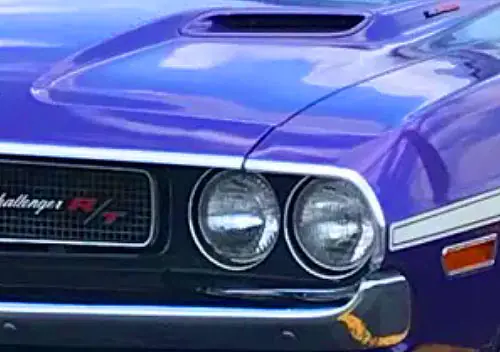
For this generation, my favorite flavor is the ’70, with its predictive snarling face that warned us about the full loop bumper coming for ’71. Note that the bare bones Road Runner handily outsold the luxo GTX every year. This was the go-fast, low-cost, big-engine, lightweight setup that the Age Of Aquarius lead foots wanted from Plymouth. After all, it was the value brand, and every time Plymouth tried to go a little upscale with cars like the GTX or the VIP Fury, customers voted with their pocketbooks and bought Road Runners, Valiants, and a lot of Dusters. Chrysler’s $50,000 payment to Warner Bros. for the rights to use the Road Runner cartoon character paid off handsomely. Scoops, stripes, decals, and the “beep beep” horn all added up to one of the most iconic muscle cars of the decade.
In 1971, the Satellite fell into step with the current corporate design language and declared “fuselage was the future”.
More specifically, designer John Herlitz was assigned to create a more aggressive, contemporary look to take on the GM and Ford intermediates, according to Hemmings.com. Herlitz stated, “I came from a design education where form and curvature to metal is a desirable, if not essential, objective. The 1968-’70 Road Runner suffered from Chrysler’s mid-’60s devotion to linear design; the value of the metal was limited to connecting the various flat surfaces–lots of sharp character lines. This delineation of separate hood and fender surfaces creates unnecessary visual distractions.”
Whether you agree with Herlitz’s philosophy or not, it was clear that curves were in. Like Bill Shenk at Ford, Herlitz was inspired by aircraft, specifically the McDonnell Douglas F-4 Phantom. In hindsight, it seems ludicrous to apply the design principles of a twin-seat, Mach 2 fighter jet to a mid-sized family car. Wouldn’t honest, utilitarian functionality better serve the occupants? Well sir, if your tastes are that pedestrian, we have a fine selection of forest green Valiants and Dusters.
But c’mon, would Daisy Duke have looked cool doing power slides in a Valiant? Speaking of curves, I’ve always thought that the squareish wheel cutouts were a bit discordant with the rest of the round, organic theme. Why make the wheel wells, which house the most naturally round objects on a car, square? I think it looks particularly odd in the side view and especially heavy at the rear. There is a lot of sheet metal between the top of the rear wheel cutout and the c-pillar. The Torino SportBacks all suffered from this phenomenon as well. Perhaps this is what happens when the car designer really wanted to make a jet airplane.
Herlitz explains his decisions here. “I wanted the body surfaces to have more homogeneity in order to focus the eye on the wheel and wheel cutouts. This was accomplished by flowing the fender shape from plan view (directly above) and side view to the wheel cutouts,” Herlitz explained in the same interview, adding that, “The flares drove the modelers crazy. The surface had to be just right or the reflections went to hell. Finally, [studio boss] Dick Macadam told me I had one last chance. Fortunately, it was enough.” (Source: Hemmings.com.)
There was new, more formal sheet metal for ’73-’74, which substantially changed the Satellite’s look. The ’71-’74 Charger didn’t receive a similar restyle, and was able to keep the cool loop bumpers until ’74. So was the Satellite restyle was about sales, (which did increase 40% for ’73) or safety? When you see what transpired for ’75, it seems like the former may have been true.
Everything changed for ’75. The upright grill, dual opera windows, and even the name – as Satellite begat Fury.
In 2-door hardtop form, this model was positioned as your cheapest ticket to ride on the personal luxury train. An analog to the Road Runner, which had cultivated a strong image as the bargain, no-frills muscle car. But frills were needed if you hoped to compete against Monte Carlos and Ford Elites. You could say Plymouth switched from Cheap Thrills to Cheap Frills. By ’77, they adopted dual stacked headlights, that neoclassic late Malaise Era styling gimmick. The dual opera window treatment was either an option or part of some arcane sub-model dreamt up by the marketing guys looking to catch a little cut-rate Cordoba magic. I frankly became too bored to research that detail. The only thing I’ll give this generation credit for is keeping a hardtop model into the ’70s and marginally better 5-mph bumper integration than its competition at Ford or Chevy.
My remaining candidates for transition cars are the ’69-’72 Ford Galaxie / LTD, the ’68-’70 Oldsmobile Toronado, and the ’71-’75 Jaguar XKE Series III. Which one would you like to see next?
Automotive History: Muscle Cars To Malaise Era-Part 4
See all my other posts at my blog, Wired On Cars. It’s about car culture; the focus is on car shows, car museums and car design. But all things automotive are fair game.










You’re not showing the ’75 ads that straightfacedly called them the “Small Fury”?
I guess it’s relative, but still…
Yeah, you gotta love the days when small meant a paltry 115″ wheelbase and 212″ overall length. (I’m just guessing on the numbers.)
People were buying the Cordoba, “the new SMALL Chrysler,” as fast as the corporation could build them, so…
But they were not buying the virtually identical ’75 Dodge Charger. A perfect illustration of the importance of image in automotive marketing. Particularly in the personal luxury class. Also, I don’t think the Cordoba listed for that much more than the Charger.
Sing the jingle: “The SMAAAALLLL Fury, it’s what a lot of people have been looking for…”
Given Chrysler’s limited resources, I must give credit to the company for being able to alter the Satellite in this way, effectively changing its personality to meet the changing tastes.
Detroit looking to the F4 for inspiration was, like Cadillac’s P-38 tailfins, a bit out of phase: It first flew in 1958; by the time of the Malaise Era & Vietnamization, the blended big-winged F-14 thru 16 were being conceived in response to how the primitive but agile MiG-17 gave their sophisticated but clumsy Mach-2 “bricks with fins” a run for their money in visual engagements. Also at this time the ugly, angular, rugged A-10 was conceived, inspired by the Sturmovik & tank-busting Stuka, after they learned how useless Mach-2 “blowtorchers” like the Phantom were in Close-Air Support. So Detroit & the Pentagon were of very different minds.
The F-4 is a great inspiration if what you’re designing happens to be a brick!
Planes seem to influence car design to this day. Just look at the Lamborghini Reventon and the F22:
Radar-defeating car styling? Maybe Lambo’s onto something, if they can find a way to make low-maintenance Stealth coatings.
Here’s another design parallel: Coke bottle and the transonic Area Rule fuselage (F-106 Delta Dart, T-38 Talon, et al.)
Don’t know WHY, the jet is in that pic…
Looks more like, the inspiration for that Lamborghini was a doorstop.
Why is it EVERY Lambo after the Diablo, looks like an isosceles triangle?
That designer needs to be euthanized ASAP.
It makes a lot more sense to have a hyper-exotic car draw inspiration from a fighter jet. But a Ford Torino and a Plymouth Satellite? Not so much. Still, I bet those were good times on the showroom floor, when you could take your family shopping under the guise of “we need something practical for our brood of 5” and somehow driving out with a Road Runner 440 Six-Pack. Hey it’s basically a Satellite. Just does the 1/4 mile in 14 sec.
The F-86H most closely approximated the MiG-17 in dissimilar dogfight training Stateside, & was thought superior to its supersonic successors “In any envelope except nose down and full throttle.”
The F-4 was an apt comparison point for ’60s muscle cars, though: Lots and lots of specific power, but not so great at changing directions gracefully.
“The triumph of thrust over aerodynamics.”
I would love to see the transition cars for the Oldsmobile 98, Buick Electra, Chrysler New Yorker and Mercury Marquis from peak cars to Malaise cars.
for the Mercury Marquis I consider 1969-70 to be the peak, 1971-72 to be transition and 1973-78 to be Malaise era of the Marquis’s.
I was planning on doing the Ford Galaxie / LTD, so I’ll just include the Marquis.
73-78 is the malaise era for the U.S, but comparing to the Era of Stagnation in Soviet, it’s much worse there. It took them a decade to make this car, which is really nothing to brag about, considering it was more of a major overhaul than a new design, and they borrowed many parts from other cars too.
Rather have that, than all the clone, round “blobs of crap” produced, nowadays.
At least, it’s RWD.
** Also, Malaise Era is 1973-83.
Wasn’t there a 1975 Road Runner done off that Brougham-ish ‘Small Fury’. If ever a car sent a mixed message………
Yes. It was too embarrassing to even mention. You may find the grim details here.
http://www.hemmings.com/mus/stories/2012/04/01/hmn_buyers_guide1.html
Well, not as bad as the Volare Road Runner I guess.
I’m not so sure, I think the “Muscle Car” evolution was par for the course with the precedent the GTO set by moving to the Ventura for 1974. Neither were successful of course but the natural progression for performance at the time was favoring the next smallest/lightest platform, just as the hot full sized engines made their ways into intermediates in the mid 60s and the way those engines made their ways into ponycars by the late 60s.The Duster/Demon were really the harbingers for that next with the 340 but unleaded gas, insurance and the fuel crisis burnt out that flame early, the 74 GTO and 76 RoadRunner were the few burning embers leftover.
Plus The Volare coupe, while hardly a stunner, was definitely more sporty looking than the 75 Fury coupe body. The big blocky indistinct grille, vertical taillights, and Lincolnesque trunklid bump, just look so dorky it wouldn’t have helped if Plymouth dusted off the 426 Hemi castings and stuffed it in this for one last hurrah, it would still be undesirable. The Volare Road Runner? Meh, It may elicit the “THAT’s a Road Runner???” question but not necessarily the “What the hell happened to the RoadRunner???” question the Fury based one does. Same goes for the Collonade and Ventura GTOs
Absolutely agreed! I’m not sure why the Volare Roadrunner doesn’t get much respect. Terrible quality control aside, they were pretty speedy for their day. Ditto the ’74 GTO.
I think if the Volare Road Runner had halfway decent quality control and the E58 H.P. 360 under the hood with a 4 speed, it might have been a contender. The very few I saw had 318 2 bbl.’s.
Exactly.
I don’t know what was tackier… The corny wannabe graphics or the Venetian blinds on the side windows.
I say the same thing when I see these roaming around…
Yeah, and I was scared that the ’74 Roadrunner I had ordered, the first car I ever actually bought, was going to come in as a ’75. The dealer somehow screwed up my order sheet and what was supposed to be a “Silver Frost Metallic” 360 4Barrel (“HP” 245HP motor) car with red stripes came in as an avacado Sebring, with a white half vinyl top, weird checkered interior, and a 400 engine.The order was put in again, right at the last minute, and the salesman had serious doubts it would show up as a ’74. I told them the deal was off if it was a ’75, it was too damn ugly, and I was assured they would do a dealer trade for a car I would want, but I wasn’t really believing them. Finally, in November, not long before Thanksgiving, I was passed by a carrier with my car, and a ’75 in the same colors, heading towards the dealership. I still miss it, and I’m happy it’s been restored with a monster stroked 440 in it, and if I can ever get to Vegas, I can drive it again.
My first car was a ’74 Roadrunner I ordered just before my 18th birthday. Somehow the order was totally screwed up and what was delivered to the dealer was a Satellite Sebring, in baby crap green with a half white vinyl top, with a black and white checkered interior. Even for the amazingly cheap price the dealer was going to give it to me for, I said, “No thanks!”, and the order was put in again. My car was built as both a ’74, and a ’75. Same color, same engine (360 4 barrel) , etc, but the ’75 had the (IMHO) awful looking new styling. My car was apparently built with leftover parts as it had the wrong fuel pump, the wrong wheel bearings(A nearly disasterous thing), and the taxicab/slant 6 8+1/4″ rear, which did manage to last past the warranty, but barely. Both cars came in on the same truck about a week before Thanksgiving, I passed them getting off I-475 and followed the truck to the dealer in Bowling Green, Ohio. It looked identical to the silver with red stripes car in this brochure pic:
CA had a great interview with Herlitz with drawings and clays leading up to the 71. Peak styling from anywhere in the world, so sophisticated and only let down by the mundane rear bumper. Transition period yes, but still too early to tell whether it was a dead-end or way ahead of its time.
I remember that article, still have it in storage. I think the ’71 design missed the mark, because they did a significant re-skin in ’73 and saw a big jump in sales. Plymouth was chasing the Ford and Chevy intermediates, and by the time their swoopy ’71 Satellite debuted, people were already swooning over formal rooflines and rolls-royce grills.
With the distinctive rounded fender edges it definitely foresaw the Jellybean era.
Right, it was either too late or ahead of its time.
I’ve been wondering about that Newberg cocktail-party story.
In those days all the automakers had spies and moles looking at all the others. It seems wildly unlikely that Chrysler’s spies would have let Newberg get away with a “misheard” vague rumor. They could have picked up better info.
It seems MORE likely that GM had set up a full-fledged disinformation program, so that all of Chrysler’s spies and execs heard the same wrong info about a downsized Chevy.
At that point in time Chrysler was a ship without a rudder. I’ve always liked the cocktail party story, even if it’s been twisted over the years.
That doesn’t make any sense either, for several reasons.
1. Chevy and all of GM full-sized cars had just downsized for 1961. It would be totally not credible for GM to plant a story that they were going to downsize again in 1962. Nobody would have believed it. Except for a doofus Chrysler Exec who probably had too many drinks, and who misunderstood and was actually hearing about the 1962 Chevy II.
2. Let’s face it: GM had no serious worries about Chrysler, or even Ford. Their bigger worry was getting broken up by the Justice Dept. for being too monopolistic.
3. Stranger decisions were made back in the good old days, when the company President could call all kinds of shoot-from-the-hip decisions. Think Mad Men. Of course, Chrysler was a lot smaller than GM, and the same thing would NOT have happened at GM; way too many suits all second-guessing each other on the 14th floor. Too many committees.
4. This story has been affirmed repeatedly since within a few years after it happened, from other top Chrysler execs. This is not just an urban myth concocted in later years. It’s in Exner’s bios, etc. It’s the only reason ever given as to how the ’62 downsizing came to be. And it works, inasmuch as Chevy really was cooking up a smaller Chevy II for ’62.
Here’s how the event is described in Exner’s bio, “Visioneer”:
In the summer of 1959, Ex suffered a crushing blow from Colbert’s second-in-command, William C Newberg. It is believed that Newberg was playing golf with (among others) Chevrolet’s chief, Ed Cole, at the Oakland Hills Country Cub, on a sunny Sunday afternoon., when he overheard a conversation Cole was having. He thought he heard Cole say that he was downsizing all Chevrolets for 1962, when in fact Cole was talking about the introduction of the compact Chevy II. Armed with this piece of dangerous misinformation, Newberg rushed to work the following Monday in a panic and ordered an immediate reduction in size of (the 1962) Plymouth and Dodge, and scrapped the new designs for the other divisions. In a meeting with Ex and Chief Engineer Bill Ackerman, Newburg told them to adapt the existing design to fit a smaller 116″ chassis instead of the planned 119″ base and to narrow the cars to 72in. The chaos that ensued saw Styling work round the clock to re-jig the designs to fit the new parameters, the night shift doing one thing and the day shift working on its own interpretation, with a half hour overlap for consultation. Eventually designs were agreed upon, but sadly, the new dimensions stole the proportions needed to carry off Exner’s proposed new look, along with the large expanse of curved side glass and wrap-around bumpers….
…Exner’s much loved Super Sport (concept on which his 1962 design had been based on) turned into a parody of its former self, and was dropped completely along with new designs for DeSoto, Imperial and Chrysler….Uncharacteristically, Exner lost his temper with the Chrysler executives, and “got really mad at them” (Cliff Voss). “These cars are plucked chickens”, he screamed. They are not competitive, and Styling should not be held responsible”.
Of course, that doesn’t prove it happened that way. And other factors may also have combined with what Newberg might have heard. And was the Chevy II already committed to in the summer of 1959? I thought a bit later, in October.
Chrysler had also become a very insular place by then, much like GM would be in the last 20 years. Colbert, Newberg and much of the rest of top management had been there since the 30s. Both Walter Chrysler and K.T. Keller had been top notch managers and production guys, but Keller in particular doesn’t (in hindsight) seem to have done very well in grooming talent to succeed him. Byron Foy had run DeSoto in the 30s (and was Walter Chrysler’s son in law) but he lost interest and did not return to the company after a tour of service in the war. I think that the company culture had become fairly toxic by 1961, and bad management decisions seemed to come fairly easily. When it was necessary to replace Newberg, Chrysler turned to Lynn Townsend, a complete outsider instead of someone already in management. It is interesting that since that time, Chrysler has turned to outside people every time there has been a change in top management (Iacocca, Eaton, and then Mercedes and Fiat leadership.)
At the point Newberg made the decision, Chrysler management was dealing with serious stockholder allegations of payola and double-dipping on supplier contracts and was in the midst of a large-scale independent audit. (If I recall correctly, Lynn Townsend was one of the auditors, subsequently becoming Chrysler’s new administrative VP.) So, there was a lot of chaos during that period.
I think it’s significant that a lot of the decisions involving the ’62 cars involved reducing production costs. The crux of the charges stockholder Sol Dann and his supporters were making was that Chrysler was not as profitable as it should be because its cars cost too much to build (which Dann and company alleged was due to double-dipping). So, the downsizing program may have been politically expedient in that moment.
Also, at that time, AMC was becoming a serious threat, particularly to Plymouth, and it was still not clear how long the buyer fallout from the late ’50s recession would persist.
So, my read is that Chrysler convinced themselves they were ahead of the curve and everyone (except, ironically, Exner) went along with it, in part because it also allowed them to say to the stockholders, “Look, we’ve just launched a campaign that will slash X dollars out of the production cost of each of our cars.”
Large organizations are often remarkably good at talking themselves into things that seem politically expedient, even absent (or contrary to) any outside evidence.
I remember reading an article – either in Collectible Automobile, or Automobile Quarterly – where a former Chrysler stylist or executive claimed that, once Newberg brought up the idea of downsizing the 1962 cars, some influential engineers and executives jumped on the idea. Some of them wanted to lower costs. Other engineers also wanted to eliminate weight, as they felt that the cars of the late 1950s and early 1960s had gotten too big and heavy.
Exner’s original plan called for the cars to have curved side glass, deep windshields and complicated, wraparound bumpers. These added to total costs, and they were all eliminated in the cars that did reach the market in the fall of 1961.
The notion that Ed Cole, Newberg, and a solitary Detroit cocktail party were the sole rationale for the 1962 Chrysler downsizing debacle may not be factual, has merit. It’s quite conceivable that when it became apparent that the ’62 Mopars were going to be huge flops, everyone involved started deserting the sinking ship like rats, looking for ways to absolve themselves of it to keep their jobs and, voilá, suddenly, poor ‘ole disgraced Newberg is left holding the bag with the cocktail party story.
It’s just hard to imagine Newberg ordering everyone around at the last minute, dictator style, without getting any kind of advice or input from his top executives, particularly, his engineers. IOW, if the Chrysler engineers had nixed Newberg’s last-minute downsizing proposal, it’s hard to imagine him still going through with it.
Again, I think that the move makes more sense if considered in light of the pressure Chrysler was under from its stockholders and the general trends in the industry at that time. Even if it was solely Newberg’s inspiration based on what he’d overheard, it was not as out of the blue as it’s often portrayed (which is not to say it was well-considered).
Also, if anyone were going to nix orders from the president, it would have been the board of directors, not the engineering staff reporting to him. Telling your boss he’s making a mistake is a very delicate skill!
It might actually be able to extrapolate the sequence of events that led to the ’62 downsizing ‘without’ the cocktail party story, chiefly by Tex Colbert, Newberg’s predecessor and one-time close friend. Colbert was responsible for the ’61 cars which were flops, too. Besides being slow-sellers, maybe they had been real expensive to get into production, as well. Colbert could have seen what was coming from the Chrysler board and essentially threw his friend, Newberg, under the bus to save his own skin when he handed over the Chrysler presidency to him. There’s a well-known incident years later when Newberg and Colbert accidently happened upon each other at a country club, at which time Newberg slugged Colbert in the nose.
So, at the eleventh hour, Newberg was made president and given the nearly impossible task of drastically cutting costs on the almost finalized 1962 cars (which were surely just made over ’61 cars).
The irony is that the enormous expense of the the last-minute re-do of the ’62 cars, combined with the abysmal sales, would ultimately be way more costly than if the board had let Newberg take a much more seasoned approach, i.e., let the 1962 cars go through as originally planned and make any kind of downsizing changes for MY1963. IOW, what Ford and GM did when they brought out their intermediates except Chrysler had the potential of beating them to market by a year.
Instead, it was Ford and GM who got their intermediates to market a year ahead of Chrysler. It wouldn’t be until 1965 when Chrysler would get their model line-up back on track.
The Newberg-Colbert fracas had its roots in Newberg’s firing over the payola scandal involving suppliers. Apparently Colbert knew about Newberg’s interests in Chrysler suppliers – or Newberg thought that he knew about them – and when Colbert did nothing to save him, he was furious.
Newberg was not an 11th-hour choice for president. Like K.T. Keller and Colbert, he had come up through Dodge Division, which was the training ground for Chrysler Corporation executives during those years. He had been groomed as Colbert’s successor, which made his firing all the more difficult for him to accept.
The 1962 cars were supposed to be new from road-to-roof. I believe that the 1962 cars, for example, did not feature a front subframe, unlike the 1960-61 full-size cars.
As originally planned, the 1962 cars were not just face-lifted versions of the 1960-61 cars. Too much was changed.
On the original 1962 models, the greenhouse featured curved side glass and the windshield shape and size were drastically different compared to the 1960-61 models (this required a new cowl, which is one of the most expensive parts to change on a car). The overall proportions – even during the planning stages, the original 1962 models featured a long-hood, short-deck look – were completely different from the 1960-61 models. These differences would require serious structural changes.
I guess if GM had launched this rumor, some of their spies might had saw some preview of the original ’62 Mopars and they don’t wanted to be outsmarted again like their new ’57 Buick who looked already old fashionned and their original ’59 was reharshed and more chromed ’58.
However, I also read more at that rumor then Newberg also heard then Ford was to downsize their full-size cars as well and that “downsized” full-size was the mid-size/intermediate 1962 Fairlane/Mercury Meteor.
Could Ford also launched a rumor as well? Mercury was forced to go almost in the low-price field after the Eisenhower recession and inherited the Comet originally planned for Edsel to stay afloat until they decided to return to the “junior Lincoln” territory. Who know what the original proposed 1962 Dodge and DeSoto would had done to Mercury who could had ended more earlier.
I’m even more doubtful that Ford would bother with such a thing than I am that GM would. At that point in time, I don’t think anyone else in the industry was sufficiently concerned with Chrysler to bother going to that kind of trouble.
I wonder If Chrysler thought the Fairlane and Malibu would eventually replace Ford and Chevy full size models.
Hopefully, Lee Iacocca didn’t think that the Dodge Aries/Plymouth Reliant would do that to the St. Regis and Gran Fury… Just because they can fit 6 adults.
The eventual ’74/’75 Plymouth Satellites (and whatever the Dodge version was called – Coronet?) were the most unreliable and most unsatisfactory to customers in the Hertz fleet in Denver in those years.
Ford and GM cars were bought by Hertz. AMC and Chrysler cars were leased – for a short term (the winter). The AMC cars (Matadors sedans and wagons) were ugly but reliable. The Chryslers (Satellite/Fury whatever/wagons/Cordobas/Chargers) were just unreliable. Customers did not like them and Hertz employees did not either.
I guess Hertz leased these crappy cars from the Chrysler sales bank – cheaply. They looked good once – on the first rental. They deteriorated quickly. The counter agents let them go to customers last – after the Granadas, Monarchs, Montegos,Torinos, Malibus, Cutlasses and Matadors had all been taken first.
That sounds like interesting material for an article.
Indeed it does.
After driving Monarchs and Torinos, and Matadors, what was supposed to be better about them? The ’74 Mopars at least looked good. The Matador was one of the ugliest cars ever.
I was in a lot of rental cars in the mid ’70’s until about 1981, and I honestly thought my ’74 Roadrunner was better than any of them, especially the Monarchs, Granadas, Torinos, and Matadors. And it could beat any of them 0-60.
Agreed with the others. You need to do up an article on your experiences and submit it! This kind of stuff is fascinating!
Thanks for the encouragement.
Here is a bit more about the situation. In Denver the Hertz fleet was always built up for the winter season – skiing. While there was some commercial air service into Vail and Aspen, many ski resort visitors just flew to Denver and rented for the week or so they would be in the mountains. This was big business for Hertz and the local fleet did have a lot of wagons for this purpose.
The AMC and Chrysler cars would arrive after the first batches of new and owned Ford (most of the fleet) and GM cars. These were, as I remember, on six month leases. This was at the time that Chrysler was in particular had a “sales bank” – built but unsold cars in inventory. I guess, but do not know, that the Hertz leased cars came from here. I remember most of these Chrysler cars as being mid-sized (in Hertz thinking) four door sedans – Satellites. There were some wagons too. Later, Aspen and Volare sedans and wagons appeared as did a few Gran Fury type four door sedans. AMC lease cars were Matador four door sedans and wagons; I do not remember any Matador coupes.
I was at Hertz in Denver from ’74 through ’78. It was important to have a fleet of cars that could be rented. This means reliable and durable. Hertz hated to lose a rental because the fleet did not have enough cars. Timing of purchase/sales/leases was important and so was keeping the fleet running and available for rental. Downtime from mechanical issues or accidents was bad. And the Chryslers were mechanical problems – as I remember the mid-sized and Gran Fury types being problems and Aspen/Volares not so much.
The nice rental agents on the counters had the keys. At Denver Stapleton in the mid-70s rental cars were still in lots immediately adjacent to the terminal; you walked to your rental car with no bus. Agents had to deal with problems – mechanical issues led to exchanges, tows and angry customers. So the Fords & GMs & AMCs went first. The Chryslers had a bad reputation in house so they were rented last. The customers knew too; any experienced renter would, when given the option, take a Granada or Malibu over a Chrysler.
The AMCs were, as I remember, reliable and durable and roomy. I do not remember any problem with them except that they were ugly.
Thank you for sharing. It’s interesting to hear people tell of their experiences with various cars when they were new – especially if they had the chance to compare how various makes held up in actual use.
Interesting, I was a transporter for Hertz ’77-’78 in South Burlington, Vt, which I think would be a similar market to Denver, overlapping the end of your tenure.
One thing I noticed travelling to different Hertz locations (all in Northeast and Atlantic states) was the difference in vehicles they had at their home location. For instance, I travelled to Windsor Locks, Ct. and they had many Mercedes Benz vehicles, and I never saw one in South Burlington. Our location had mostly Fords (LTDII and Fairmont in ’78, Thunderbirds, Granadas, but no Pintos nor Mavericks (in ’77). We had a few GM (mostly compacts, Olds Omega or Chevy Nova); only one AMC (Pacer) and more Mopars than GM (Dodge Diplomat primarily, also some Chrysler Cordoba, and even a Dodge Magnum). Small number of imports back then, a few Toyota (Corolla Liftbacks) and Datsun (510). My tenure there preceeded the AMC 4WD cars by a couple years, don’t remember any 4wd rentals, even though Subaru had them (my Dad owned a FWD Subaru DL at the time…not many knew about Subaru back then), no trucks that I knew of.
Most of the cars were OK, though several transporters hit deer on their trips. I was a slow driver, which didn’t serve me well pay-wise (we were paid probably less than minimum wage, by the trip rather than by the clock). I had to pick up stolen rental once which I had to nurse home, also car with bad alternator saving battery as well as I could at night. Once we picked up a bunch of Florida cars in Framingham, we were given the registrations ahead of time at our home office but few of them matched the actual cars we picked up. Also took a few cars to Manchester NH for sale after they got their prescribed miles (don’t know what that calculation was…I wasn’t a fleet person, in fact one of the lowest members of the team as they didn’t thing transporters needed to know much more than drive). Also always got checked at the Canadian border, young kid driving late-model car (picture a Thunderbird or equivalent) they’d always want to see what was in the trunk (thankfully nothing!). It was a fun job….older guy (probably my age now) instructed me “not to make a career out of this job”….Toughest part of the job was sometimes finding where unfamiliar Hertz office was in a small town…lots of those in the northeast!
There was new, more formal sheet metal for ’73-’74, which substantially changed the Satellite’s look. The ’71-’74 Charger didn’t receive a similar restyle, and was able to keep the cool loop bumpers until ’74. So was the Satellite restyle was about sales, (which did increase 40% for ’73) or safety? When you see what transpired for ’75, it seems like the former may have been true.
The Charger did get a pretty significant change to the quarter panels in 1973 though, ditching the rather unconventional love it or hate it upswept side windows of the 71-72 for what appears to be a direct repurpose of the 71-72 Satellite windows and all associated hardware. It didn’t lose the loop bumpers as you said but it too was toned down.
And I agree, I don’t think the 73 restyle was done for 5mph bumper standards at all, just looking at them makes me wonder if they’re even compliant, as there was a loophole delaying full compliance to 1975 for cars nearing the end of their run or design cycle(which the E bodies took advantage of).The 75 Fury, while better integrated than than the competition still looked like it was wearing railroad ties compared to the 73-74, which was still using a visible valence under the front bumper and had taillights integrated with the rear, which few compliant cars had from that point on(El Camino and Malibu wagon are all I can think of with the latter???)
Stacked Quads. I’m fine with whitewalls, rattling spoke hubcaps, padded roofs and tacky stripe kits.
But those stacked rectangular headlights? Like Ketchup on a Hot Dog.
In my opinion, Chrysler did a better job of grafting the stacked rectangular headlights on to an existing body than Chevrolet and Buick did with the Monte Carlo, Chevelle/Malibu and Century in 1976-77.
I’m a fan of the 65 -70 Satellites,especially the 68 -70.When the 71s came out I was horrified(as I was at the Mustang and Javelin).I’ve since softened to these cars but to me 71 was when American car styling took a big step back,though in hindsight they look good compared with what followed.
Let’s have a look at a Jaguar next please,I’ve also been interested in Jaguars but while I bought 2 American cars(64 Comet,69 Javelin) I never had the nerve to buy a Jag.Like Italian cars I think they look great but their complexity,running costs and temperament has always held me back
Agree. My mother had a white ’69 Satellite with 318. I think it was a former driver-training vehicle; it had oversize brakes. Unlike later Chryslers, it seemed unpretentious & reasonably well-made to me.
Belvederes were prominent in early Adam-12 TV episodes. The show is a sort of CC archive now.
I’m calling ’71 as the key transition design year that brought us a bumper crop of lower, longer, wider, heavier cars that were dubious improvements from the prior peak design generations.
Consider:
Mustang / Cougar
Javelin
Satellite – Road Runner
Charger
Riviera
Toronado
Jaguar XKE
What’s interesting about 1971 is you could still get some monster motors, so ET times didn’t take quite the hit that they would by ’73, but you’ll notice that in most cases those hyper performance engines were getting increasingly rare. The customers’ changing tastes were dictating what went under the hood as much as the looming emissions standards and insurance rate hikes.
1971 is the year that the Wile E. Coyote of high performance driving ran off the cliff and pedaled furiously in mid-air before plummeting to the ground in a smoldering heap only to be resurrected as an opera windowed, Pantheon grilled, fake wire wheeled, velour tufted personal luxury dream machine to lumber along for the rest of the 70s.
Perfect example of a downward spiral. Still as Sarcasmo said, Id rather have the crappiest RoadRunner than the best faceless 4 door blandmobile.
Jaguar, please.
That’s at least a couple votes for the Jag, so I’ll call it a consensus. Might be fun to mix it up with some British seasoning now. At the end of this series, I’ll look back and see which automaker wins the Maximum Malaise trophy. I already know who it is, actually.
I think we have to acknowledge that every one of these Plymouths was at least 3 years behind the style curve being set by GM and increasingly by Ford.
The 70 Monte Carlo and the 71 Ford LTD were smash hits, and it was all about formal styling. The 71 Satellite was in style for maybe 6 months, then looked like last year’s bellbottoms. They tried to square the car up for 73, but it didn’t help that much. The thing that did help was a record breaking car sales year. I maintain that if Plymouth had offered the 75 Fury as a Satellite Sebring in 1973, they would have sold even better.
But by 75, Mopar’s iffy quality had sunk to awful, and the cars lacked the solid subjective feel of the stuff at competing dealers. Also, these Furys were in the same showroom as the Cordoba, which was much better looking. It is a sad fact that just like 1949 slowly became 1955, 1969 became 1975 – a different era with different styles and different priorities. And the cars reflected this.
Re: the ’73 restyle, it did boost sales 40% for what was a three year old model at the time. So that has to be seen as a win, and desperately needed shot in the arm for poor, beleaguered Chrysler.
But Plymouth would have done well to stick to its roots as a cheap performance alternative to Chevy. I think that angle resonated with the customer as they sold truckloads of Dusters until ’76. Trying to be a cut-rate Cordoba just didn’t cut it. People never bought into Plymouth as a luxury car, witness how the Road Runner handily outsold the GSX for years. But they loved it as a cheap, fast car. What if Plymouth had followed that development path, and stuck to their Road Runner roots while adapting to the tough times like the Camaro and Firebird did so successfully? Chevy and Pontiac cleaned up all through the 70s, mostly because there was so little competition.
But imagine if instead of wasting development resources on the pointless and utterly forgettable “small” ’75 Fury, they made a smaller, lighter, intermediate with a 4-bbl 318 and a close ratio 4-speed. Sized like the Volare/Aspen, but without the quality control issues. Just skip the Roscoe P. Coltrane generation altogether and focus your engineering efforts on the making the Volare as good as GMs ’78 intermediates. And don’t name it Volare. Name it something cool, fun, and linked to the space age that still loomed large in the public’s consciousness. Something like… Satellite.
We all tend to harp on Mopar’s terrible quality control of this period….but Ford and GM’s quality control wasn’t all that great during this time period either.
Love this, thanks Greg.
The powertrains are what they were; various Wedge and Hemi big blocks, Torqueflites and Pistol-Grip 4-speeds have earned their place in history, as well as these cars’ racing histories, but from a styling perspective, I think the 1971 Satellite series is incredibly underrated and Mr.Herlitz was justifiably proud of them. It is a sexy, as well as muscular body but, probably due to its late arrival at the end of the musclecar years, never got its due respect that the earlier 68-70 cars have and have an undeserved reputation for being heavier (which, in and of itself is not necessarily true; the cars weighed roughly what the previous generation did until the bigger bumpers and additional safety equipment appeared and as the cars became more heavily laden with options as the decade wore on with the movement towards the broughams) and underpowered, which, at least for ’71, which still had lots of cubic inches and carburetors, was not even close to being true. The interiors looked great too, they have a great dash, and are very roomy and comfortable.
Ive owned, driven and built more than a dozen 68-72 Mopar B-Bodys (currently I have 4) so yeah, Im a little biased. Chevelles? Yawn.
Herlitz also did the ’67 and ’70 Barracuda designs. Quite the career portfolio.
The pictured 1970 model was my favorite grille of the 1968-70 Satellite/Road Runner/GTX body.
I loved the 1971 body wayyyyy back then; not as much today. The more squared off 68-70 body style “Wears Well”.
I really want to do the LTD transition article.
The Road Runner was never going to make the transition to the malaise era. It was always what’s known in the industry as a ‘kid car’ and one of the rare instances of Chrysler hitting all the right buttons at the exact proper time. Even then, there was severe internal resistance from Chrysler’s head of styling, Dick Macadam, against the car, specifically the cartoon decals. He was the guy who chose those lame, black and white, first-year-only decals of the ‘walking’ Road Runner. Subsequent years got the more common, color, ‘dust trail’ running bird.
The one I can’t figure out is why Chrysler dropped the GTX for 1975. It would have fit as well as the Charger for a Plymouth PLC-type car. Interestingly, I recently read that none other than Volkswagen is going to be introducing a GTX model soon. I guess Chrysler never kept the rights to the lettering, if it was even possible to trademark something like that.
Plymouth was pretty faithful to the GTX package keeping it 440 powered through 1974 powered while the RoadRunner broadened(diluted) the engine lineup to start with a base 318. The only way to get a 440 in a 75-78 B body was as part of a police package, no 440 no GTX.
Yeah, I knew that the engine in any GTX (including the 1972-74 Road Runner/GTX) was always a 440. Still, it seems like a missed opportunity. A Road Runner PLC just didn’t fit. But a 1975 GTX, even with a much weaker engine? It could have worked (at least better than the malaise Road Runner).
In fact, a 1975 B-body GTX, skipping the Road Runner entirely for one year until the Volare showed up, might have been a better strategy. Probably wouldn’t have sold any better than the Cordoba-based Charger, but still would have been worth a shot.
Huh? I thought the GTX model was dropped after the 1971 model year, although the 440 remained available a few years longer.
Yes, but also quite, the GTX ceased to be a distinctive model and was tied into the RoadRunner package for 72-74(presumably for the same insurance dodging reason R/T became Rallye at dodge), if you checked off 440/4bbl on a RoadRunner you got a “RoadRunner GTX” with an emblem above the 440 callout.
Ah, exactly the same as the GTO becoming an option package on the
’72 LeMans, then – and moreover, that year the Endura front bumper previously reserved for the GTO became optionally available on any LeMans. So the “1972 GTO’s” identity became vitiated, as was probably inevitable. Perhaps if the 455 had never become available in 1970, it might have lasted longer as a distinct model; certainly the 389/400 and its variations had served well enough through ’69.