
I have long been fascinated by automotive paint colors. In this era when automotive colors are so limited, it is fun to look back at the rainbow of choices that was once considered normal. And one phenomenon I have noticed from the time I first started paying attention was how auto manufacturers would change colors. Quite often, a popular color would stick around for multiple years. But sometimes a color would be once-and-done.
Why is this? Sometimes it was a bold choice that just wasn’t that popular. Sometimes it was a subtle change to a popular shade from the years prior. Or a color coming right on the eve of different shades becoming popular. In any case, these one-year colors have always fascinated me and I thought it might be fun to have a look at some of them through the decades.

So why would we start what I hope will become an occasional series with little, barely remembered Kaiser-Frazer? Because that postwar start-up that briefly flowered in the early 1950’s was the first company that really started taking chances with paint color in an era when colors were typically within a fairly conservative range. Before we start, a couple of notes are in order.
First, it is hard to get an accurate reflection of paint colors from photos online. Old paint fades. New paints can stray pretty far from the original shade because of changes in paint formulations. Some cameras replicate color better than others, and sunlight (or the lack of it) can affect what we see as well. An additional problem with cars that are not widely collected is that it can be difficult to confirm a paint color because so few people sweat the details of a 100 point restoration, and will describe the color of a car only as “blue” or “green”. Finally, this is not meant as a treatise, so there may be a few one-year colors that we skip over, either because they are not that interesting or to keep your author from going too far down this rabbit hole. So with those caveats, let’s have a look at a few of the more interesting selections from K-F.

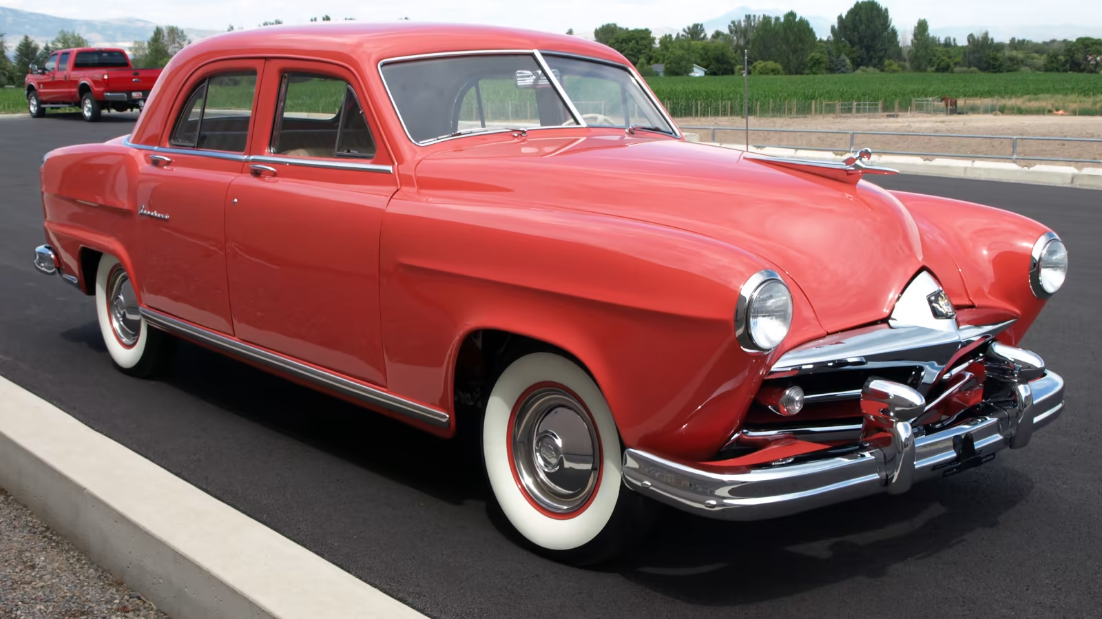
With the one exception noted below, there was not much interesting about K-F paint colors from the company’s inception in 1946 through about 1950. Before 1949, the only single-year color I can find (from the excellent source paintref.com) is an unremarkable 1947-only shade called Saddle Bronze, which (I believe) is shown on the roof of this example.

But things started hopping soon thereafter, like with this paint color called Indian Ceramic. This one rates an asterisk as a one-year color, because it was actually offered for three years. It was initially a choice for 1949 and 1950 solely on the extremely low production convertible-sedan and Virginian 4-door hardtop models.

But it was made available in 1951 across the company’s entire model lineup, and this paint color is so in-your-face for the era that we cannot ignore it. Like on this 1951 Frazer Vagabond sedan, which was (with the Kaiser Traveler) the original American hatchback. If you wanted your neighbors to notice your new car in 1951, this paint color would almost certainly do the trick.

Another 1951-only shade was Aloha Lime, as shown on this 1951 Kaiser Henry J. There was a more subdued mint-like green that appeared for a year or two on either side of 1951, but the more intense Aloha Lime went away after just this one year. Aloha, indeed.

1952 saw mostly carry-over colors. Two (or maybe three) one-year colors appeared, but I cannot find pictures that I can identify with any reasonable certainty as either Parakeet Green or Turquoise Blue. Though if I had to guess, the car above is the non-metallic Turquoise Blue.

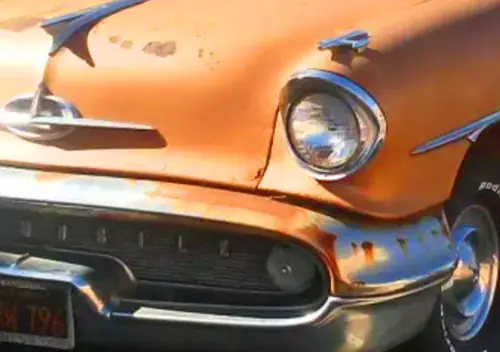
A metallic color identified as Blue Satin is a bit of a mystery too – this 1952-only shade is a different code from a 1951-52 non-metallic color with the reversed name of Satin Blue (which is much more subdued). This vivid electric blue is one that would be right at home on a new 2025 small crossover. And unlike most of the popular two-tone treatments, this solid color really minimizes this car’s primary design sin – the roof that is much too tall in proportion to the body.

1953 was another matter, with the cars entering their third year in showrooms (and a continuing terminal sales slide). Some new colors were surely just the thing – like a rich-looking shade called Maroon Velvet on this top-of-the-line Kaiser Dragon. This was a different color from the Buckeye/Cardinal Maroon that was more common and was spread across several years of K-F production.

Another Dragon appears in this 1953-only Jade Green. Kaiser offered several other darker, jade-like greens that carried over into multiple years, but this was not one of them. This is a great example of a popular color across the industry that inexplicably saw several one-year variants.

Then there was 1953’s Peacock Blue. This is a color not far off from one that adorned Richard Petty’s No. 43 Plymouths and Dodges through the 1960’s. It is also not that far from several other non-metallic blues/aquas that were fairly common on these cars in the early 1950’s, though none was quite as vivid as this color.

Not all of the 1953-only colors were so vibrant. On the conservative side is this two-tone of 1953-only offerings: Sabre Jet Blue over Australian Beige. The photo source specifies that the roof is original Saber Jet blue paint. But for that it would have been hard to distinguish it from a couple of other light blues Kaiser offered over multiple years.

One example of a one-year color that was swimming against the current in an era when bright colors were becoming more common is this 1953 Anchor Gray. This is another shade that would be right at home on any modern SUV. But at Kaiser, it disappeared after 1953.

As Kaiser circled the drain in 1954 and 55, they were not afraid to make a stab with new paint colors to try to gin up some sales – along with the new front end styling almost certainly inspired by the Buick XP-300 show car of 1951. This 1954 color called Blue Comet looks an awful lot like the family of metallic navy blues that predominated in the 1970’s and 80’s. But with Kaiser it was here for 1954 and gone for 1955. Kind of like the rest of the company, at least as far as U.S. sales were concerned. Interestingly, very few Kaiser colors were shared with corporate partner Willys in 1954. Though I could not find a photo of one, you actually could order a 1954 Willys Aero or Jeep in this color.

There was at least one new color for 1955 – maybe – a metallic called Julep Green. Yes, it looks a lot like the Jade Green Kaiser Dragon from 1953, but it is a little off from that one. Unless it was painted with a 1954 Kaiser/Willys color called Signal Green. See what I mean about rabbit holes? It appears that most of Kaiser’s 1955 production was packed off to Argentina, with only a handful of cars going out to dealers in the U.S. I am pretty sure Kaiser did not much care about paint colors by then so there would be none of the pinks, lavenders and other bold choices being tossed out elsewhere in the industry.

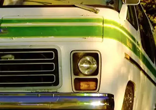
I had to include this last one if only because this car is almost certainly the same ’55 Kaiser Manhattan I captured on film on a gray day in Auburn, Indiana in probably 1974. It was the first time I attended the Kruse classic car auction there, and I knew even then that this was a rare one. It may be the only 1955 Kaiser I have actually seen up close and in person, and I have never forgotten that lovely metallic green paint – whatever it might have been called.
I have been noodling around with this topic for awhile and have been assembling a sampling of one-year colors from other companies. As time permits I hope to follow up with other more popular companies and into more modern periods of time. Until then, stay colorful!


I’m a big fan of fun and unique colors so I really enjoyed this one. It’s far from a one year wonder, but I really love my blue-green metallic Mercedes 300D. It’s a pretty wacky greenish teal that certainly stands out.
A unique paint color does seem like a cheap way to make your aging products stand out but in 1955 I suppose there was just no point anymore. Still, I’ve always admired Kaiser’s unique bubble windshield.
It looks like single year colors really dwindled after the 70s. There were plenty of wacky colors in the 90s but they tended to stick around a little longer.
Gray ;
That lovely and unique Mercedes color is / was “Petrol Blue” and very sought after by collectors today .
-Nate
Kaiser is a really good place to have started this series. They aren’t particularly attractive (the greenhouse ruins it and one can see what inspired GM for the ’91 Caprice) but there is still something alluring about them. Your ability to discern differences in sometimes very similar colors is quite remarkable.
Given the lack of a wide range of colors in current offerings, I am looking forward to this series.
A 53 much like the Sabre Jet Blue over Australian Beige car pictured appeared at a local show a couple of years ago. I probably spent 15 minutes or more luxuriating in its splendid details, both inside and out.
Count me in as well for looking forward to this series! And what a great place to start…Kaiser. This is a car that fascinates me because it seems simultaneously familiar and entirely alien. The former because it’s just so iconic as an early 1950s car (and the colors really help make that association in my mind) and yet I have virtually never seen one in person; certainly I’ve never seen one outside of a rare appearance at a museum. You’ve given me stuff that I want to spend time looking up/falling into rabbit holes about. That will start with the 1951 Vagabond.
Your last photo is excellent. It’s quite sharp for what I think might have been taken on an Instamatic? Also, the textured print…I have a lot of family snapshots from the time that were printed on that type of paper. I’m not sure why it was popular, but I can so remember checking off the box on processing envelopes for “plain” (glossy?) or “textured” prints. So 70s.
Thanks Jeff. There are so many rabbit holes that involve Kaiser!
Looks like they started the two color scheme which the big3 went to in the mid 50s. Really like the looks of some of these cars. Too bad the Henry J didn’t make it, but bigger was better at the time.
Our niece bought a Fiat 500 in 2012 and it was a beautiful brown called espresso with a tan leather interior. My wife fell in love with the look of it and when they were thinking of selling it we were going to make an offer, but they decided to keep it. We still needed a second car, so I started looking for one. The 2012 Fiat was offered in 14 colours but I could only find 3 available for sale (red, black and silver). I guess the other colour just did not sell.
Fantastic detective work! I’m one who tends to lean in on white for my cars; easy to keep clean and in my opinion, it best shows off the designer’s intention with the exterior style.
Not sure why H-K couldn’t invest in better designers; their cars were all very awkwardly designed, from the widow’s peak windshield to the impossible to update greenhouse to the misplaced side trim pieces.
We could also discuss which interior colors go with the exterior paint colors.
From the 1958 Ford brochure, a Custom 300 in Bali Bronze and Desert Beige–with a GREEN interior! You wouldn’t think green would be paired with tan, but somehow it works.
Weird exterior-interior color combos would be a great topic. My beige 68 Newport with the 2-tone green interior would be companion for that 58 Ford.
This color commentary was a great way to remind me of how distinctive these cars were, and how they had almost completely disappeared from the streets within less than ten years when I started becoming aware of cars. The colors, the windshield, the versions with the rear tailgate: pretty cool stuff. Kaiser was a household name in the East Bay where I grew up, but not for cars.
There were a few of the ’51+ Kaisers around in Iowa in the early ’60s, and the first time I encountered one I was like…whoa! What is that? A Kaiser? Never heard of it before. And a rare sighting of Henry Js.
But I cannot remember consciously seeing one of the earlier versions.
I knew of them as a kid because my maternal grandparents bought a new 51. It was a car everyone who had been around it thought pretty highly of. Sadly, it had been totalled in an accident before I came along. My grandma, who lived in a small farming community once said that after they bought it, there were no longer any secrets about where they went. 🙂
It’s funny, for me there is something sighty off about Kaiser Frazer cars for me, the proportions and details of these cars seem strange, this is of course with the caveat I’ve only seen them in photographs. The product of some Stephen King esque parallel reality or maybe the Twilight Zone. I know the early sixties Mopars are crazy/distinctive enough but they lack the out and out weirdness of Kaiser Frazers. A windscreen with a widow’s peak? Bamboo finish vinyl? Not of this world.
I’ve loved your commentaries on colors here over the years, so this is a very welcome deeper dive into the wonderful world of color.
I’m probably on the other end of the spectrum. I do notice and appreciate colors but my eye instantly goes for the design and surface details. In this case, it’s interesting to see how K-F realized their initial cars were too smooth and blobby and moved to adding surface details to give the eye something to look at other than a giant peanut M&M.
That roof structure on the ’51+ Kaiser is so unfortunate, in the way it keeps curving way up before dropping again (and of course the windshield). It just overpowers the relatively low bottom half of the car. If it had had a flatter roof, it would have looked much better and stayed more contemporary looking. Darrin was over-rated.
Makes you wonder if there was a hat space edict from management–for top hats.
Thanks, Paul! I recall reading that Darrin had proposed a significantly lower roof line, but that one of the Kaisers (whether Henry or Edgar) had insisted on raising it. Which pretty much ruined the design.
Darrin was a legend in his own mind, but he did want a somewhat lower roofline. From Richard Langworth’s “Kaiser-Frazer: The Last Onslaught On Detroit”:
“An argument occurred over the shape of the new chassis. Darrin wanted the frame to descend abruptly from the rear axle hump…allowing him to maintain the low roofline and body sides originally designed in the Constellation [prototype] while offering normal headroom inside. The engineers favored a more traditional sloping drop from the axle hump. [Engineering V.P. Dean] Hammond supported the engineers’ approach, as a result of which the roofline of the car was raised one inch to increase headroom. This still left a five-inch discrepancy in the headroom Darrin wanted….”
Not sure a one inch lower roofline would have made it look that much different, Dutch!
Great article – and Kaiser-Frazer is an excellent place to start with this. I wonder if K-F’s experimentation with colors and interior design was a way to try to differentiate itself in a cost-effective manner from other manufacturers.
From what I understand, a lot of K-F’s boldness in color is attributable to a designer named Carleton B. Spencer – who was one of the company’s leading stylists and before WWII worked in paint research for PPG. Spencer realized that people’s interest in bright colors had surged after WWI – and he bet that an interest in colors would surge after WWII as well. He said that after the war(s), Americans were less concerned about being conspicuous and would be eager to cast off the war years’ dreariness.
I love these colors – among the ones you’ve highlighted Maroon Velvet is my favorite. It’s interesting, but still subtle. And the names are great too. Parakeet – a guess mirroring the trend of owning pet parakeets. Though I’m amused by Australian Beige – I assume that’s a reference to the light khaki of some Australian WWII uniforms?
That was my understanding – that the bold interior and exterior colors and fabrics were an inexpensive way to stand out. And stand out they did!
How people choose names for colors (whether for cars or houses) is one of the great mysteries of life!
Some paint colours just disappear from the palette, I had a 63 EH Holden getting paint matched was an issue Mitta green was inly used until December 63 then no more finding the formula challenged the paint shop that mixed it for me pretty colour and two tone green interior, Kaisers didnt sell here one is known to have arrived new, Ive never seen one in the metal
Bright bold and pastel paint colors really bring back memories of the 1950’s automobiles. It’s a shame that modern cars are so boring in their color choices. Still, I’ve managed to corral Forest green, Vista Blue, and Ruby Red examples. My Flex is a very bright Ingot silver with a black top, better than the dark gray alternative that was available to me at the time.
At one time people would get their cars repainted at low priced shops like Earl Schieb and they would often choose a color that tickled their fancy. Usually it was just a body respray without doing the door jambs, or the underside of the trunk. It still happens, occasionally. I recently saw a late ’90’s Camaro that was bright yellow with the door jambs the original metallic gray. I also saw a 90’s Lincoln Town Car that was painted a bright pink/mauve color. The personalized plate read: Pinky.
Over the years, I’ve referred to you as CC’s “Color Whisperer” finding your ability to recall, know the details of, or just simply have an eye for car colors. It’s always been so impressive to me. Whether or not you like that nickname or description, please advise, so I can either stop those references, or keep going on a limited basis. 😉
Being a fan of colors and color trends over the years, both automotive and otherwise, I am REALLY looking forward to this series!!!
The 1951 Aloha Green, the 1952 non-metallic Turquoise Blue, and the 1953 Jade Green are my absolute favorites here in this article.
Great detective-work, JPC!
When it comes to all these great colors that popped up in the 50’s I wonder if WWII has any impact. Many car buyers are veterans in the 50’s. My father is one of them. Obviously those who fought WWII was nothing they wanted to remember once discharged and home. Especially those in combat.While serving the main colors in the Army was olive drab. from uniforms to vehicles almost all the same. Navy was haze gray outside of the uniforms. Of course there is Marine green. Once out I don’t want to see olive drab again.
Just a thought since 50’s and 60’s car buyers would have been heavily WWII veterans.
Could be. The predominant color for domestic interior decorating in the Forties deems to have been chocolate brown. The Fifties brought a lot of brighter pastels, including yellows and even pinks. You can probably remember that toilet paper came in different colors to coordinate with your pink/green/yellow/blue bathroom. Whether this was because of military drabness or just a reaction to the earlier fashion is hard to say.
I remember Kaisers from the bottom end buy here used cars lots in the very early 1960’s, always in the best shape but also always in dark drab colors .
I cannot imagine anyone ever thinking such odd looking cars were ever going to be popular, one more fool’s errand of the 1950’s .
-Nate
J P: “Indian Ceramic” is a striking shade and it looks like the color seen in “Indian Paintbrush” flowers. That is the state flower of Wyoming and is quite familiar to me as the flower and the color are used often in creative arts in Wyoming.
The white one with the blue top sure is a pretty car.
A colorful, much appreciated article!
I think the Jade Green would go well with either the TR6 or E-type. The three orangeade colors, do they glow in the dark? They would be easy to spot in most any situation.
Speaking of today’s cars we don’t have paint, but “monochromatic paint”! I guess to reverberate more of a feeling of…whatever…than saying the car is just one color.
I meant “Chromatic Color” not “paint”. Like it matters.
I’m one of the (apparent) weirdos that actually LIKES the Kaiser styling. I bought a ’51 Kaiser Special 4dr a little over a year ago. It’s kinda maroon/dark red, and I’m told it’s a repaint of the original color. On a cloudy day, it’s as maroon as you can get….. But in the sun, it’s a bright dark red (oxymoron much?) with a hint of metallic sparkle. I haven’t been able to locate an actual name for the color, though. Guess I need to do more research. Been dealing with a NASTY vapor lock issue with this car, purchased a ’55 Lincoln Capri droptop, and had to find a replacement daily driver thanks to a damn drunk driver……. Research hasn’t been high on the priority list lately.
I’m wondering if your car is Cardinal Maroon, which was used for several years. The Ditzler PPG code is 50070. A page with info is here:
https://paintref.com/cgi-bin/colorcodedisplaym.cgi?ditzler=50070&rows=50&syear=1946&smanuf=Kaiser&smodel=&sname=Buckeye%20Maroon
A cousin had a maroon 1951 Kaiser two door. It looked a little odd at the time, but looking back and considering the styling of every American car in that era, it was a leader in clean-cut practical and at the time, innovative styling. What early 1950’s car looks better? It is almost timeless.
The only weakness was the engine, a six cylinder Continental.
Nice work! Thanks. Looking forward to the next installments.
What a revelation this post is for me. I’d spent almost no time eyeballing the Kaiser Frazer line, for any time period. Shame on me.
In the colors chosen for presentation here, I’m dazzled by them. Especially the Aloha Henry J, and all of the models featured with a shade of blue. Just gorgeous.
Thanks for opening my eyes, JP.
IIRC for a while Kaiser put the color name on a fender mounted chrome badge. I see no one else mentioned it. Am I delusional?
Yes I’ve read that too, about the color name emblem script. It may have only been on the Dragon since they were the top of the line models. But those have got to be some pretty rare scripts, at any rate….
Like Mr. Travis lve always liked these cars despite their greenhouses and lack of v-8s. Somewhere in my stack of old collectible automobiles mags is a couple photos of a ’55 Kaiser in lavender (maybe even two -tone lavender), it was probably an original color as most of the cars in that mag are either original or restored to original specs by the current owners. Maybe a few unusual colored ones still got out even that late in the game
Great article! There seemed to be such a difference in car colours between the early fifties and the late fifties, and to think that Kaiser-Frazer (which I don’t think were ever sold here) were at the forefront of it all.
Did any other automaker in 1949 boldly have the actual color name in chrome on the front fenders proudly proclaiming it? Bold colors alone did not sell Kaisers by the mid-fifties when the competition also started offering bright colors, including true ‘refrigerator’ whites and brilliant reds that weren’t generally available previously. Henry J. Kaiser was not always accommodating to a buyer’s personal choice for color combinations. Reportedly, he saw a car coming down the line two-toned in chartreuse & maroon, and promptly ordered it sent back and repainted gray.
My second antique car was a 54 Kaiser and the chrome and large greenhouse was beautiful to those viewing my car antique shows in the 1970s and 1980s. I enjoyed its its upscale interior and rugged high torque inline 6 engine. This upstart company tried desperately to succeed. Their attempts to differentiate with color was very noteworthy. I now enjoy a fanciful turquoise and cream color factory original 55 Plymouth that appreciated the use of color to appeal to optimistic 1950s buyers.
Good article and examples.
I recently purchased a 53 Kaiser and i think it migjt be peacock blue! so I was excited to read this…