(first posted 7/27/2012) A GM Motorama concept car from 1957? No, that’s a prancing horse, not the mark of excellence on the hood. It’s not exactly a 1959 Dodge either, but the American-style big, blunt and menacing front end with quad headlights found its way even unto a Pininfarina, whose svelte front ends had come to rule the house of Ferrari in the late fifties. And the front end (as well as the name) isn’t the only homage to American-style; its sides sport a bit of decidedly Detroit-style gaudiness.
That’s a stainless-steel flank, below that intense blue-green side stripe.The Superamerica 400 Pininfarina coupe Speciale was built specifically for Fiat chairman Giovanni Agnelli. Some 25 additional 400s were built in the following two years, with some variations in their bodywork by Pininfarina and Scaglietti. All were powered by a 340 hp, 4.0 liter version of the Colombo-block V12.
This car is a bit challenged by its proportions, and the marriage of American and Italian design cues.
Not that I’d kick it out of my garage…
But given that Ferrari’s “bread-and-butter” 1959 car, the 250 GT Series, was eminently more handsome, it does beg the question of why some chose to pay a 25% higher price for the 400 Superamerica. Exclusivity comes at a price, in more ways than one.
image source: demntd







Reminds me of a Fiat 8V, another car I’ve never seen in the wild.
They wanted to show that Italy could build a big ugly American car too? I wonder how it looks in red with those stainless steel flanks. I wonder if the head of US Steel drove one. Did it give John DeLorean ideas?
My eyes could caress that 250 GT all day. Delicious.
Mike, you are indeed a poet.
That’s a hell of a bad looking car Paul. I started thinking “Ok maybe the back’s not so bad…..Nope, it’s bad too.
You’d think with all the GTE’s cut up to make GTO replicas they couldn’t use this first.
Where did you take these photos? Oh wait, you didn’t. I went to the FCA national when it was in Toronto, very interesting to talk to a couple of owners and have a look at these very hand built cars.
I was also one of the few people there NOT dripping with camera gear and Ferrari swag, at one point I was mistaken for a show judge by one of the officials. Too bad I wasn’t smooth enough to press the opportunity.
Story behind this shape us that Agnelli asked for a shape that wasn’t on any other Ferrari. He also had a 375 with a similar larger squarish grille.
You should have asked for a ride!
It bears quite a resemblance to a modern Chrysler 300. Maybe not the highest compliment to a late 1950s Italian sports car. But it is fascinating to look at.
I was think more of a chopped, channeled, and shortened Checker Cab.
Facel Vega Excellence anyone?
I love it! To me it strikes a perfect balance between the elegant sportiness of a typical Ferrari and the adventurous Detroit design of that era.
I would also caress the 250GT with my eyes all day, but I would take the Superamerica 400 out of the garage and drive it to the Opera… or the 7 eleven.
The driving wheel looks as big as the front tire!
That’s an amazing fake California license plate.
I agree that this would be the car to drive one’s similarly rich and well-appointed wife to dinner and the opera, the 250GT to be reserved for drives in the countryside.
That’s one sharp Edsel!
That is the first thought that struck me when I saw the first head-on photo. Proving that the Italians, too, can design an ugly, lemon-sucking car!
Yep, I agree, definitely a cross between and 1958 Edsel and a Ferrari.
That would make it either an Edarri or a Fedsel.
I like how the quad headlights and the panoramic windshield integrates with the rest of the car, very classy, the right car for a flamboyant individual like Gianni Agnelli, I’m sure he drove it at 160mph down to some Monte Carlo casino, snort after snort…
Its like a Ferrari and 57-58 Eldorado Brougham had fling in a dark parking garage.
Very Maserati looking … maybe kit car going for a Maserati look.
I would have chosen the Aerodynamico coachwork instead, and it sounds like most actual buyers did too. Not exactly what you would call elegant!
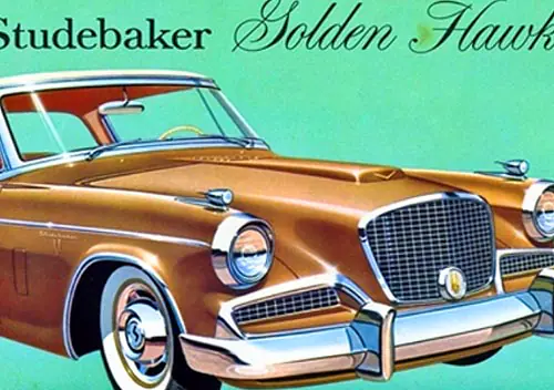
Is this where the idea for the Studebaker Lark came from?
No, the Lark also came out in 1959, and had single headlights.
Agnelli also had a Maserati 5000GT in a similar body. i wonder which one was the winner.
I guess even Pininfarina can stumble! But it’s still a vintage Ferrari and that makes it inherently interesting…
Credit for trying something different! These are more “art” than automobile, and artists have to experiment sometimes.
Obviously more of a grand tourer, I wonder if a cheaper version with a small block V8 was considered. Enzo had already put America in the title. It shows what happens when designers hate the cars they are told to design.
“Those tacky yanks”, who buy most of the cars we design and we would not exist without, “like chrome, we will give them a whole sheet of effing stainless steel,” The design house should have fired them. This car was not a homage but a sneer. The designers could have sneered al they want from the unemployment line.
You seem to have totally lost the point? Or rather, completely misunderstood the intentions behind it all. This is not a sneer, it’s actually more of an hommage. Or rather, a play between different design languages and mindsets. The entire fifties was a love affair between Italy and the US, there was a tremendous cross pollination between the two countries.
American companies turning to Italy (Chrysler and Ghia, Cadillac and Pininfarina, and so on), and Italy turned to the US for inspiration. There’s a fundamental difference between the countries concerning design convention, where the American cars could be seen as more muscular, masculine, brutal, and in your face. And the Italians were more refined, effeminate, haute couture, and had more of an over-all grasp in their thinking.
There’s a ceratin coherence to Italian designs, which are often missing at the Americans. American designs are often more of a collection of details than coherently put together. With this cross pollination, certain aspects were seen as more “American” than others, they were therefore marketed as such. The “Superamerica” wasn’t the only one, the “California” was another, a strippo Ferrari that became a success just because of its asketic but determined design. That’s not a sneer, that’s an actual improvment, just because they listened to the American demands.
The entire Ferrari brand was actually more American in its approach already from the beginning. Compared to for example the more restrained Maserati, which has always been more of an English Gentlemans Express, like an Italian Aston Martin. So, it’s no coincidence Ferrari took a liking to the Americans, as they were so close in thinking anyway.
The Superamerica may not be the most beautiful Ferrari of them all, but that was not the point. The point was to make it brutal and in your face. Agnelli was at the top of his game at that time, and he simply wanted something that said “I’m so fuckin’ rich I don’t actually give a fuck!” And that’s what he got. And I wouldn’t say it was a Grand Tourer either, more of an Italian hot rod. Biggest possible engine. This is a café racer to pick up this afternoons girl. This car shat in the face of all other Ferrari owners, and Agnelli just didn’t give a shit.
Just because Pininfarina exaggerated certain design aspects doesn’t mean he did it to mock the Americans and their “stupid taste”. No, this is a playful game between two countries committed to a serious love affair. Pininfarina didn’t do it out of spite, but in awe. And he used this opportunity to play with some aspects he would later develop more fully for later designs. Agnelli wanted something special, and let Pininfarina have his way just roaming free. Some things work, some doesn’t. It doesn’t matter, it’s all a play, it’s all just a game…
Thanks for your thoughtful response. My thoughts on the car turned into more of a rant then intended. I do think part of the issue of why this car turned out the way they did was that the designers did not like what was being asked of them. Agnelli asking for something over the top and getting a slathering of American design cues sounds to me a lot like what happens now with the cars from boutique makers aimed at newly rich and bizarrely tacky. I prefer when cars reflect their national identity.
It just seems to me that a designer at Pininfarina working on a new Ferrari in the late fifties was capable of more. I would be curious what Bill Mitchell or William Lyons thought of it. I just don’t think something like this submitted to them by a junior designer would have gone any further.
Agnelli could have anything he wanted (including the whole Ferrari company, less than a decade later) and he apparently didn’t want something that anyone else could have.
I’d first seen pictures of this car in the mid-70s, and I was always attracted to it__yes, it is different, and not your typical Ferrari, but that’s what one-offs and show/concept cars do: test the buying public’s reaction. It was a favorable response from me, but by then it was already fifteen (>15) years old, so the nostalgia might’ve been kicking in.
I finally got to see it in the flesh, so to speak, at either Meadowbrook or the inaugural Inn at St Johns Concours; nope, I wouldn’t kick it out of my garage either!
The front windshield looks like it was taken from a 50’s Chevy. The front end looks like a 50’s Cadillac with a smaller grille. The rear window and D-pillar looks like a 64 Mustang
Pininfarina did a very handsome version of a early 60’s Cadillac. The European coachbuilders also built versions of the Corvette. It’s interesting that these versions were quite attractive. It seems that tying contemporary American design themes to the Ferrari and other European makes resulted in some “interesting” results. I remember seeing some pictures of other Ferrari Super Americas with tall tail fins. Even Mercedes Benz jumped onto the tail fin wagon with their “finback” line of production cars.
I guess I was thinking more of this Ghia version. I know i saw this either at the Blackhawk museum or The Peterson. I was greatly impressed. It does kind of remind me of Harley Earl’s Y job, which had been built much earlier.
The front fender/headlight design in the first picture shows some resemblance to that of the 1954 Cadillac La Espada, a GM concept car that toy builders seemed to love – my Auburn Co. rubber toy version was a childhood Christmas stocking stuffer.
The big car version:
Looks like a C1 Vette, had an orgy with a Studebaker Lark, an Iso Grifo, and a Maserati 3500 GT… I love it.
Although, it looks more like it would be wearing the knightly dragon of Alfa Romeo, than the prancing horse of Ferrari.
The car doesn’t photograph well. It looks better in the flesh.
I’m surprised nobody mentioned the 1st series Lancia Flavia coupe (and the 4 door version, too) which was obviously influenced by the Agneli car…
Is it beautiful? No. But do I like it? Yes, actually. The comment of “Ferrari Hot Rod” hits the nail on the head, for me. It has that attitude. Square-jawed, but still worthy of the prancing horse.