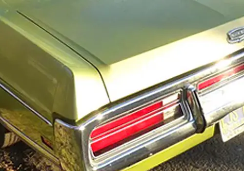
For the last few years, it’s been a pleasure and a privilege to bore you share my automotive lifestyle with a like-minded readership; after all, my love of the four-wheeled conveyance is an all-encompassing part of my life. Before I could amass my continually growing car collection, I gathered anything and everything remotely related to the automobile. As a result, my collection of antique automotive advertisements has easily surpassed a thousand, and this past Friday, it grew by at least 30. It’s time to share, and I’ll start with the strikingly illuminated tail of a 1965 Thunderbird. There’s more past the jump.
To disclose an obvious facet of my personality: I’m an obsessed child to some extent. This is a room in my house; my wife and I have labeled it the car room. It’s where I keep most of my advertisements, toys, and books, although some things have spread to other areas of our abode.
Therefore, I’m constantly hunting down old magazines at antique stores and sales. On Friday, my wife had just returned from a week-long conference and was catching up on work stuff at home; therefore, I cruised over to our local antique warehouse and returned with four Look magazines from the mid-1960s. Although four of the eight vehicles that are titled in my name are 1965 models, I believe that 1965 marked a turning point in advertising. The ads were largely boring and colorless when compared to the heyday of automotive ads: the 1950s. Buick, one of my favorite marques, was especially guilty, with drab ads selling spectacular cars like this Riviera GS. I love the car, the ad…not as much.
Ford, like many other manufacturers, had made the jump to photography, and this spectacular two-page spread pairs a bright red Mustang with the cool “Gas Turbine” transport truck.
Of course, in the 1960s there was always some heavy-handed sexism involved; after all, why should a “little lady” have to change a tire? Today, almost nobody knows how to change a tire, so it might be that we’ve retrogressed from a society of misogynists to a society that allows new cars to be sold without spare tires.
Even if the he-men of the world precluded ladies from doing any heavy lifting, they weren’t above posing them provocatively for the sake of a sale. Pretty girls sell cars and car parts, and any number of parts store calendars prove that time hasn’t changed that. Here, a scantily clad brunette poses naturally near a ’65 Coronet.
On the other hand, Chrysler took advantage of the horticultural world for this neat ad featuring a ’65 Newport in a knockout color combination. But why is the tree dead?
General Motors “Guardian Maintenance” always advertised in the 1960s; in this ad, some technicians are posing near what appears to be an Olds 394 two-barrel.
General Motors was always a prominent advertiser, even if Chevy’s ads were often tame. This Honduras Madeira Maroon Chevelle was probably the tamest-looking A-Body of 1965, but that’s like saying that your pizza is bland. It’s still pizza. This is a Malibu SS featuring a young couple having a good time on what looks like someone’s driveway.
This ad is one I have several copies of, but it’s near and dear to my heart, featuring a Corvair Monza convertible, the same model as my Mist Blue ’65. This is another pretty girl ad, this time in front of some pretty scenery in what is certainly one of the prettiest cars of 1965, if I may allow my bias to show.
Pontiac’s ads of the 1960s were, by miles and miles, the most beautiful and undoubtedly effective of all-time. Very few ads create such a glamorous image, and unlike most manufacturers of the 1960s, Pontiac stuck to illustrations and reaped the rewards. This Bonneville hardtop could never look as good in real life as it did in Kaufman/Fitzpatrick ads.
Nor could this Catalina, even though it too was one of the stylistic high points of 1965.
Oldsmobile’s 1965 crop of ads paled in comparison to Pontiac’s, but made Buick’s look blue in the face. At the very least, the photography was colorful, and this Dynamic 88 hardtop is the central focus of a brooding pretty girl ad. Has her date stood her up? Existential angst? Catalina envy?
GMC ads were also-rans, workaday ads for workaday vehicles. There were no pretty girls, just a van.
See what I mean? Other than painting some suspension and driveline components and loading up the white space with text, GMC just phoned it on in.
General Motors even advertised as its own entity in 1965, singing the praises of the durability built into its entire lineup of cars. This lineup might be “peak GM,” before rampant cost-cutting eroded quality and individuality. Savor it, kids!
Behind Pontiac, I think Ford was the advertising leader of 1965, although the new Mustang practically sold itself. The LTD was prominent in many ads with its “quieter than a Rolls-Royce” schtick. I am haunted by the advertisement above, not only for the red Mustang GT, but also for the most beautiful race car of all-time (personal opinion), the GT-40. When Shelby-American took over some of the GT-40’s development in 1965, it was truly on its way as a legendary racer, winning the first race of the year at Daytona. But why are only its rear discs glowing?
Here’s a really nice ad for a Vintage Burgundy Galaxie 500 convertible, extolling the virtues of the new 240 cubic-inch “Big Six.” If 1965 wasn’t one of the pinnacle years of automotive styling, I don’t know what is.

Following Pontiac’s lead, many Comet advertisements were illustrated in 1965, after using mainly photography in ’64. While they pale in comparison to the originals, Comet ads were fun, and they often featured actual illustrations of fancy foreign sports cars, like the TR-3 on the upper right edge of this one. Few people probably rallied Caliente convertibles in ’65, but it never hurt to make the connection. Comets were heavily featured in racing in 1965.
Ending where I began, this beautiful ‘Bird will have to hold us until the next installment, where I’ll bore you with ads from 1964 and 1967. Until then, keep your ‘Bird away from the salt, unless you’re taking it to Bonneville.












I don’t get it. Why on earth do you call that the car room? hehehe
Nice large-scale Winnebago, I’m on the lookout for the Barbie GMC myself.
That Ford Gas Turbine truck is insane and gotta love that t-bird rear.
I’d say 1965-66-67 were all pretty golden for design. 1968 started a slow slide down.
Give me a 1965 “Chevelle” 300 Deluxe with the L79 and a 4 speed and I’ll be happy. I’m not a fancy guy. I like the Taxi grade specials.
Forget the lime walk, I want a car room!
On the “Little Lady” theme, have you seen the 1958 piece Dodge issued? Large format condescension, actually labelled “Woman’s Brochure” if I recall correctly.
Great story and ads. When I was a kid, one of my favorite things was to check out the car ads in a stack of old magazines, and it’s something I still enjoy today. I’ll definitely be keeping an eye out for the next installment.
It’s coming tomorrow morning, same time!
WOW! And I thought I was a hopeless gearhead. Nice to know I’m not the only one. Seems you share a love of many of the vehicles I have coveted over the years. But where is the aviation room???
I’m afraid of flying, but I do like airplanes. I have a few books on airplanes in the car room. 🙂
Oh Aaron, I am so sorry. Believe me when I say, nothing compares to finishing your first solo flight as a student pilot.
I’m also fearful of flying, yet I have a whole wall full of aircraft lithographs. And I love to visit aircraft museums. I’m at a loss to explain this contradiction.
As a kid, I remember even then that 1965 was a special year for cars. So many of them seemed like real winners.
Oh man, the Air Force Museum in Dayton makes me almost as happy as a car museum. I hate that we sometimes need military planes, but there’s something intoxicating about the bravura involved in the design and application of them.
If you ever have some extra time in Dayton, there is a Packard museum that is very much worth a visit.
If you have a bit more time, there is a small air museum just north of Urbana, OH. They have a flight-ready B-25, and several smaller planes, and are in the process of rebuilding a B-17 back to flight-ready status.
Thanks for the great ads, looking forward to the next installment!
You’re lucky you live closer; Dayton is on my bucket list. Home of the surviving XB-70. It’s just that I have to fly to get there.
The Dayton museum also has Boxscar, the B-29 that dropped the bomb on Nagasaki, along with several presidential aircraft, Truman’s Independence, Eisenhower’s Columbine and SAM 26000, the Boeing 707 that took JFK to Dallas.
Nice collection. That T-bird running through salt water makes me cringe though.
I love this series – more please! I have to agree with Sean that the mid 60’s (although I’d stretch back to perhaps 1964) were the peak of American car styling. Yes, there are certainly many beautiful cars from other eras but they’re individual examples, whereas in the 60’s (to a kid anyhow) the 60’s seemed like a fairyland of fantastic creatures, each more exotic than the last.
When I was younger, I got a small advertising collection going, to go along with my larger literature collection. Now, so much of that stuff is online, the paper is of less interest to me.
I framed a couple of them (a 1935 Ford V8 Deluxe and a 1950 Lincoln Cosmopolitan) back in the 80s for some office decorations. Unfortunately, I learned that exposure to light will badly fade the colors of the printed inks.
It is funny that for some reason just a couple of days ago, that slogan of “putting salt on a bird’s tail” came into my mind. I am sure that I have that ad in my stash.
I find myself at the stage in life where I need to do something with that stuff. When it sits in the corner of the basement for over a decade without being touched, it is time to thin things out. As I get motivated to assess just what I have (hopefully this winter) then I can be in a place to see if anyone out there in gearhead land has an interest in any of it. I know that none of my kids does.
Just one corner of the basement? No big deal. When it takes over the entire basement, that’s a problem. Wish I even had a basement to keep from taking over the whole house!
Happy Motoring
Oh, and the color police have had time to fact check the Honduras Maroon on the 65 Chevelle. I thought I remembered the color on the car in the ad to be quite a bit darker than Chevy’s Honduras Maroon of the early 60s, and paintref.com says that I am right.
Your 65 Chevelle ad features a car in Madeira Maroon, a color found on 1965-70 Chevy and BOP cars (oddly, with one year absence in 1968). RLPlaut would never let me hear the end of it if he was the only guy pulled over by the color police. 🙂
Fixed! I guess I didn’t even look to see if there were two maroons, because who has two maroons? GM, that’s who. 🙂
The ad for the ’67 Ford six convertible is a major head-scratcher. I’ve never seen it before, and it really surprises me that they would bother to spend media money on what had to be an extremely rare combination. Convertibles were expensive and nicely trimmed; only die-hard six lovers would order one with one. Why bother advertising it, given that the profit margin was undoubtedly a wee bit less?
And how many of these were actually built and sold?
“How many unique ads did Ford pay for?”
“What haven’t we advertised?”
I was going to suppose it was for secretaries et al. wanting a little flamboyance, but a man is driving. Maybe it was in a magazine read by skinflint extroverts?☺
It would be good to know which publications these ads appeared in, it may help to make sense of them. Advertising is very targeted.
Maybe it was in a magazine read by skinflint extroverts?☺
That is pretty funny.
Maybe they were using convertible availability as sort of a halo for the six itself. When Stan Skinflint is pondering his next car purchase, he sees that ad and thinks “well if it can haul a convertible around, it might be pretty lively in that 2-door post I’ve been dreaming about” and goes down to the Ford dealership to check it out.
Anybody who ordered a nice convert like that with a 6 needed to be slapped and kicked.
On a similar note, did you catch the Riviera GS ad’s implication that power steering and brakes are *optional* on the non-GS Riv?
My theory for the somewhat bizarre Big Six in a full-size convertible ad is that it’s based solely on a shortage of small-block engines, due to the overwhelming demand of the new Mustang. While Ford did a good job of ramping-up production for their wildly successful new ponycar, I’ve read that this also created a big problem of being able to make enough of the small-block V8 engines to distribute to all of their various vehicles (including the new mid-sized Fairlane). Because of this shortage, Ford made a very serious effort to steer Mustang buyers to the six-cylinder engines (the old Mustang ‘Sprint 200’ package). I don’t remember any such effort for the Fairlane, but I would wager that the Galaxie convertible ad was definitely in the same “Get them to buy sixes because we don’t have enough V8s!” category. Not to mention that the Sprint 200 Mustang actually turned out to be rather popular. It’s quite possible that the Sprint 200’s popularity was also factored in to maybe rubbing off on a full-size six-cylinder convertible, as strange as that may seem now.
Regardless, once Ford was able to get the supply of small-block V8s up to meet demand, all pretense of pushing six-cylinder engines in full-size cars went back to mostly poverty-spec fleet/government sales.
We never had that problem in Canada at this time. Oakville-built models had no 289 until ’66. In you went right from the six to the 352 2-barrel (also a Canada-only engine).
Back in the early 1980’s my friend Doug gave me a collection of his Grandpa’s Popular Mechanics magazines, virtually every one from 1950 to 1972. The car/truck ad’s were just amazing as were others. Like the tiny little less than quarter page ad, WAY in the back, for the Datsun pickup. Who, at the time, would have known? Wish I still had them.
Mid 60’s really was the golden age of styling for US cars. The Bonneville is the same beige as grandfathers ’65, though his was a convertible with white top. His last car, and in 1972 still looked like brand new when mom sold it to a car lot after he passed.
I used to always look on the back of National Geographic for the Lincoln Continental ad’s, watching them progress through the ’60’s. The tribal pictures of the era, of course was another reason the magazine got my attention.
The Winnebago model is great, brings back memories of the family’s ’72 Brave. Like the time the high school principal called the folks to let them know that funny smelling smoke and Black Sabbath was rolling out the windows while it was parked in front of the school. Parents were not amused.
The ’65 Ford Six. Unless you look under the hood, you’ll swear the V8 has 2 plug wires disconnected.
Looking forward to the collection.
Ford’s Big Red is pretty cool, reminds me of GM’s Futureliners. Thanks for including that link.
GE’s gas turbine-electric locomotives (GTEL) were in vogue during this time. Could Big Red use the same cheap Bunker C oil?
UPRR’s GTELs were later sidelined as oil costs rose & diesels grew in single-unit HP.
UPRR has always had a thing for very large locomotives. Your mentioned GTEL’s, steam powered Big Boys and the GTEL’s replacement the Centennial DE’s were the largest of their types in their day. It must be in their corporate DNA.
Thank you for posting these great ads from your collection Aaron.
I was struck by the similarity in the layout and design of the first two Ford ads from the mid 60s, and the look and feel Ford used for their print ads from roughly 1983 to 1986. The overall ad appearance used by Ford in the early to mid eighties appears to be a design homage to their mid 60s ads. Including the use of the ‘Goudy Bold’ font for headlines. I never saw enough ads from the 60s to make this connection until now. Interesting, as I used to find those mid 80s Ford ads somewhat conservative in design. In a similar vein as the early 80s Honda print ads. This helps put the 80s Ford marketing design into better context. Thank you for these!
I love this article. I’ve been fascinated by advertising ever since, as a kid, I was given a big stack of 50’s era Holiday magazines 40 years ago by my neighbor. I loved the high quality colour ads. The mags all got thrown out. Years later I was horrified to realize Holiday was a prime source for sellable collectible ads and my dad threw out $1500 worth of material.
When watching Mad Men on TV, I was interested in the fictional depiction of an ad agency of the era much more than Don Draper’s latest extramarital conquest.
Great ads!
I thought I was the only one! There were a few episodes so heavily filled with that I almost jumped ship on the series, but I loved the agency stuff!
I watched the whole series, even though Don Draper might have been the protagonist with the fewest redeeming qualities in TV history. They were usually very careful about period details, and it was loaded with historic and literary references and allusions that I enjoyed spotting.
Yeah I mostly jest. A lot of the references hit me after the series ended while some were right in your face, so some of the episodes or stories I found unnecessary or gratuitous at the time fit better with the final narrative.
There was a scene where Don Draper is reading a magazine in a hospital waiting room. He sees an ad for the ’65 Pontiac and tears it out and keeps it.
Re the tire ad, That seems to be a tout of treadwear longevity, the tire the women is looking at seems to be concerned with how bald it is, which doesn’t necessarily mean she will be going for the spare. Rather, the tires need to be replaced(which is something shops have always handled, regardless of macho skill, due to the mounting/balance process being much more specialized than R&Ring 4-5 lug nuts) and she may be worried about immediate safety, budget, or whether or not the car is worth pouring money into(a 57 Ford in a 60s ad is positively ancient!), which can apply to any kind of woman, married or independent.
Targeting women specifically for a worry free (high treadwear) tire I guess is the sexist bend, since it is a product that can appeal to both sexes, but marketed to appeal to women for a supposed desire they have that men supposedly don’t, but that format is hardly limited to the 60s – until the recent Jim Gaffigan ads for the Pacifica I’d say 99.999% of minivan ads target a Mom driver. At least in Good Year’s case their Tufsyn ads had various slogans, this one was just one of many to broaden appeal.
The Coronet ad on the other hand…
The tire changing comment was merely a form of rhetoric to set up a premise that I continued to follow with my “pretty girl” ads, nothing more. I understand that the point was for lazy men to feel guilty about letting their women drive on crappy tires; even though the men aren’t specifically mentioned, the insinuation is clear through the “let her” copy. And even though they aren’t specifically discussing her changing the tire at that point, depicting her in a coat looking at a bald tire introduces the possibility that she could be out there alone when the damn thing does finally blow, so we’re splitting hairs at that point.
Anyway, I love those Jim Gaffigan ads. He might be the perfect celebrity endorsement for a minivan.
I can take that ad in a few ways is my point though. Who’s doing the letting and what exactly the letting is isn’t specifically told either – let her “have”, would fit with the possessive take(husband, or even parent), or let her “know” in the PSA sense, she can drive with confidence if you let her know about these tires. In that take I could have been a friend of hers who pointed out the tires on her car are bald and she’s like “oh wow, they are”, framing the image we see depicted, and then I “let her know” about Goodyear’s Tufsyn tires, so she can drive in confidence next time. Just gotta use your imagination haha
Ditto on the Jim Gaffigan ads!
Personally I’m wondering why the bird in the Newport ad is talking, more so than the tree (which isn’t dead if you look closely, it has nebulous green shadows around the branches).
Nice collection!
Here I thought I was the only one with a “car room”. My room is filled similarly to yours, although I don’t really collect old ads. I do have an extensive library, including old factory service manuals, brochures, magazines (new and old), and of course books. The only compromise I made on my room was it contains a bed so it acts as our second guest room. Apparently a room just for car stuff wasn’t practical…
Looking forward to your follow-up posts.
Very cool ads.
My library of car stuff includes several intact Reader’s Digest magazines from the ’50s and ’60s, including two from mid 1965. I have several of the ads featured in your post.
The lead post ad made me think of a GM ad that I always thought was pretty cool, and was a bit different from what you see for today’s cars. Simple text conveying things done to provide you a better automotive experience. I don’t recall GM or the industry doing much of this kind of advertising in the early 1980s, it probably would have come across as pretty hollow considering how many cars simply didn’t work as intended for very long.
There was a trend in the ads in Reader’s Digest. The fall and winter ads focused on the cars, and the spring and summer ads focused on optional features such as air-conditioning or quality control since the cars pictured would go out of production, usually by July of the calendar year, to make way for the new fall models.
I love this ad for quality testing, especially the summary at the bottom of the page. And, close up photography of mid sixties cars certainly highlights the styling details that made so many cars of the era desirable. I wish I could have been the test driver in this ad……………
With apologies to Art Fitzpatrick and Van Kaufman, I have modified their Pontiac ad so as to more accurately represent the true scale of the “Wide Track” as it was in real life.