Thanks to nifty43 (nifticus)
Share this:
- Click to share on Facebook (Opens in new window) Facebook
- Click to share on X (Opens in new window) X
- Click to share on Pinterest (Opens in new window) Pinterest
- Click to share on Reddit (Opens in new window) Reddit
- Click to print (Opens in new window) Print
- Click to email a link to a friend (Opens in new window) Email
- More
- Click to share on Tumblr (Opens in new window) Tumblr
- Click to share on Bluesky (Opens in new window) Bluesky
- Click to share on Telegram (Opens in new window) Telegram
- Click to share on Threads (Opens in new window) Threads
- Click to share on WhatsApp (Opens in new window) WhatsApp
- Click to share on Mastodon (Opens in new window) Mastodon







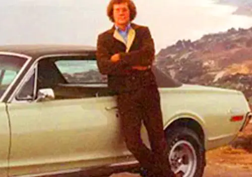






“Ramming speeeeeeed!…”
In all seriousness, this Comet is a decently looking compact for the Seventies, even with that front bumper. This one is tricked-out perfectly with those stripes and mags.
I even like this shade of chartreuse (which looks like the same color as Dave Skinners “Soul Survivor” ’74 Mustang II Mach I).
I am a life long FOMOCO fan. Have in 50 years of driving owned mutiple brands of US , Japanese, Korean, And European cars and trucks. But have always had the best luck keeping Fords and Mercurys on the road. That being said, Ford did a horrible job of adapting to the completely Idiotic 5mph bumper b.s. if I owned this Comet, id take it to a good body shop, and have them adapt it to utilize a pre 1974 bumper. These (bumpers) look like they took an ugly “continetal” spare rear bumper, and slapped it on the front.
Wow, has there ever been a photograph of one of these that shows off that horrible front bumper better (or worse?) than this one? Wow, that things is like an extra storage shelf on the front of the car.
In my mind the wheels, the “GT” stripes and the hood scoop do not intersect with the big-bumper 1974-77 models in the Venn diagram of Mercury Comets.
Looks as though the photographer intentionally took the top picture with the bookshelf bumper in mind!
Exactly. The camera angle seems to specifically highlight the length to the point it looks like a photoshop. The big-ass bumper guards don’t help.
Here’s a pic of a Maverick from a similar angle. Not quite as bad, but close. In fact, it may actually be the same bumper, but the Comet needs it to stick out further due to the grille’s prow. And the Maverick has additional, horizontal rubber trim strips which help, too.
“In fact, it may actually be the same bumper”
Little doubt of that- If the Mercury built a dedicated bumper for the Comet, they would have reshaped it to better fit the nose (see the ’72 below for comparison).
No way they would tool up a unique bumper that matched that poorly. I’m sure the conversation went like this:
“OK teams, for these new 5 mile an hour bumpers we need to tool for new bumpers and also create a cosmetic fill panel to fill the gap between the bumper and front fascia. That gap gives us some flexibility, so if you can modify the fill panel to use an existing bumper, go for it.”
The shape of the bumper definitely seems to be a compromise to be able to be used on both cars. While it more closely matches the curve of the Maverick’s grille and hood, it’s still not exact.
The tell-tale is the point in the middle. Neither car’s front end really comes to the same kind of sharp point. I guess it makes sense since the cars weren’t originally designed for that kind of huge bumper and it was just half-assedly tacked on.
The four-door Mavericks wore the big bumpers best, simply because there was a bit more car between them to balance things out.
IMO Fomoco should’ve given the Comet the Maverick’s front sheetmetal and did what they could with trim by way of a facelift to restore distinction.
That bumper just doesn’t look right to me. Are we sure this is correct?
I owned a 74 GT. Same color. That is the right bumper.
I’ve always wondered: Why did Ford’s bumpers look so ridiculous during this period, while over at Chrysler their products’ 5 MPH bumpers seemed much better integrated—and quite simply didn’t stick out from the body nearly as much? Anyone?
I recall reading something regarding the Chrysler bumper guards circa 1973. They weren’t quite up the full standard but still, .gov granted an exemption because many models would either be gone in a year or 2, or heavily restyled. E-Body, B-body (2-doors at least) and C-bodies qualified. It appears A-bodies did actually get new design bumpers in ’74. It was the only carryover design that was indulged this expense.
Hardtop coupes were exempt from the full bumper-bashers in ’74. This is particularly noticeable on the Datsun 710 with its’ painted railroad ties on the sedans and wagon and international-style chrome smile on that year’s coupe only, albeit set further out from the body than the stylists intended.
http://importarchive.com/brochure/datsun7101974_01
Yes…my undergraduate college car was a ’74 Datsun 710 (4 door)…so it had the cow catcher bumpers (and the seatbelt interlock under the hood).
It got me through 4 years only once not starting (during the blizzard of ’78…when I had to bum a ride from my Father into Burlington). The bumpers were so rusty by the time I went to sell it in 1981 that I was trying to get replacements (but 710s weren’t exactly common). Despite a terrible test drive where some trim parts were falling off the car, I found a buyer for it (any economy car seemed to sell in 1981) when I bought my ’78 Scirocco.
The 710 coupe with the chrome bumper is rarest of the rare…I’ve actually never seen one. Inside was a bit different to with a brown steering wheel rim (to look like wood). My pet theory is that this model is the start of what became the 200sx (later 240sx). I think they discontinued the 710 coupe when the 200sx debuted. My 2 youngest sisters had a total of 4 of the 200/240 sx’s….youngest sister died 11 years ago, but my “middle” younger sister still owns her ’97 SX she bought new (everyone seems to want to buy it from her as it is near the “end of the line” for RWD Nissans.
My co-worker at my first job out of school had the ’74 4 door Maverick…he brought it down from Maine where he went to school…his family owned a potato farm that pre-dated the US-Canada border (part of the farm was in Canada, but I guess their house was in the US. He also got another car in 1981, a 1978 Pontiac Sunbird (and paid 24% on the loan for it).
I think in the case of the A bodies is because they already had fairly large functional bumpers as part of the original designs, it was fairly easy to make them aesthetically compliant.
The A bodies didn’t get by completely unscathed. The rear ends of the sedans and hardtops were extensively revised replacing the 70-72 taillight-in bumper design with a rather dull looking taillight above bumper design and large crash bumper using the existing sheetmetal. Additionally the Dodge front end for 70-72 used a much smaller stylized bumper more in fashion with the ponycars of the era, but had to revert back to the previous large bumper aesthetic for 1973, even recycling the the 67-69 fender stampings
The Chrysler bumpers that year did not have the shocks absorbers that Ford and GM had. Instead, Chrysler put heavy rubber blocks over the bumper mounts. This meant that the Chrysler bumpers didn’t telescope during an impact and return as the Ford and GM bumpers did. Instead the Chrysler bumpers just took the 5 mph blow directly.
I see, interesting!
I hadn’t heard that before. Interesting difference. I’d guess the Chrysler bumpers ended up with less damage because there wasn’t a metal shelf to replace.
If the “shelf” you’re referring to is the body-colored fill panel between the chrome bumper and the grille, it wasn’t metal. On my ‘74 Maverick and my Dad’s ‘77 T-bird, this was plastic (I’m guessing urethane), and it was fairly flexible – at least, when it was new.
Funny thing is that I referred to these as “bench bumpers,” because we often used them for seating at youth league ball games, picnics, and tailgate parties.
You are correct. I also remember the paint on that filler panel of my brother’s red ’74 Maverick peeling in both the front and back. The colour underneath appearing to be a matte-finish grey primer.
Those rubber block bumper guard cars were limited to outgoing and low volume models. When Chrysler was designing for the long term, such as their new 1974 full-size cars, Chrysler really shined with well-integrated true 5 mph bumpers.
Absolutely. The best bumper integration of the era. Pitty they didn’t sell. The ’75 B-body redesign wasn’t quite as good, but it was still miles ahead of both Ford’s and as good and maybe better than GM’s intermediates, both of which were newer platforms. The Volare/Aspen/Diplomat/LeBaron were pretty good, too.
Which makes the pathetic wrap around on the R-Bodies all the more inexplicable.
One year older would be a dead ringer for the brochure shot.
What’s particularly odd is the front bumper changed twice on the Maverick/Comet. The 73s were large but not quite as large and protruding as the 74s. Most other 1974 cars carried used the same front bumper as the front end compliant 1973 model year cars but not these for some reason.
Interesting note, the Hood scoop on the Comet GT is recycled from the 69 Cyclone spoiler and Cougar Eliminators.
What’s the difference between the ’73 and ’74 bumpers? I sure can’t see it. Was it the same bumper and they just used longer shock-absorbers and fill panel?
FWIW, the bumper doesn’t stick out nearly as much depending on the lighting, i.e., a shadow somewhat masks the size of the fill panel. That’s why it’s so apparent in the feature photo: no shadow.
You’re right, XR7Matt, looking at the photo you posted, there’s a clear difference between the ’73 and ’74 front bumpers—for some reason they decided to do an interim step for ’73. Wow. So interesting too to look at the progression from 1972 to 1974: Beautiful>acceptable>awful.
The federal bumper standards were first required on the ’73 models. They were expected to withstand a front impact of 5 mph and a rear of 2.5 mph with little damage and no damage to safety equipment (lights, etc.). They were tightened for the ’74 model year to 5 mph front and rear plus height standards. And then relaxed for the ’83 my to 2.5 mph front and rear. In many cases it made the ’73 models stand out. These standards took the lamps out of the bumpers for a few years. Information recollection from my old memory and confirmed by Wikipedia.
The 74 bumper is taller, pushed further out and has larger air openings, if you look closely comparing this with the pic of the 73 posted by Roger you can see its lower valance panel is still visible, on 1974s it’s entirely covered by the bumper.
You really have to wonder, then, what was behind changing the bumper from the big, but still better looking, one-year-only1973 version to the simply god-awful 1974 monstrosity.
Maybe it had to do with the rear bumper. The 1973 cars didn’t have the 5mph bumpers but when they went into effect in 1974, they decided to have both the front and rear massive railroad ties.
Holy battering ram Batman! That front bumper is the second worst I’ve seen after the Canadian Mini
The color, stripes, mags…all look really good but wow is that front bumper CRAAAAAAAAAAAAAAAAAAP!!!
I wonder how hard it’d be to just source the older piece and retrofit it?
“I wonder how hard it’d be to just source the older piece and retrofit it?
In many cases, the grille and sheet metal remained unchanged, so the old bumper and sheet metal valence panel still matched the body lines. However, when annual or semi-annual styling changes rolled in alongside the new bumper, the old ones no longer matched (think ’74 Vega).
In addition, the bumper mounting points were extensively revised to fit the “shock absorbers” behind the bumper, and the old style brackets would not match the frame mounts.
On some cars you can drain the shock absorber in the bumper then push it in a good bit. Then trim or eliminate the filler panel. Not so good at preventing damage anymore but looks are improved on the cheap.
The first new car that one of my sisters purchased was a 1975 Comet, complete with the massive bumpers. I was only in the Comet a few times but do remember it being slow, slow, slow, especially when accelerating from a stop. In addition to the lack of vigor the Comet only averaged 14-15 MPG, and this was with the 250 CID six/auto trans combo. The poor Comet seemed to be an example of everything that was wrong with the U.S. auto industry in the mid-seventies; poor performance, shoddy build quality, rude dealers with incompetent service personnel, the complete package. She only kept the Comet for a couple of years; it was traded for some variety of Toyota sedan that soldiered on until the body literally rusted off of it.
That front bumper looks like it’d be ready for a continental kit if it were on the back.
Beat me to it. Willing to bet that angle was not used for the brochure shots
My car in driving school was a yellow 1976 Comet coupe with the 200 Straight Six. Drove awful but it still has a place with me
Did someone drop their bottle of Viagra behind the bumper?
What an extremely clean example of a Comet. I love it, but I also like a lot of 70s stuff:
Disco and light rock. Ain’t ashamed to say it.
Match Game is still great.
Rockford Files, or anything with James Garner in it, actually.
Movies like “Network”, “Marathon Man”, and “The French Connection”.
Wide neckties.
Brown. Brown is badass. Yeah, I said it.
Atari 2600. “Combat” is still a fun game.
And stripey Fords!
Another great pull from the co-hort Jim.
From a pop culture POV, this Comet perfectly represents so much of the style and car culture of the early and mid 70s. The Maverick body style, colouring, outlined lettering graphics, hood scoop, slotted mags, oversized rear tires, striping design that follows the body contours, is all very commercial. And has such a strong vibe of the era.
Could easily see Hot Wheels product designers using this Comet as inspiration for an upcoming release.
All it needs is Rick Derringer and Edgar Winter in the eight track tape player.
Ford’s approach to the 5 mph bumper standard seemed almost as if HFII was openly hostile about it, and authorized his company to make it look as ridiculous as possible.
The Maverick / Comet was a high volume late in product cycle model with a future that was in question when the Granada started rolling out of plants in late 1974. My guess is the cheapest solution possible was what the budget allowed for.
Another explanation, I recall seeing somewhere, possibly in the pages of Curbside Classic, some early 1970s Ford design studies that showed various cars with rather extreme front overhang as part of creating crumple zones, led by some fairly extreme “shelf bumpers.” I cannot find those photos now.
The photos were kind of an “ah ha” moment regarding such style legends as the 1977 LTD II. Ford was not shy about putting a lot of car and bumper ahead of the front wheels.
There was a period video posted as well going deep into the design process and dealing with the realities of safety, IIRC it was filmed around the time the 74 full sizers were being designed as many details were in the background and being featured. It was very cheesy and cringeworthy so I highly recommend it!
It’s interesting fodder for debate, we’re they made ugly to rally contempt towards regulation, or was it another attempt at Ford’s patented “better idea”. The former’s slimyness makes for a good story but I’m not quite that cynical to believe it entirely. I think the reason Ford’s bumpers ended up particularly ridiculous and shelf like is Ford had a styling fetish going back to the late 60s of having exaggerated protrusions from the front ends, especially on Mercurys like the 1970 Montego. I seem to remember someone joked that those may have single handedly spurred the insurance lobby to get the 5mph bumper laws passed, and I actually wonder if that’s true. The LTD II largely carried over this styling fad Ford designers were so reluctant to let go of and there really was no other bumper design that would have worked to protect it I think. Given this and Ford’s (Lido’s) other questionable aesthetic appendages applied to their cars during the 70s that no other regulations forced them to do (like the Rambler Marlinesque Mohawk vinyl top treatment on these Mavericks and Comets), it was the bumpers they expected to rally public outcry?
Yes, I have hard time believing that the Ford – or any other manufacturer – deliberately made the bumpers ugly in the hope that sales would drop and the federal government would thus repeal that standard.
How, exactly, would Ford prove this?
“We surveyed 100,000 customers who didn’t buy a brand-new Ford product last year, and 90 percent of them replied that our ugly bumpers were the reason.”
To which federal regulators would reply: “ALL manufacturers must meet this bumper standard, so what car did those customers buy instead? Why weren’t the bumpers of vehicles manufactured by Company X offensive enough to drive them from the showroom? Or did those customers switch to a horse?”
If Ford was trying to meet the standards in the ugliest way possible as a form of passive/aggressive protest – I’d hate to have been the executive who had to explain that approach to the dealer body!
If anything, Ford was in love with the blocky, square-cut look in the mid-1970s. Those big bumpers fit right in with the overall look the company was trying to achieve. The problem came when Ford grafted blocky bumpers on to vehicles designed in the late 1960s, when the styling goal was a “racy” look.
Also remember that the Granada and Monarch were originally supposed to completely replace the Maverick and Comet. Ford wasn’t about to spend money on a heavy facelift for a vehicle slated to go away in a year or two.
“seemed almost as if HFII was openly hostile about it, and authorized his company to make it look as ridiculous as possible.”
Not an assertion, just a humorous way of poking at Ford’s handling of the regulation.
You mean like this?
I remember Tom Mcahill tested it in Mechanix Illustrated,but it was so long ago I can’t remember the specifics WRT to his opinions of it.
2 points I remember-It was powered by a 255 HP 351-Q code
instead of the more expected 460.
The other was that the tires were B.F. Goodrich MR70-15
radials, specially made for this car. AFAIR LR70 was the largest retail size at the time.
Wow. Just…wow. The ultimate bumper-mobile. It looks like a photoshop. And I can certainly see what the stylists were doing: make a really horrible prototype to get the not-as-bad bumpers approved.
Imagine if that thing was actually driveable and what a terrific car show display it would be today.
Yes, exactly. Thanks for putting this up.
Horrible thing. The “beak” Mercuries never worked for me, regardless of which size or model, and that bumper does not exactly help.
Yes, I have a Comet, just not one like this…
I half jokingly once suggested that Ford’s philosophy was “lets make the 5MPH bumpers so damn ugly the Feds will have to repeal it”
Australia was never inflicted with these hideous appendages, but I believe the thought was there. Two examples come to mind. The thin elegant bumpers of the HQ Holden range and the thicker, futher-from-the body ones on its HJ successor. The Falcon XB suffered the same when it was revised as the XC
Purchased from the original owner, I have owned this gal for 30 years now. This is a numbers matching car and virtually all original. Yes, those bumpers are big but original. These cars are climbing in value quite well recently and with the build sheet, original warranty card and history of this vehicle from new, I wouldn’t change a thing aside from tidying it up a little further yet. Thank you to all who have commented on it!
Crear un diseño feo es más difícil que hacer un automóvil bonito . Este Mercury Comet es un diseño difícil de digerir , ni siquiera es atractivo para ubicarlo en la franja vintage