It’s a common complaint among a certain crowd that many of today’s cars have overly complex instrument panels, with numerous buttons, controls, and screens galore. While there’s justifiable validity in this claim, somewhat complicated, poor user-friendly layouts in cars is not a new trend — just look at this 1986 Pontiac 6000 STE reveling in its ’80s techy glory with a clusterfuk of tiny buttons and digital displays.
Complicated vehicle controls aren’t a 1980s-present problem either. If you don’t believe me, just turn to the 1958 Edsel and its confusing Teletouch pushbutton automatic transmission controls located in the center of the steering wheel.







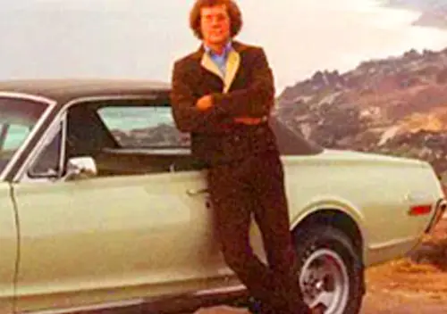







The 1986 Buick Riviera’s touch screen display/control system was also not great for the user. It did provide a lot of information.
When I see big glowing green shadow from a Buick Riviera in the tunnel I can tell it’s the touch screen.
The number of buttons here wasn’t that bad. Steering wheel controls were redundant, everything else was grouped where you’d expect it. I’d take those buttons every time over stuff embedded in a menu tree like most of today’s cars.
But hiding the climate controls behind the steering wheel was ridiculous.
What kind of stuff (integral stuff, mind you) is embedded in menu trees in today’s cars?
Anything that’s not on the main screen. On my cars it ranges from changing the media source to changing the station. And on some Fords you need to change screens to use the HVAC, for example.
Drives me nuts!! On my Jeep you need to go into submenus for seat heaters/coolers, HVAC airflow location (face, feet, mix), radio tuning, etc., etc. Now it takes multiple clicks on a touchscreen to call up basic functions, and that definitely is a step in the wrong direction.
Ironically, given all the initial complaints when it was introduced, the iDrive on my wife’s BMW 535 is easier to use than my Jeep’s touchscreen, at least to me (maybe I’m used to it now), plus the BMW has more primary function controls on the dash with button activations. Sub menus are for fine tuning that is only needed periodically, not for common, frequently used controls.
I’ll take buttons with tactile feedback any day. I have no interest in driving my phone…
I meant integral to the operation of the vehicle. FWIW, my father’s brand new Ford has buttons for the HVAC, and everything with the radio can be controlled with the steering wheel, no sight of the screen necessary.
Well at least they’re buttons, where I can eventually memorize their relative positions, I’d take it over touch screens some newer cars have anyday
Can’t positions on a touchscreen also be memorized? Yes, it’s easier when physical buttons have little raised spots, but not impossible.
Of course, but easier to feel your way around buttons when not looking, you memorize the positions and you can generally tell if it’s the correct button before actually pressing it from the surrounding area, touch screens are just a screen, I may be able to hit within an inch of what I wanted but there’s a margin of error there that doesn’t really get much better out of familiarity. Plus buttons have clear borders when there’s a lot of glare if I need to quickly glance at what I’m going for.
Want annoying? Try one of the new Hondas that replaced the volume knob with a slider on the touchscreen. Evidently the knob will make a return in 2018 according to rumors, but you’d think 5 minutes of using the radio prior to approving it could have spared them the overwhelming negative reaction in the media and on forums. Between that and their dual-screen setups, they really seem to struggle these days.
We’ll see even more of this in the long run though, and for a simple reason: If you already have the screen it’s cheaper to put the function in there than to design and manufacture a physical button.
Plus there are multiple hits you have to make on a touchscreen, and the underlying menus look different depending on the control. Yes, I know the order of the icons on the top menu, but each one I press calls up a different layout underneath, so the action you want is always in a different spot. You have to look every time, versus actual buttons that are in a constant, fixed location and really can be memorized by feel.
Exactly, and buttons seem to give you quicker and more positive feedback than the touchscreens. The one in my Toyota’s pretty good, but I still have to double-check to see if a command has registered every once in a while.
The Pontiac 6000 almost got everything like full digital dash, button control, and AWD and probably it can pretend coming from the 2010s. I’m glad the cars nowadays don’t talk to me like Chrysler did in the past.
“Your door is ajar! Your fuel is low! Your tufted-pillow upholstery is deflating! Opera lamps non-functional!”
LOL!
My best friend had an ’84 Chrysler Laser XE (the ‘upscale’ version of the Dodge Daytona). It was 7yrs old and had 130k miles on it when he got it. It was brown (like the POS that it was) and the digital instrument panel and ‘Electronic Voice Control’. The technology for the EVA was licensed from Texas Instruments (the same voice was used in the ‘Speak and Spell). It has been 25 years, but I can still hear the words- “Engine overheating! Engine damage may occur!”
Hey now, don’t be hating! I loved talking cars back when I was young. They were awesome! 😉
Yes, as easy as it is to mock them now, talking cars were pretty awesome back in the day. A dead-end technology, sure, but as cool in its way as a Sharper Image catalog or Colecovision. Good times.
I just love digital controls in the cars. I think Pontiac instruments look like a apace ship nice looking at night. Great article.
I had that exact car, and yes, the buttons took some time to get used to the layout/function, especially for me coming from a 1970s car to a high tech 1980s car in 2000. Each button on the million button radio did one function, and once you had used it a for a bit, it was second nature to just reach over and mash it. All the controls that you used the most were still common enough with other cars that it wasn’t a big deal. The headlights still used a pull-switch just like my ’70s land yacht, the signal lever was still left of the column and still worked the same way, the shifter was a lever that moved and clicked into place after the 3rd detent for normal drive range. the HVAC system worked pretty much the same as the one in my 76 Chevy.
Only when you got into the lesser used functions (the E/M switch) did you have to look at the dash to read the buttons.
New cars are a crapshoot as far as UX goes, and the touchscreen ones are even harder since you can no longer tell by feel what its doing. You actively have to take your eyes off the road to read the screen.
My Pop’s ’87 Bonneville company car had these steering wheel radio controls, and they weren’t bad, actually. There were too many of them, at least compared to today’s redundant radio controls on the wheel (basic functions like station presets and volume on my Grand Cherokee, for example, make the most sense to me). But you could control the audio system while keeping your hands on the wheel. In general, I think the Bonneville had a far more ergonomic instrument panel than the 6000, so the wheel controls really just augmented what else was there.
Many buttons does equal overly complex. I’d take this over the poorly designed menu cluster**** displays of the past ~10 years. We had several Pontiacs back in the day….were they the first to have steering wheel radio controls?
I can also see a future QOTD coming out of this topic: what small control issue drives you nuts out of all proportion? For me it’s Toyota getting rid of the “Defrost Only” setting on the climate controls. There are times when I’d really like to clear the windshield without sending hot air to also bake whatever’s in the footwell. Grr.
Non-defeatable traction and stability control. I’m looking at you, VW!
Not being able to turn the headlights off. I used to be able to signal a truck driver that he has me passed by turning the headlight off for half a second. That is not possible with the Pontiac Vibe. The lights are automatic.
My 2016 Toyota has defrost-only. Now if only it didn’t default to recirc when you turn on the A/C (with a button). I rarely use recirc.
That was the style back then, one button for on and one button for off. It wasn’t limited to cars check out old photos of ghetto blasters and home stereo.
Exactly my thought. The relative value of boom boxes was determined by buttons/$.
A 6000, hideous!
Hated them then and I hate them now. You get a digital speedometer on a Sonic but only an idiot light instead of a proper temperature gauge. But you can get an optional temperature gauge in the outside rear view mirror. Stop it already.
Keep your 80s retro tech. Is it too much to ask for controls that simply work and don’t distract or need an online course to operate ?
I don’t know what all the fuss is about. If you have technology, people complain. If you don’t they complain. Sometimes you cannot win. I think if someone gets a new car and just spends a few hours reading the book and trying the features, once you have used them a few times it will be second nature.
The STE was considered a technological marvel back in the day. I remember reading the various reviews on them and they were very well liked/received by auto enthusiasts and consumers alike. Remember, this was 30 years ago!
I really liked the technology on my 86 STE, even in 1999. Still do to this day, even the digital dash.
The thing about using the touch screens is that there should not be anything in front of you to worry about or a car beside you. Then a brief look at the screen should not result in a crash. You only need a second or two to choose a function.
On long trips I like the audio screen which gives me a list of stations that are available if I have run out of the current stations range. I can go directly from the nav screen to the audio or climate control screens.
Sometimes old-school mechanical controls can be confusing as well. The HVAC system on a late 1960s Rebel or Ambassador with air conditioning was controlled by four levers plus a rotating knob on the dash to the left of the steering wheel – 5 controls you had to fiddle with while driving, and you couldn’t even ask a passenger to do it for you!
I’m not a great fan of touch screens for heat and air controls – don’t you want to be able to make a quick easy instinctive adjustment, without having to call check what the screen’s set to, then select touch or slide on it? Same for basic audio functions.
Screens are fine for controlling the phone, navigation, car set up but sometimes they go too far.
And that Pontiac 6000 dash looks great to me!
Sometimes automakers try to overtake the complexity problem with good fonts… but to no avail. Since we’re talking dashboards, why not a QOTD on what is the prettiest gauge cluster/dash font???
My gauge cluster is reconfigurable.
My instrument ‘cluster’ consists of two gauges: FUEL -and- TEMP. Then there’s two ‘idiot lights’: OIL -and- GEN. And the speedometer. That’s it for the ‘instrument panel’. It’s a 1964 Ford.
Favorite fonts: Volvo, Mercedes, BMW, and Honda/Acura
+1 on Volvo
I think a desire for simplicity of controls is one subconscious reason I hold onto my old 2000 Corolla. Well, it just surfaced so it’s conscious now.
One of the reasons I like my 2014 Subaru Impreza – mostly manual controls. The Hvac is three dials. The radio, while admittedly does not give the best sound or get the best reception, is easy to use. I can change the modes with gloves on in the winter.
I feel you, coobal. When I bought my ’13 Impreza, the simple, intuitive, mostly manual controls paired with huge glass area and interior room were major points that eventually won me over to Subaru for the first time ever. I’m sad to see the next generation of Impreza chasing the competition. Whatever sells, I guess.
I can’t help but wonder how long the dash displays found in new cars will last. Will classic cars of the future be sidelined by the inability to source replacements?
it will be bad. I know how many problems my dad had trying to source a working cluster for his 80’s Diesel Rabbit in the 1990’s. I also know how many problems my sister’s 2011 Ford Explorer with it’s electronic controls, and that’s just out of warranty.
There won’t be any classic cars in the future! Who is going to be motivated enough to keep a car bought new in 2016 for 52 years? Or 40? Or even 30? Maybe a tiny percentage of motor vehicle enthusiasts would keep a 2016 model car for 30 years, but cars are just so disposable now. You trade in one complicated, computerized car for another. What’s there to miss?
I know what a 1976 Cadillac Fleetwood looks like. A big, long fuel-feasting beastie! With a ‘500’ engine that’s been a bit strangled performance-wise by the new Federal emission standards of the time + the advent of the ‘catalytic converter’. Has a humongous decklid, too. I wouldn’t know what a 2016 Cadillac looks like. Nothing about a new Caddy motivates me to pay attention when the commercials come on. I look right through them. I know I’ve seen them, but . . . meh.
Well you’re entitled to your opinion but I, among many others, very much disagree.
Cars have always been disposable. The reason old cars are rare is because most of them have been scrapped.
Ah Bosch composite headlamps. Quite the thing when finally approved in the United States. Now 30 years later we have $1000 foggy headlamps instead of $10 sealed beams. Progress!
As my wife and I have battled some of our newer cars, and multiple rentals, I’ve joked that everything you needed to know about convenient car controls was settled by GM around 1964.
’64 was the first year for Comfortron, their first automatic climate control system. If you look a little deeper at it, there are some nuances – mostly because it isn’t quite as sophisticated as today’s systems that sense a lot more than basic temperature. But, it’s a clean, straightforward system that can be operated by touch and minimal eye glances. A friend’s mom had Comfortron in her 1966 Olds Ninety-Eight, and it worked quite well for the 12 years she had the car – ending in 1978.
When luxury was defined by convenience, instead of complexity………………..
I love it that the industry uses the term “redundant controls” with a straight face.
re·dun·dant
/rəˈdəndənt/
adjective: redundant
not or no longer needed or useful; superfluous.
“this redundant typewriter factory has been converted into an iStore”
synonyms: unnecessary, not required, inessential, unessential, needless, unneeded, uncalled for; surplus, superfluous : “the system is hobbled by redundant paperwork”
antonyms: essential, necessary
•(of words or data)
able to be omitted without loss of meaning or function.
•Engineering
(of a component) not strictly necessary to functioning but included in case of failure in another component.
Maybe it’s the last thing manufacturers are worried about?
Renting an unfamiliar car is where control complexity really hits. I consider myself fortunate if I can figure out how to adjust the seat and the mirrors, and find the wiper and light controls in case I need them. Everything else comes later, if at all, and there can be surprises at any moment — like the controls on the backside of the steering wheel on certain Chrysler products. Suddenly the radio station and volume were changing, the A/C came on, etc., and I had no idea why, until I realized I was resting my fingers on buttons I could not see.
And speaking of controls you can’t see, I once sat in a Nissan Cube desperately Googling for the location of the gas filler door release button (it is so low on the dash that you can’t see it from a normal sitting position, and no there was no owner’s manual in the car)..
the longer I drive my 97 Grand Cherokee the more I hate touch screens!
at least with your phone or tablet you can close your eyes and curse at it till you cool down. try that setting the a/c in your new car!
I’ll answer my own question. Yes, it appears Pontiac was the first to use radio controls on the steering wheel. Nearly all vehicles have these controls today. Pontiac/GM, quite the innovators, despite the naysayers 😉