Driving behind a Rolls-Royce Silver Spirit over the weekend, my car-loving friend and I were commenting on its aesthetic merit. It’s a blocky design very much of its era and let down by some details, like its taillights. As we looked closer, though, we could appreciate some of its subtle curves that harkened back to older Rolls. Nice, but if we want to talk designs that successfully blended old world British elegance with contemporary 1980s lines, we agreed the XJ40-series Jaguar XJ couldn’t be beat.
I needn’t tell the whole XJ40 story – I’ve done that before. I saw this rather ratty one in the sleepy Gold Coast suburb of Runaway Bay this weekend and even with its primered trunk lid and hood, I could see just why I love this design.
The classic Jaguar proportions are present, this generation looking as svelte as XJs prior, but it’s slightly more squared off so as to better fit in with the W126 S-Classes and E30 3-Serieses at the country club. Yes, I can even dig the rectangular head and taillights.
The following (X300) generation of XJ switched back to round headlights and more retro detailing. It looked great, mind you, but Jaguar had a habit of clinging onto retro design cues for far too long, culminating in throwback designs like the S-Type and X-Type of the 2000s that didn’t meet sales targets.
The X350, too, clung to classic Jaguar design cues despite being the most high-tech Jag yet and featuring an aluminium body. Again, very handsome, but hardly forward-thinking stylistically. The Ian Callum-penned X351, conversely, took the XJ in a new direction and yet it still looks sleeker and sportier than rival full-size luxury sedans. It’s not perfect but I’m a fan.
I know the XJ40 is controversial but I can appreciate it for evolving the classic XJ design language. Can you?


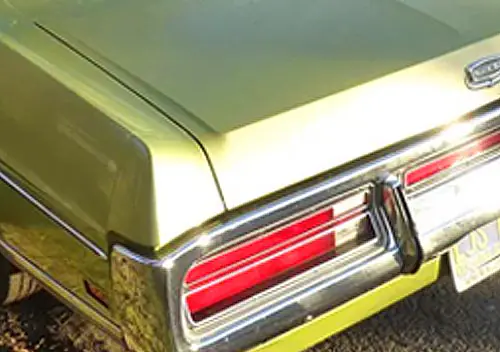

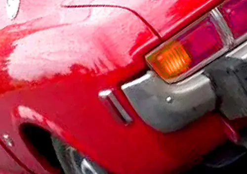
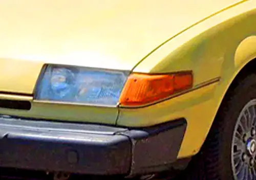
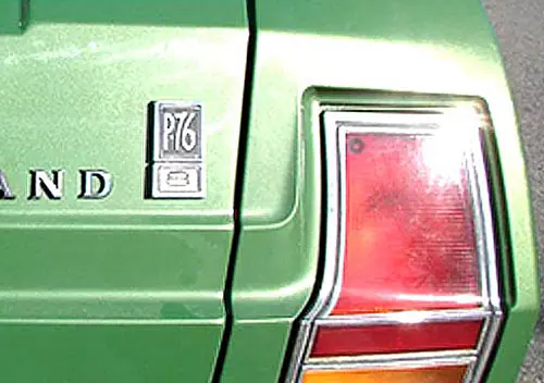
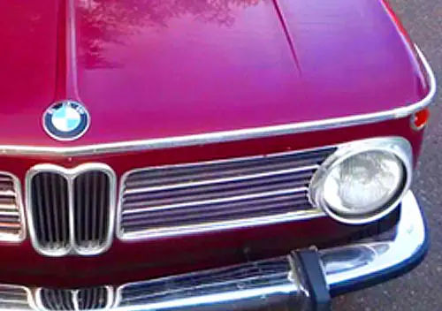




But how did the Silver Spirit tail lights (and the rest of the rear end) work on the Dodge Spirit/Plymouth Acclaim?
The pictured Jaguar is the extended wheelbase model, which is a bit awkward in having a too long back door compared to the standard front door. Ford got some details cleaned up, like that little chrome bit on the C column which was probably in classic cheapskate Brit practice covering a weld instead of filling it in.
But I too like the rectangular headlight version. The Ford version headlights look oddly unframed and the new wimpy oval door handles were worse than before. The original hooded headlights might have been unaerodynamic but looked WAY better. The original rear end was a little crude compared to the smoother Ford one, but the Ford one makes the rear look too long.
By the end the body design was severely dated by the long low trunk.
The XJ’s as a whole from the 70’s to the early 2000’s are some of the most gorgeous cars I’ve ever seen. Everything about them works for me. My personal favorite would be about a 1998 XJR
I hate the X351. The classical upright grille and hood on the otherwise sleek nose reminds me of the Mercury Bobcat, and the indecisive not quite wraparound black rear pillars that neither mimic glass or flow with the glass lines drives me nuts.
I never minded that Jaguar clung to what defined them, just as I never minded that Porsche did with the 911, or BMW with hoffmiester kinks, twin kidney grilles and round headlights. I never understood this need to progress and eschew identity in car design, Jags shouldn’t look like Mercs, and wooing Merc buyers shouldn’t be done on such a shallow level. Mercedes didn’t bow and conform to its competitions traits to sell cars back then, that’s a reflection of the confidence they exuded. The 87-94 XJ6 on the other hand looks like a car completely self conscious of its place in the luxury field. Not to say I don’t think it’s attractive, but it doesn’t speak to me as a true Jaguar the way it’s immediate predecessor or successor does.
Sorry, but I always thought the XJ40 was a dog. It kept the XJ styling queues but bungled them.
Obviously the Series 111 (Pininfarina) was a hard car to replace – and they haven’t managed it yet.
These appeared disguised in Oz in ’85 or ’86 for hot-weather testing. They were so visible, the journos stopped snapping them after a bit. I recall thinking that they will be nice to see with the ugly cladding off the front and rear.
Then they took it off at launch, and it was worse.
It looked like a an undistinguished effort from a lower-order marque from the late ’70’s, a Ford Granada on the make or thereabouts. And, as it was years late, the late ’70’s was about when they styled it. By ’86, it looked dated, and despite the unfashionably late arrival, still yet unfinished.
Kudos to Jag for building an entirely new car AND engine on what was probably the GM budget for a Saturn side mirror, but an eternal pox upon them for forgetting to style it. And to fit an electrical system. Or seals on the boot, or a sunroof that worked more than in one direction once.
Alright, the profile is quite nice, and if you squint really hard, it looks like a blurry Series iii.
Though if you squint even harder, you can’t see it at all, where it looks at its best.
Not their finest hour but they had to do something I suppose. The subsequent series got back to the plot and I’m a fan of it from them until the current ones, blah. These though, well, I don’t know. There was a version with round lights (in square apertures) which still didn’t look right, the tail lights are just a square block and don’t do anything justice (but tinted!) and wasn’t this the version that introduced the J-gate shifter? (which worked alright but didn’t have much of a point to it.).
I’ll be positive though, these are getting better with age and in fact due to the Cc effect I happened to be behind one painted a lovely green “giving it a bit of the Welly” through the countryside today for about five miles or so. Any that are still running must be well taken care of and so deserve some respect. Duly given.
“due to the Cc effect ” Quote
I see you used Cc rather than CC in deference to the new logo……
Can’t live in the past forever… 🙂
On the British car website “Driven to Write” many contributors refer to the XJ40 as the last “evolutionary” style Jag. These were followed by the retro X300 XJ6 of 1995-97 and the V8 models up to 2011. It wasn’t until the current XE, XF. and XJ series that the design departed from traditional styling points. I have always liked the XJ40 especially with the big “fish tank” headlamps. It was the first Jaguar that really caught my attention.
I’ve always thought that big “fish tank” headlamps provided a lot more real estate for stones to hit and damage. On my Chrysler Alpine it wasn’t possible to buy new glass – you had to replace the whole lamp unit. Ditto my ‘D’ type Opel Kadett.
“Fish tank headlights” damn you bloody nailed it
Do my eyes deceive me William, or is the one you’ve photographed wearing Daimler wheels and bootlid plinth? I did a double-take at the roof too – on first glance it looked like it was vinyl…so this would be a rare occasion where primer is an improvement on what I thought was there!
I’ve always found the XJ40 interesting. Nowhere near as beautiful as the SIII XJ6, but the proportions are slightly better than the X300. I love the big rectangular headlamps; I thought they were a good break with tradition. The detailing around the glasshouse is far too fussy though – the exposed B-pillar results in far too many vertical lines for example. But overall an interesting design. My favourite XJ is the X351 by a long shot, then the SIII. The rectangular headlit XJ40 would be a contender for third place in my eyes. Beautiful? Not really, but interesting enough to count.
Alongside many others, for a long time I thought the XJ40 was the black sheep of the XJ family. Not anymore. Its lines are very good, better than its successor (X300). The rectangular headlamps suit the profile very well (much better than the versions with the double round lamps), as do the rear lights. The X300/350 head and taillamps looks just a bit too much retro, also the X300/350 big wooden dash with the deep inlaid gauges is just a bit too much. The XJ40 was improved over its 6/7 year build. Early models had “modern” digital dashboards.
If I were to choose an XJ for daily use (and I have been thinking about that, replacing my trusty and very practical X-type estate), of the XJ range from 1968 until last year, it would be the 4.0 litre six cylinder XJ40 from 1993 or 94 with airbags, rectangular headlamps and short wheel base.
Interestingly, the Giuguaro (sp?) design that ultimately became the ’93 GS300 was slated to be next big Cat.
Ah yes, the “Jaguar Kensington”, styling cues from which also appeared on the Daewoo Leganza in 1998. “Car” magazine did a full story on it in 1992.
I’m a Jag fan but the XJ40 is not the easiest on the eye. Its styling makes more sense if understood that this design should have hit the showrooms in the first half of the 1980s.
Sometimes I feel I didn’t see how beautiful this car is when it was still common. Then I remember the average owners (and their concrete garden fountains) and I know why it didn’t register back then. The QOTD on brands so stigmatised you’d never consider one a few weeks ago? Yeah, add any 1980-2007 Jag to that list for me. XF onwards the buying public seems to have diversified, but in hindsight that model perhaps threw overboard a bit too much.
Paint repairs in best Bogan blak colour me unsurprised, after hearing about paint repairs on these cars when they were new this one has held up quite well in the sun a local guy has a few of these along with lots of other relics just parked waiting as parts cars for the one that runs, Nice cars when they go properly.
I’m a complete and utter unashamed fan of these. I’ve had two (the first got hit by a tree, the second I dailied for a number of years and am now restoring and swapping an M57 into).
For me, they’re the last time in decades Jaguar were actually looking forward (up until the Ian Callum era). Absolutely they looked a bit dated when new, but in all honesty that was what Jaguar’s clientele responded to. They were still smitten with the Series 3 XJ nearly 20 years after it was first produced! One of the reasons the car took so long to produce is because they vacillated back and forth between traditional and forward-thinking styling, unsure of where to pitch it.
Personally I think they pitched it absolutely perfectly. Enough of a hark back to the XJ so that people knew it was a Jaguar just from the silhouette, but enough 80s sharpness to make it fit into a world where you were more likely to drive your Jaguar to a meeting about stocks and shares than to a soiree and a country house.
And the interior. Man. It might have more panel gaps than a Lexus, but my word is it a special place to be. I’ve been in a fair few German luxury cruisers of a similar era and they just feel a little…plain.
If cars were suits the BMW would be black on grey, while the Jag would have a red silk lining you can see poking out of the pockets.
I am all on board with you, William! I remember waiting patiently as the car was in the last throes of the LONGGG gestation period, and was looking at the magazines on the pharmacy shelves to see the spy photos of extreme weather testing in Arizona and Northern Ontario. I wasn’t disappointed when it finally broke cover. Pininfarina did an amazing job in the restyling resulting in the XJ6 Series III, and it was one of the few times in car design when the restyle is exceptionally better than the original….although that obviously is open to debate. That being said, the fact the sales increased in the 1980s and were going strong is testament partly to that exceptionally brilliant redesign, as well as John Egan’s management that vastly improved quality and owner satisfaction. The XJ40 is superb, and perhaps one needs to have lived in that era to really appreciate the look. I love the squared off lines that have extremely subtle curves…I know because the rain pools on the trunk lid just before the slight sweep upwards. This was the last Jaguar that had the input of then-retired founder Sir William Lyons, who did some consulting by that point, and there is a photo of him reviewing the car in 1985, shortly before his passing. To me, the design retained the style of Jaguar, but brought it to a contemporary point of the 1980s. The only unfortunate bit is that it came a bit late to market as John Egan insisting it not be released before it was properly finished. I think the original date had been targeted for 1984, but didn’t hit the UK market until 1986, and the US the following year as an ’88 model. I remember when the replacement was coming, and when I first saw it on the street in January 1995, I immediately did not like it. Yes, not only did Jaguar dip into styling cues of the past, but unsuccessfully. The grille was lowered and widened, which made a wide car look as if the front had been squashed. The scallops on the headlights accentuated the odd-looking lower and wider look. Unlike the Series I through III XJ6 that the X300 was trying to emulate in terms of styling, the headlights were the same size instead of larger outer units and smaller inboard ones that gave it a bit of a cat eye look aggressiveness. And even around back, the revised tailights should have appealed to me more, but I don’t like that look either….I think it was taking a masculine, chiseled 1980s look and imposing the ovoid 1990s look on it. Dynamically, the X300 was a better car then and now due to significant improvements, but I suspect that Dearborn’s influence with purse strings dictated lots of “ye olde English” cliches instead of letting the designers unleash something fresh and exciting designwise. Yes, one of my favorite Jaguars, and that’s all that matters to me. Your article demonstrates a keen eye for assessing details of car design. Well done, and thank you!