I used to mock the BMW X6. You may have noticed that, in some of my earlier pieces on this site, it was my go-to example of an ugly car. I thought it was an affront to good taste and utterly pointless. Well, I still think it’s pointless and I still feel it makes no sense to pay more money than an X5 to get less practicality. I still find the whole notion of a coupe SUV laughably absurd. But I no longer find the X6 as hideous as I used to, and there’s one good reason.
Mercedes-Benz made an even uglier coupe SUV. Two, actually. The GLC Coupe and GLE Coupe are late to the niche BMW started but have managed to out-ugly it so thoroughly, it’s made me re-evaluate the Bimmer’s styling and in turn made me appreciate it a little. Heck, I even found myself gazing appreciatively at a couple of X6s this week. Maybe I… *gasp*… like the design now?
(clockwise from top) X4, previous X6, 3-Series GT, current X6
Would I buy one over an X5? Hell no. But I actually prefer the X6 and smaller X4 fastback SUVs to some of BMW’s other weird, niche, gap-filler models like the 3-Series GT. But as much as I and many others mock those, too, kudos to BMW for selling $60k hatchbacks to Americans. Who could’ve seen that coming?
While we’re talking Bimmers, I recall hating the E65 7-Series. Yeah, a lot of us bashed Chris Bangle back then but now I appreciate how he shook up BMW styling. It would have been quite easy for BMW to endlessly re-tread the same basic design language for years, like Jaguar did. Bangle’s designs weren’t pretty but they were bold and many of his design elements were widely copied. And today, I find the E65 7-Series and E60 5-Series very desirable.
I can say the same about some other controversial designs, like the final generations of the Honda Prelude and Toyota Celica, and the facelifted 2011 Lincoln MKX. I found all of these ugly when they were launched – perhaps in large part due to their prettier predecessors – but now I like them all.
So, tell me: is there a car that you once found repulsive that you now actually like to look at?







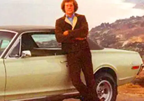







Honestly?
Pontiac Aztek.
And it has nothing to do with Breaking Bad, I swear.
I’m with you on the Aztek, I thought it was the ugliest damn thing when new. Now I’m “getting” it. PS I never even watched “Breaking Bad” FWIW!
I still find the Aztek one of the ugliest cars — or whatever it is — I’ve ever seen. If ever I were to buy one my family would know I’ve gone insane. Ugh!
I honestly tried to think of a car I used to find unattractive but now have second thoughts about . . . and I can’t think of one. All the vehicles I used to find hideous-looking to look I still find repulsive.
Same here. I think part of it is a lot of today’s cars have such incoherent styling it starts to look good in comparison.
I guess that’s kind of what William is saying too. Not necessarily that he likes the X6, but that it now looks better than some of the alternatives.
The monochrome versions aren’t horrible, but the earlier examples with gray cladding are. I just can’t unsee the bits of body color peeking out from the gaps in the cladding – looks really cheap.
Yes, those are much worse. But everything about them is sort of inept looking, like something from the Soviet Union or something. But I always thought its cousin the Buick Rendezvous looked really good and still do whenever I see one of those still around, except for being, like the Aztec, a little tall for their width or something. The lost the two tone along the way as well.
+1
Yes, That would be one. I never watched breaking bad. But I have read more about their utility, and especially the camping aspect. Another would be the Mercury Grand Marquis. Always thought “what a freakin’ grandpa car” ‘ A Crown Vic with make-up” Etc, etc, That’s until I found a gorgeous light green over a misty light gold final edition GS for wifey for her birthday. The actual color is intriguing, as in a certain light it looks silver. Beautiful car, beautiful interior And 20 years ago wouldn’t have been caught dead in one. But not being an “Old Man” 20 years ago, and now in my mid 60’s might be a factor 🙂
2002-2012 Range Rover and its relatives…but because of the people who drove them, not the car itself. I went to a certain large private university in New England (that I picked for the wrong reasons and ended up being a bad fit for me, but that’s a story for another day), and it seemed like all the rich d-bags, both male and female, drove these.
Now that I’m (thankfully) not there anymore, I can appreciate the truck itself. Despite its mechanical issues, it is a pretty timeless design. Also, Doug DeMuro’s satirical reviews.
Just get one with an unlimited miles bumper to bumper warranty at CarMax
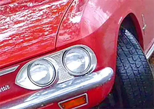
I didn’t much like Corvairs when they were on the road but now I like them, especially the later ones.
Time has been kind to the Bentley Continental GT. Still can’t stand the X6 though. Sorry.
Off the top of my head: First generation Nissan Murano, current generation RAV4, current generation Chevy Malibu, and the current generation Prius.
While I find the current gen Prius is less jarring than is was a year ago, I think that’s just familiarity. I’m nowhere near ready to say it’s grown on me.
I still can’t stand it. And I’m the owner of a Gen 2 Prius.
When I first saw the current Equinox, I thought it looked like melting sheetmetal. Now, however, I like the design. I will still probably end up with one of the new Tiguans.
I didn’t really like the first generation Ford Focus when it was introduced in the late 1990s. I thought their tall styling looked weird compared to other cars on the road at the time. Now that pretty much everyone else has adopted the tall-small-car philosophy they just look like every other small car.
This will sound crazy, but it’s true: the Jaguar E-type. Never found them appealing at all back in the day. Now, in our modern context, they are positively marvelous in contrast to nearly everything else on the road. To be fair, It was the third series cars I saw first, so that really jaded me at the time.
Funny, for me it’s almost the opposite. As a kid the E Types, both coupe and roadster, though NEVER the 2+2, were stunning. But now, they all seem to have awkward proportions.
Ooh, it’s not crazy to bring up the E-type, but what I’m about to say probably is.
Because for me, it doesn’t stay the same, rather like a picture going in and out of focus. When little, I was (car) culturally directed to the series 1 convertible as “the most beautiful car ever made” etc, and I thought: “It’s a sausage dog with a fish mouth. And the wheels are too far in, surely they need to come out some so it doesn’t roll over”. Later, I saw a V12 convertible, and thought, “Ah, now that is beautiful, wide wheels, a grille, thin little wheel arch lips, the whole thing fixed.” Then later again, a V12 coupe (not realising there were 2+2’s) and thought: “Beautiful my arse, that coupe looks like it’s a convertible wearing a goldfish bowl.” Later, a 6cyl 2+2, and I thought “Good god, even worse, a sausage dog wearing a goldfish bowl”. Then I spied a series 1 coupe, and thought: “That’s much nicer, a thirties racer and a fifties one combined. Very nice.” Then I saw another, in profile, and thought: “Hey, that cabin is altogether too far back!” (which I still sometimes think).
Currently, I am uncertainly settled on the series 1 coupe and the series 3 convertible as being beautiful cars, perhaps particularly now when elegance has all-but disappeared as a modern design trait. But in a years time, I’ll bet that I think one or both of them have gone slightly off again.
Tesla Model S. I was instantly biased against it because of my inherent dislike of EVs, but even beyond that the styling I found lumpy and unremarkable, but now it’s one of my favorite designs, admitted helped by the facelift. It’s got an 80s Mercedes Benz sort of beauty to it.
Fifth generation Camaro. I despised that design, it looked like 1969 Camaro refined by an 11 year old, but when I look at one compared to the current sixth generation, I find it to be a much more resolved design, while the current one looks compromised by the basic design carried over onto new underpinnings. Still wouldn’t be my first choice, but I don’t mind the mere sight of them like I once did.
Bangle designs look even worse to me now than they did when I first saw them. Sorry that man ruined BMW and frankly car design as a whole.
Couldn’t agree more about your comments about Bangle.
The X6 is the answer to the question that no one asked. It is amongst the worst “designs” ever, and I detest it more than ever. The type of property who I see drive one conform to a certain stereotype. It is telling that Audi has not joined the conga line of colossal bad taste.
I always liked that last generation Prelude and can’t figure out why journalists at the time all seemed to be in agreement that it was ugly.
The previous model Prelude with the Pontiac type front and XJS rear, now that was (and remains) ugly.
I always felt like Bangle’s talents were wasted at BMW; if he had been given a truly clean sheet instead of having to still retain so many 1961 Neue Klasse design cues, who knows what he could’ve come up with. Instead, he was given an impossible design task – be bold, dramatic and different! But make it “look like a BMW”!
Chris Bangle deliberately made BMWs controversial/ugly. It wasn’t simply the best he could do within the constraints of BMW’s hallmarks. For better or worse, it was intentional.
I never got the Prelude hate either, it looked like a modernized third generation, which (IMO) was the best Prelude. The fourth generation looks like a sewer rat.
I liked the exterior of the 4th-gen Prelude, although the dashboard was ill-conceived. The 5th-generation car’s only real styling flaw is the headlights; I see what they were thinking, but it doesn’t work.
Chrysler Imperial 1960 Triumph Dolomite Audi A2 Plymouth PT Cruiser Fiat idea Multipla1993
What’s not to like about a Triumph Dolomite? Am I missing something?
Nothing at all
I thought PT Cruisers were beautifully conceived and styled when they came out, and improved when they blended in the bumpers (although the headlights were a wrong move) and best when they got the chrome grille bars they should have had from the beginning. I still do.
Also they are practical. Somehow they never got as good mpg as they should have.
The current Jaguar XJ and the Mercedes CLS, but I love both of these cars now, particularly the XJ because it took Jaguar’s styling in a completely different direction.
I can’t say my nuclear-ugly opinions have changed much, but it’s a lot shorter list than some of you have. The Aztek and its spawn (the aforementioned CUV/coupe Bimmers and Benz’s) are likely to be on it forever, as will the Isuzu Vehicros and first-gen Panamera.
W204 Mercedes C-Class. Hated the car when it came out but grew to appreciate it over time – maybe because a good friend got one.
BTW, the Tesla Model X is the car I really find repulsive today. Quite a few in my neighborhood and I hate the looks. The X6 is a beauty in comparison.
The Model X looks like an egg. The Model S, however, is sexy and the Model 3 (essentially the Model X’s styling with proper dimensions) is handsome.
Every time I see the Model 3, all I see is an injected plastic body for a slot car kit from the late 60s or early 70s. The implied grille just does not work, and having the form there but not the opening draws attention to an apparently missing item rather than making it a seamless part of the design. The Model S, with the fake blacked out grille is a bit better than the original, but not much. Plus, they all look so similar to every other sedan on the market, why not do something bold in the design?
The first two generations of Toyota Highlander. I thought they were blandness personified when introduced but have grown on me a lot over the years. The size of the first generation now seems just “right” and the second generation, especially after the refresh, I find very attractive, especially the interior with the blond “wood”. and tan seats.
And btw, the BMW X6 is still hideous no matter how hideous-er the Mercedes versions might be. So don’t even try to sugarcoat that.
The new (since 2016) Prius was literally repulsive to me. As regular readers know all too well I’ve been a Prius fan since before day one. Got one of the first off the boat in 2000, and replaced it in 2010. I think the 2010 is a particularly handsome car.
When I first saw the new Prius I was shocked. Looks like it came from a Japanese monster movie. With all the arbitrary slices and vent-like recesses, I couldn’t find a face in the front. And the side’s creases don’t work together either. Only the rear end’s wild taillights looked cool.
Now that I’ve been seeing them on the street for awhile, I admit I am getting used to them. I can see a face in the front end, though it’s not one I’m happy with. I still don’t see one in my driveway, ever.
Fortunately 1) I seem to buy alternating Prius generations, so there is hope for next time, and 2) the Prius Prime plug-in hybrid is much better looking, and if it had more electric range I could see owning one.
I’m hoping by 2020 they’ve improved both the looks and the EV range of Prius Prime. Though I might just become a Tesla Model 3 owner instead. Those Teslas are fine looking cars.
I still only like it in light or bright colors. The gloss-black cheater panel behind the rear door windows needs the contrast to deliver the intended look.
I’m in the same boat. I’ll replace my gen II with a Chevy Volt or a Tesla Model 3 if I can afford to do so when that time comes.
My first thought was the Nissan Cube.
(Dis) honorable mention for the Aztec. The later ones without the side cladding don’t look too bad, except from the front, which still looks like they dropped a Sunbird on top of a GrandAm.
Each to their own – the Cube has never grown on me. If anything, the fussy styling cues really age it. The Kia Soul pulled off the boxy/quirky theme much better. Speaking of which – I hated the Soul at first (and expected it to flop like the Rondo), but actually like it now!
At first I strongly disliked the Honda Crosstour, mainly for what it represented. Now I don’t think it’s bad-looking at all.
Crosstour. Definitely has looks better to me now than previously.
I always thought those were OK although I also always thought the X6 is a a study in pointless excess. Huge tires, huge vehicle, and then a fastback to make sure it doesn’t have the cubic feet or usefulness of an identical normal SUV. The Crosstour just looks like a modern version of a post WWII fastback sedan.
Time: Mid 1970s. Age: about 7 or 8. Mum sent me to the butcher in the small shopping strip behind our house. Parked alongside the butcher’s HQ Monaro GTS (dark green, white stripes) was the most grotesque UFO I had EVER seen in my life. I remember being struck almost into catatonia by this monstrosity which seemed to be the complete opposite of the clean shapes of dad’s Fiat 125 and mum’s Beetle. Standing eye to eye with those rococo curves and filigree marking the front end of the car, I still remember – to this day – the strength and affect of that visceral response.
I can’t remember when I saw the light on what has turned out to be one of the finest shapes ever to have emerged from the US (or Canada in this one’s case). But I did.
Struck into Catalinia?
:^)
hehehehehe
Non artistically stretched view:
1989-1993 Buick Riviera (with the long overhangs.) At the time they just looked like mutated, misshapen, distant relatives of the 79-85 version, but now I find them to have a sort of period charm.
The third generation Kia Optima (2010-2015). When it came out I thought it was too extreme, overstyled, and frankly “bug-like” in appearance. However, since then most other midsize sedans have either become even uglier or even more conservative. The Optima, both the third and current fourth generation have really grown on me.
Speaking about ‘ugly’,the front clip on the 2018 Camry takes hideousness to new highs with it`s Kabuki mask style.I don`t think I will ever change my mind on that. Makes the front clip on a `61 Rambler Ambassador look positively gorgeous.
This one?
Or this one?
Think I`m gonna have a nightmare tonight.How can I unsee these?
Definitely the Audi A7. It happened pretty quickly too. I guess I mostly despised the idea of it, but the first time I saw one in the flesh I almost walked into a fire hydrant. Gorgeous car. Lots of presence.
The Fox body Mustang has kind of grown on me. I used to think it was such an affront to the name but I think that might have more to do with only ever seeing ones that were beat to crap and adorned with “FEAR THIS” stickers and whatnot.
I didn’t like the heavy fixed window frames on the Fox Mustangs – they seemed out of place on what was supposed to be a sporty car. I supposed I’ve gotten used to it over the years but it could have been something like this.
My gosh, that’s pretty. You nailed it, Tonyola – the difference is in the details between that mockup and the production notchback. I like the finished ’79 product, but thinner, more artfully executed window frames (and some of the other changes in this mockup) would have taken the looks of the ’79 Mustang to a whole, other level.
Proof of concept: T-top cars didn’t use window frames, they look a million times better.
Too bad they only came with T-tops…
On The T-Top cars, the factory pretty much just chopped off the glass frames and added larger glass seals on the body side window opening, so you could build your own. There might be additional guide parts mounted inside the door (i kinda doubt it…). If so, you could scavenge them at the junkyard.
I owned a T-Top notchback, so I can identify a couple downsides- The window seal would come in three pieces so you’d have cut lines where the T-Tops went, they would probably leak, and the the glass wold rattle after 50.000 miles of use.
Seems like to glass rocked in the guides a bit as well, since the window frame helped position the back edge of the glass, but despite that, they rolled up and down without a lot of drama.
I still think the Bangle BMWs are awful, as well as the Celica and Aztek.
Nope.
Weird is weird ………. but after 60 years, it becomes quaint.
Go Henry J!
The Virgil Exner Forward Look cars for the Chrysler Corporation from 1957-1961 used to actually scare me as a boy of four and five. Now, I’d die for one.
The only thing that comes to mind was the Dodge Dakota pickups. The first generation looked like it had been shrunk and had all it’s creases ironed out. Now I like them better than the mini-me Ram look that followed.
I’ll add my voice to the Aztek crowd. I like them without the hideous black cladding or whatever it’s called. They look MUCH better when it’s body color.
When I was too young to drive I thought the ’60-’62 Valiant was the ugliest thing on wheels. When I got old enough to drive I found out how much better than a Falcon or early Nova these cars were and began to appreciate them. First for the mechanicals, then eventually even the styling.
When the 2003 Chevy pickups were introduced I actually decided to keep my ’99 awhile longer. I thought that front end was the ugliest thing since the ’58-’59. Sheer repetition wore me down on that one and I ended up in an ’04.
Who knows, someday I may revise opinion that the current Ford F series front end is the ugliest thing on the road today!
The Austin-Morris 18-22, better known by the ‘Princess’ name it adopted soon after introduction, though it took about a decade to warm to. Most others I’ve hated/disliked I still hate/dislike.
The Princess looks like the wrong turn to the future. I don’t want one, but I do like looking at them. The Ambassador though… oh dear!
Another one: the original Subaru B9 Tribeca. I remember first seeing a picture of one, and thinking it was a new level of ugly, even beyond the Aztek and Bangle’s 7-Series. Now it looks better than many newer CUVs, and the latest Kia Sportage even has some similar styling cues!
I most definitely agree that the (now rarely seen) Subaru B9 Tribeca actually made the Pontiac Aztek and the Bangle-butt BMWs seem more acceptable. Still no fan of the B9 Tribeca, however. Still a downright horribly designed front end, IMHO. But, I can acknowledge that some may appreciate it for it’s versatility and creature comforts, while overlooking the styling faux pas.
I also hated the 2009 Acura TL, and still think the FWD versions look like a pregnant whale on roller skates. (“How could Honda go from the beautiful 2008 to THIS?”, I thought as a classmate at my high school pulled up in a brand-new 2009 in the fall of 2008. One of his parents worked at the local Acura dealer, and I tried not to mumble anything rude under my breath. “Ummm…nice car” was about all I could manage.)
However, the SH-AWD version almost looks OK. Almost.
I used to agree with you on the 2011 Lincoln MKX. Now I own one and think it’s pretty cool. Go figure.
Being a child in the 1970’s I never liked the look of that decades corvette. I liked the 1960’s split window one and the later ones in the 90’s. Today I actually like them although I hear the stock smogged out versions can be outperformed by a modern minivan. Maybe the design reminds me of my childhood or more likely it is what passes for car design these days or the lack of 2 door coupes.
The Porsche 356 coupe seemed like such a dull, plain, simple, looking car. I thought that it completely paled in comparison to the 911! Then over the passage of forty years or so, they started to look better and better to me. Now I think they are almost beautiful and I would have one if I could afford Today’s inflated values.
Toyota Rav-4. I hated the ribbed, ugly high plastic cladding (a common point of hate on several picks today), the cheap, unfinished look of the taillights, the clumsy slope of the beltline.
Today, I see it as a raw Japanese Jeeplet. Not sure if it aged well or if I just came to see it better for what it is.
I actually saw 1 of these on Saturday, a green one. It looks too short (as a 2 door) compared to it’s height. The 4 doors actually look decent.
This one is also on my list. I just got back from a week in Baja where the 1st gen RAV4 is pretty common, bouncing along dirt roads and often pulling small fishing pangas on trailers, and they looked pretty good to me.
Not crazy about the 1st generation of Nissan Leaf, the 2nd generation is going to make all Priuses look stupid.
Just about any car that calls itself a “coupe”, but has 4 doors.
The Lincoln MKS, I used to hate it but facelifts/updates have made it acceptable looking.
Chevrolet Suburban -Eighth generation 1992-1999 -not sure why this design bothered me so much, maybe because it was so popular and big?!
Nissan Murano CrossCabriolet 2011-2014 -weird, but they are so rare that it is a treat to spot one now.
Nissan Juke -while still ugly familiarity is why it might have grown on me.
There’s a certain subtle clumsiness about the B and C pillars on the GMT400 Suburban and Tahoe that’s totally absent from the pickups and spoils an otherwise squeaky-clean design.
Citroën DS. They were other worldly, but reminiscent of a step down Hudson. They looked grotesque when their suspension leaked down and they sat two inches off of the ground. As time goes by I can appreciate just how revolutionary the were.
When I was a little kid I was waiting in the car while my father went in a drug store. There was a black car that looked like nothing I had ever seen before, like something from the distant future. I was staring at it while the driver got in (frameless windows!), started it, and it rose up several inches. Unbelieveable. And I always liked how they looked ever since.
Yes, two GM W-bodies: the first-generation Lumina (especially the coupe) and the 1988-1996 Regal. The Lumina’s low cowl makes up for its general blandness, and over time it has retained a strong sense of “American-ness.” I think it’s the best-looking sedan of its era after the 1988-1992 Honda Civic 4-door. The 1995 redesign wasn’t bad but the car lost its gracefulness … and its low cowl.
The Regal lacks the low cowl but has the same sense of “American-ness.” It edged a little too close to traditional faux-luxury cues, but then it IS a late-1980s Buick. I think the sedan is just as nice as the coupe.
I’ve always liked that era Cutlass Supreme. I didn’t like the Grand Prix when it was new and I still don’t.
I owned a 89 Civic sedan and a 92 Civic hatchback, and the sedan was a delightful car while the hatchback was a semi-anonymous looking boot or bar of soap.
Not sure the cowl was elevated all that much from one generation to the next, though.
The 92 was a 70 horsepower CX that got an Integra engine transplant that more than doubled the horsepower….60 mph while still only in 2nd gear, with an estimated top speed of over 140.
Honda Element. When they first came out I thought the boxy utilitarian styling was so “trying too hard to look like you’re not trying too hard”
But later once they were not so new I started seeing them camping, and parked along forest roads, and I thought that a used one with a 5-speed would be a great little runabout. They really did grow on me, although it took 10 years to do it 🙂
+1
That was one that hit me hard the moment they came out. I wound up buying a new one, 5-speed, and drove it for 144,000 miles.
I still miss it from time to time, not gonna lie. I still love the look of ’em, too.
an here I thought the Element would escape notice in the hailstorm of Aztek posts. I never liked the looks of the E. now I own one. My transition of viewpoint came when I found that you can carry a full size tandem bicycle, a single bicycle both inside the car, all doors closed and still have seating for 3 adults. mine is black on black, so the cladding is less obtrusive. beautiful in its versatility.
I’m convinced a sentient Nintendo-64 designed the Honda Element.
I am with you on the Element.
Like the Aztec the later ones without the utilitarian gray plastic parts are a lot better .
The GM “Colonnade” coupes
The Citroen DS 19. I absolutely hated them as a teen, I thought they looked like a large mouse on wheels. The one day, I saw one in a whole new light. It was absolutely beautiful,and it made just about every other car look passe. I was lucky enough to buy one in the early 80s, a very clean and mechanically sound one at that.Possibly the best car I ever owned, bar none.
I really disliked the 2010 Camaro when it returned to the scene. It sort of looked like a cartoon version of a classic 1969 model. The 2016 redesign hasn’t changed the styling very much and I have a hard time telling the 2016 and new models from the 2010 to 2015 models. But over time I’ve gotten to where I don’t mind the styling as much. It’s not as good as the Mustang or Challenger from the same time periods, but I don’t mind it anymore.
Honda Crosstour , Nissan Xterra come to mind
The early sixties Rambler wagons looked quite quirky to me when I was a seven year old second grade elementary student. There was one always parked by the bus stop. I was glad it wasn’t in our driveway. It wore a bleached out, oxidized light pink or mauve color with a few spots wearing through to the primer. Perhaps it wasn’t loved, or had led a hard life. The body lines just did not flow. What really puzzled me was the speedometer. It read 1, 2, 3, 4, and so on.
Forty-five years later, I appreciate that Rambler for it’s character, inside and out.
Same feelings for the bat-wing 59′ and 60 GM cars.
Give me any one of those today in same condition, same patina, and a three-on-the tree. I would park it next to the bus stop and watch people contemplate it’s story, just as I did.
The Lamborghini Countach, of all things. I understood that they were fast and dramatic, but they were messy and bitsy, too much like a kit car or some distorted silhouette racer. This was pre-internet, and ability to afford books. I had not seen the LP400 original. Once I had, it changed my thinking. An amazing design.
I never quite got the dislike of the Bangle 7-series, though it did get a bit silly at the back. It looked clean, expensive and bullish as befitted its market. It still does.
The X6 is an idiotic machine, and the expensive pointlessness of it is probably part of the aggravation, but I suspect it will age ok because that idiocy will become muted as the rising tide of greater and lesser variations on the theme normalises it.
AMC Matador coupe with the giant headlights has grown on me and the 80 t bird. I used to hate their look but now I’m ok with them. Still can’t stand fastback 78 Cutlass and the 78 Grand Prix. And I will never like the hideous oval Taurus or the 85 DeVille.
Henry J. When it was new it looked way too tall and way too stubby. Now it strikes me as sharp and well-proportioned.
Probably a matter of perceptual baselines. In the ’50s the baseline was low and long; now tall and stubby is the default.
When the luxury crossovers debuted in the late 1990s (namely the Mercedes M Class, the Lexus RX, and BMW X5), I thought they were all offensively ugly…the concept was so different and weird. After about 20 years, the concept is anything but weird, and those designs don’t seem off-putting at all. In certain angles, they even sort of are attractive to me.
I also originally thought the PT Crusier was really ugly, but then came to really like them (now I’m somewhere in the middle).
Perhaps my biggest change of heart pertains to the original Audi TT. I hated them when they were brand new, but now I think they are one of the best designs of all time.
Gotta go with the box ‘Birds. When I first saw an ’80 T-Bird I about barfed and now I actually wouldn’t mind owning one. With suitable performance mods, of course 🙂 .
The fuselage Mopars. I was 10 when they came out. I thought they were too sleek to be conservative and too conservative to be sleek. Every version and every year (at least through 71) were generic and almost unidentifiable by year.
Today I find them very attractive and get that the design was actually a little edgy for the time.
+1 on the Fuselage Mopars, JP.
I felt that way about the smaller Dart around that time (Fourth Gen ’67 – ’76).
I took Driver’s Ed in one of these back in the day, and thought that they were glorified “librarian mobiles”. (I think that’s what we called the older Plymouth Valiant back then, anyway.)
I’d love to have a ’70 to ’72 now. Make mine a two-door hardtop (Swinger?) with the venerable 318, although the Demon 340 or heck, even a basic slant 6 would be nice.
The Lexus LS430. I now like them so much that I own one.
A little late to the party here, but when I first saw the current generation of Civic (2016-?), I wasn’t sure what to make of it. Repulsed is a strong word, but I just wasn’t so sure about all of the angry angles that the car has, but seem to be all the rage lately.
While still not that crazy about the sedan, and think that the hatchback is way over the top styling-wise (I’d rather have the Mazda 3 if going for a hatchback), when I spotted my first 2016 Civic Coupe, I was smitten.
Now I have one:
Bingo, I agree with you on this Civic! I have been wracking my brain to think of a car that I initially hated that ultimately grew on me, and it was tough. For the most part, my opinions haven’t changed. And then I read your comment and realized: that’s it! When the current Civic first emerged, I thought it was crazily over-styled. Now I see lots of them and I must admit that I am now warming to the looks. Don’t know if I’ll ever love it, but it is distinctive and edgy looking, and very noticeable at night with the unique tail lights.
I like that the taillights are different on the coupe from all the other versions of the Civic.
It lends a certain ‘exclusivity’ to the car… if you can even use such a term on a mere Civic. (LOL)
You can get an Si in every flavor of Civic now, be it coupe, hatchback, or sedan, but the Type R only comes one way – as a hatchback. I’m showing my age here, but there was a time when the sportiest model of a car only had 2 doors! I guess the kids today want 5 doors.
Not that a “kid” can afford a Type R… Talk about exclusive, but that version of Civic is like $35-40K, if memory serves. Of course that’s a Civic than can go like 170+ MPH if this video from the Nürburgring can be believed…
Chevy Avalanche – 1st runner up for the title “Worlds Ugliest Truck”
I hated them in the beginning. Now? I actually like them! Especially the refresh ones with body colored cladding.
The problem with your posit is that we become accustomed to anything, over time. What we find ugly at first can often, with time, become familiar and thus “normal” and likeable. What is more rare are the items we found attractive instantly that most found wretched. Take the early 60s Mopars. Many thought those horrible, but a few of us liked them from the get go. Same with oddballs like a Ami 6, so ugly that it is cute to some of us. I like many of the “hated” designs, not out of being cantakerous, but rather for taking a stand and doing a design that is unique and makes a statement. Too many cars look as if styled by committee, pared down to be average and boring. Give me a weird Japanese kei car, a funky French take on anything, or even the earlier Korean designs that were outside the conventional box. When you have a polarizing design, it stays polarizing for a long time, but eventually, history changes how it is viewed, and usually for the better.
True. We can get used to almost anything. 🙂
Perhaps the inverse question should be asked.
Back in the day, I thought the Saab 99 was about the ugliest thing on the road, all tall wheels, funny high nose and weird profile. A little later (when I could actually drive) I sat in one, and it suddenly made “sense” – the way the door bottoms tucked under the car, the wraparound windshield, and cavernous cargo area had me appreciating the form-follows-function aspect of the design. Which I think explains a lot about Saab, actually.
As an 80’s and 90’s kid, I grew up thinking the B-Body GM cars were strictly for cops and grandmas – who would want to be associated with either?
But,
As the years have passed, I’ve developed a soft spot for them, especially the Caprice two-doors with the “fastback” glass and the wagons.
Try a Craigslist search for a B-Body wagon. You won’t find many these days. They were ubiquitous only a few years ago and are now a rare find.
How many B-Body wagons were needlessly lost due to untreated metal cancer and demo-derbies? Who will step up and help save the wagons!
I am doing my best to do my part! Looks better since I cleaned up the neglect of the original elderly owner visible here.
Found it on Craigslist. Yes, it took awhile.
What a rare find! I love these in plain-Jane mode, sans wood-grain, roof-rack and wire wheels.
The hot-rodder in me would love to see what a 454 would look like twixt the framerails, maybe done up in GM corporate blue, with all the period smog accouterments. Maybe even make some fake underhood emissions stickers. Convince all the guys at the cruise in that it’s a rare COPO model.
Thanks! It has an AM radio, in mono and the third seat. No other options, and it even appears to be missing items that should be standard such as wheel lip moldings.
That is part of the big appeal, the plain-jain, utilitarian look. I had a fully loaded ’87 Caprice Estate, and the character between the two is night and day.
That would be too funny- wonder how many that would fool?
Last-generation Crown Victoria wagon. I thought the way the body widened toward the rear was terrible and the taillight design was ghastly.
Now? I own one, look at it admiringly every time it’s parked, and consider the horrible Family Truckster satire to be sacrilege!
I have not disliked much over the years, but the Pontiac Aztec was horrible when I first saw it, and still is. The Buick version is better but not anything I would want either.
The BMW X6 appears to be a cross between a crossover SUV and a sedan, and seems to be a hatchback. I don’t think it is bad looking. I did a build your own for both the X6 and X5. With comparable equipment to my Cadillac XT5, they are 10,000 and 15,000 more. Interiors seem (from pictures) higher end and there are more colors available.
I didn’t much like the Grand Wagoneer when it was being made, but now I am smitten with its uncurved side glass, rec-room carpeting and minimal tumblehome.
Not repulsive as such, but merely weird and a one-year oddity in Ford’s pantheon of cars from 1952 through 1964 – the 1960 Ford Fairlane/Galaxie models, with the half-moon-shaped taillights. It bugged me when they came out when I was a kid…but I’ve come to appreciate the entire car in its whole. The profile is sweet, and the front-end treatment was really nice. I can tolerate the back end these days. 🙂
The 1960 Galaxie is a beautiful car and was a big leap forward. The coolest one (well, maybe equal to the wagon which was also a one-year roof design at the rear end) is the Starliner two door hardtop. The Chrysler product style roof design had been put out of style by Ford itself with the Thunderbird roof design, making it (and the wagon) more unique with their one-year designs.
Elements of the front end design have been cribbed more than once for American and European Ford designs.
Country Squire with one-year rear roof/side window/tailgate.
Ugly is ugly. Plain Jane may grow on you, but ugly stays ugly. Ugly = Nissan Cube (and every Nissan now), Infiniti QX 80, Honda Element, 1st gen Honda Prelude, Honda Odyssey with the lightning bolt belt line, the present Honda Civic, most present Toyota’s, the prior generation of Chrysler mid-size and full-sized sedans, all Chris Bagle-era BMWs, most present Mercedes cars (droopy butts), 1st gen Audi TT, prior gen VW Jetta, Subaru Tribeca (leftover Edsel grille?), last gen Pontiac not-so Grand Prix, Saturn Ion, 1st gen Cadillac CTS, Chevy Cobalt, Ford Contour/Tempo. If I offended anyone, get over it.
Thanks for mentioning the current droopy-butt Mercedes sedans. To me, they are the most unattractive Mercedes cars ever. I consider that an especially notable design faux pas. Just should have never happened. Once inside, I’m sure that I could appreciate the interior, though.
I don’t know. Anyone who has softened on cars like the latest Prius, or the Honda Crosstour, or the Grand Wagoneer, must be a victim of Stockholm Syndrome.
But, to each his own ! I don’t like the Porsche 356 any better today than I did as a teenager, and the Citroen DS was beautiful (in a strange sort of way) from day one, and still is. Granted, cars (and other objects) do change in one’s sight, over time. It took me fifty years to decide that the Cord 810 sedan is a bit clunky, with a front track too narrow for its fenders . . .
’52 & ’55 Studebakers were once loathsome, and now I don’t mind ’em so much, especially if you paint the that ’55 catfish mouth body color from the original chrome. But that’s not to say I’d ‘want’ one of either (except for the ’55 dash! )
You remind me of an alternative QOTD – what is a car you once thought was cool but are thoroughly sick of. Bulletnose Studebakers!!!!!
I see your point on the 55, but I kinda like the 52.
Uf!
SEAT Toledo III. Ugliest of all!
The 2003-07Chevy Silverado. That nose?! Why?
I still don’t get it but accept it. It’s funny how the Tahoe, Suburban and GMC trucks were spared the “Angry Eyes” treatment. Oddly, it was a good look for the Colorado/Canyon.