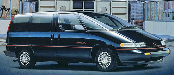
Art and design are subjective. What appeals to some may be abhorrent to others. Car design is no exception. No car designer in the world can pen a design so perfect it earns unanimous praise. There are some cars that manage, however, to earn widespread acclaim and appreciation for their styling. Conversely, there are some designs that are derided by the vast majority of commentators and consumers. My question is: are there are any oft-maligned car designs you find appealing?
When I first pondered this question, the first car that came to mind was the 1996 Ford Taurus. Read the comments section of any article on the third-generation Taurus and you will encounter a heaping helping of scorn for this controversial design. It seems to fly in the face of what is commonly regarded as aesthetically appealing in a car design: it doesn’t look longer, lower, wider or meaner than its predecessor and its abundance of oval shapes appears to many observers to be gimmicky and contrived. I beg to differ: I find its design intriguing and multi-faceted and I feel it has aged well. I loved it as a child and I love the design to this day.
While a somewhat similar and equally poorly-received design, the 1998 Ford AU Falcon is one I didn’t have such strong feelings about at its launch but I have come to admire. Like the ’96 Taurus, it was replaced with a heavily restyled version that was more restrained and elegant. However, the AU Falcon’s design is one that I feel has aged well and presaged the advent of the now ubiquitous “four-door coupes” like the Volkswagen CC and Mercedes-Benz CLS.
Coming directly after the slinky 1997-2004 Grand Prix was bound to hurt the 2005 Grand Prix’s reception but, long front overhang aside, it is a muscular and aggressive design and similarly echoes a four-door coupe design.
Paul’s recent article on the Chevrolet Lumina APV had me admiring the photos included within. While the expanse of dashboard inside and overall practicality vis-à-vis rival minivans were valid concerns, the exterior design – to my eyes – is clean, futuristic and elegant. These were a funky, fresh design without looking like an over-inflated water balloon à la the Toyota Previa.
Of the same era, the 1991 Oldsmobile Ninety-Eight is also frequently criticized for its design. Other large General Motors sedans of this time, like the Chevrolet Caprice, were pilloried for incoherently juxtaposing traditional design elements with more aerodynamic lines. The Ninety-Eight, however, managed to retain a fairly conservative roofline and chrome rocker panel trim – stylistic elements rapidly becoming déclassé – without looking awkward. Well, to my eyes at least. Its platform-mate, the Buick Park Avenue, is regularly praised for its elegance and comparatively flowing lines but I prefer the Oldsmobile.
In some respects, the Oldsmobile Achieva appears almost like a mini-Ninety-Eight. I find this small Olds rather handsome. After a decade of almost identical-looking cars, General Motors was finally exhibiting some design flair. I feel it is better to take a risk with a design rather than continue trudging along with bland, anonymous designs. Alas, the market tends to disagree.
I also rather fancy the wild 1992 Buick Skylark, especially in sporty GS trim. Its wedgy lines are intriguing, its pointed prow like nothing else on the road.
Some other cars come to mind as well, like the daring 1961 Dodges…
…or the 1961 Plymouths with their piercing prows.
Finally, the 2007 Lincoln Navigator may have made the Cadillac Escalade look subtle by comparison, but inside and out these look the very definition of a 21st century Brougham…
…or like some modern day interpretation of a fuselage Town & Country.
Seriously, aren’t these almost 1970s-retro? I know Lincoln was going for a ’60s vibe with the grilles of some of their products last decade, like the first MKX, but these Navigators seem to harken back to the days of shag carpet and leisure suits. And I love it.
So, what cars do you love the look of that everyone else seems to be repulsed by?
Related Reading:
Curbside Classic: 1961 Plymouth Fury
Curbside Classic: 1998-2002 Ford AU Falcon
My 2003 Mercedes-Benz ML320.
This vehicle gets crapped on routinely online but I think it looks great in black!
The most obvious one for me is the Tempo/Topaz. The first time I saw them I didn’t like them but their looks sure grew on me. I like the first generation the best with no preference for 2 or 4 door but in the later ones I prefer 2 door; also in the later sedans I don’t much care for the Tempo’s C-pillar treatment but I really like the Topaz roofline.
Re: ’96 Taurus: Did NOT approve of the sedan, mostly because of the REDUCTION in rear seat headroom on what was supposed to be the typical American family sedan. However, the wagon suffers no such malady and I fully approve of that design (’99 Sable wagon owner).
always loved the tempo/topaz- look like mini continentals
What really helps Tempaz’ appearance is for them to have “correct posture”. I think some of them suffer weak rear springs so they adopt a nose high, draggy butt attitude. None of the many Tempaz I have have done that but even so, on one of my coupes I cut the springs to lower it, cutting a bit more off the front for a slight nose down attitude. Ahhhhh, that’s the ticket!
We happen to have a 98 Sable wagon which doesn’t bother me either. However, I do not care for the sedan whatsoever. It is ok from the front but the profile view and rear view I can’t stand. Those are no issues in the wagon.
A car I like, but many don’t, are the basic K cars from Reliant/Aires to Caravelle/600. Not so much the Le Baron where part of the roof line is part of the rear door. I seem to like angular cars better than round ovoid cars. If I had to choose between one extreme over the other I would go angular.
Marlin and Pacer. I just get AMC’s vibe I guess.
Here’s a list from Edmonds of a top 100 ugly cars (by whose standard they don’t say):
http://www.edmunds.com/car-reviews/features/100-ugliest-cars-of-all-time.html
Though they’ve got the 1957 Mercury Turnpike Cruiser at position 31 (and rag on the roll down rear window) so obviously the list is suspect.
I, too, give the nod to a few Kenosha Kreations: Pacer, ’74 – ’78 Matador coupe, and 2nd-generation Javelin. I also like the Renault Fuego.
Yes to second gen Javelin, but only in AMX form!
Just glanced at that list and yeah, it’s very suspect. It’s like whoever made up that list believed that every car produced since WW II should have been a rolling metal masterpiece….but wasn’t, because of laziness (?), stupidity (?), near total lack of taste (?), on the part of the designers and/or manufacturers.
Unfortunately, I can’t come up with a car that others find attractive that is commonly considered to be ugly, except for the 61 Plymouths. Sure, just about every other car built in the 60s looks better, but I’ve always thought these Plymouths exuded a weird sort of confidence. Sort of: “I may be ugly, but….”.
Cars I consider ugly, but a vast number buy anyway? Just about anything built by Toyota/Lexus (if not ugly, incredibly boring/bland looking) and EVERYTHING with a Porsche shield on it’s nose….and 4 doors.
I liked Ambassadors, all styles, 2 door, 4 door, wagon. Liked them for the unibody space and material efficiency vs. the Ford and GM large cars, liked for the understated decoration. Big 3 cars were over-the-top baroque in comparison. An ideal compromise between function and style. Liked the face, liked the proportions, even the back was okay I thought. Not ugly as so many have said.
Being a Kenosha kid in that era, got close to many of these. I rode with bud driving his parents’ Brougham coupe a few times… the 360, Torqueflite, and twin-grip made for a fun ride. Another bud’s parents’ Amb wagon was a sports car compared to our own clamshell Chevy wagon, while having nearly as much room inside.
I liked the Brick, and was disappointed with the ’74 Matador coupe. I liked the Pacer.
1972 Ambassador
I agree…. I have a 68 4 door SST – a very nice family cruiser and not a slouch with its 4V 343
Nice car! Makes me miss my ’69 SST for the very reasons you mentioned. It was a great daily driver back in the early nineties, but it was all original and needing work I could not accomplish, so I passed it on to another AMC fan.
The third gen Sebring, the Crossfire and the ”upside-down bathtub” Caprice. They look really good to me, and I really don’t understand why other people don’t like them.
I had no idea people thought the Crossfire looked bad. I’ve always liked it.
CC48: I always thought it looked like a Chrysler front clip had been grafted to the rear end of a New Beetle.
I agree with the Crossfire and Caprice. The Sebring…well, let’s just say I was thankful for the “200” facelift (seemed like it became a decent-enough cheap sedan).
Oh, and also the Aspen (Chrysler, not Dodge). That is one of my most favorite cars.
1998 Fiat Multipla – a triumph of sense over sensibility 🙂
+1
+1
Agreed. Arguably the bravest design of the past 25 years in that regard.
+1 Looks great imo; I would buy a Multipla if they came with auto trans
I was just about to say the same thing – I love these! Only the pre-facelift ones like you’ve pictured though, the 2004 restyle took all the fun out of them.
They always make me smile when I see one, which is more often than you might imagine.
I rode in one once. The scenery (in Provence) was beautiful and distracted me from having to look at the car). But in hindsight, a useful car, not unlike an Italian Aztek. My vote for a car that is often reviled by non-enthusiasts, though probably not by CC-ers, but to me is a triumph of clean styling and proportions, is the Volvo 142/242 and also the wagons. The 4 doors, meh.
+1
The Chrysler Sebring/200 four door 2006-2014. There were some odd angles around the rear door but the extra helping of decoration made it stand out from the completely generic looks of most competitors. Inside as well there were enough dated but very mopar looking radio and instrument displays that I got a definite sense that this would be my father’s car if he were still around. His last three cars were a Dodge 400, a Plymouth Reliant, and a Plymouth Scamp.
+1 on the 200. I admired them for awhile, and finally bought a ’13 Touring model. Still love it.
The 200 for sure, the Sebring (hood strakes aside) had an inexcusable interior for a Chrysler. Once they’d changed the name and fixed the interior materials, it became something decent to behold. Or rent. But after Consumer Reports’ reliability reviews, I’m not really willing to take the risk. The staggering depreciation might overcome that objection, because a V6 powered 200 might even be fun?
The problem with the 200, to me at least, is why get one when you can get a 300? If Chrysler wanted to step it’s game up, they needed to do it across the board. Even in higher trim, the 200’s interior still seems not much better than the stripper rental fodder versions when in actuality, it needed to be at least as inviting as a second/third generation 300c.
The problem you set out applies to the current 200, where Chrysler tried to failed to sell at 300 prices. The old 200, the old Avenger, and too a large degree the Compass and Patriot CUVs sold mostly as basic $14995 specials. The old story of bringing in an expensive foreign model, charging more, and seeing the volume go away was the the Contour or G6 redux.
The Pontiac Aztek… Just kidding 😀
People here don’t like the Porsche 924/944. I always liked them, especially the 944 S2, certainly dated but in a positive way.
I always liked the Multipla too, very confortable and practical. Globally I think that bio design, with no straight lines (unlike a lot of cars of the 80’s which even if I don’t dislike all of them you can see how old they are) aged pretty well and still has some influence with cars of today.
I don’t hate the Aztek as much as others. OK, it’s not Alfa Romeo beautiful, but it’s not as “ZOMG WORST EVAR LOLLLZZZ!!!” as others think. If anything, it was ahead of its time. If you had slapped a Land Rover or BMW badge on it in 2011, it probably would have sold quite well.
* The main problem with the styling for me is the base model’s hubcaps: those are undersized and truly hideous. The fade-prone cladding didn’t help, either. But a later, higher-trim model without cladding still holds up today IMHO.
The reverse is true for the PT Cruiser: people consider it ugly today but people were putting down outrageous deposits and waiting months for “theirs” back in 2000!
Check this Aztek out!!!
http://justacarguy.blogspot.com/2016/05/om-empahasis-f-g-it-looks-like-someone.html
Re: hubcaps: Remember those awful, awful black plastic discs on the “KITT” Trans Ams?
Wow!
And yes, those “KITT” hubcaps were certainly bizarre.
Re: 924/944: It’s amazing what a nice set of fender flares will do! Because I don’t like the 924 AT ALL- bland- but the 944 I LOVE- exciting!
Same goes for the ’87-’96 Pontiac Grand Prix coupes- base version completely lacking attractiveness while the GT with the flares and a different nose totally transforms the look in a good way.
There’s actually quite a lot I can think of so I’ll just throw out a few closest to heart – Formal roofline 83-97 Mercury Cougars, that goes for both the MN12 versions like mine with just the polarizing roofline, as well as the Fox versions with the almost universally maligned upswept side windows. GM made a lot of ugly cars with the upright roofline in the 80s, but few had proportions fitting for it besides the 79 Riviera Toronado and Eldorado, the Cougar was long low and with the Tbird’s aero hardpoints, depending on your point of view
gave either a truly unique combination or simply disjointed. Whatever. I always saw the former and sought out the Cougar because the Tbird looked more plain, and I still think so and still own one.
Speaking of Cougars, though not one I have much personal connection to, I think the 71-73s are also a lot more attractive than people give them credit for – no they don’t have electric razor grilles but the proportions are still sweet and with the shift of aspirational Ford design from Thunderbird/Continental to the Mark III, it gave a unique blend of chiseled muscular styling of the period as well as that baroque luxury the Lincoln oozed.
I agree about the 71-73 Cougars, still had a sporty edge to them. And I like the ‘big’ Stangs the same way.
I grew up with that upright formal roofline and liked it. It was a space-efficient design and looks fine. I was surprised to read some people think its ugly.
The upright roofline only seemed to play in America. To many of us elsewhere it looks strange, possibly because we never saw that sort of thing in traffic, except for the Volvo 740/760. And they were never common in Australia.
I once saw an Aztek that was all black…no grey side cladding with oversize wheels and low-profile tires. And I LIKED IT!
Ford Flex.
I don’t know if they’re commonly considered ugly, but several people I know detest them, including my wife, who thinks the Flex is clownish and dumb-looking. Therefore, I’ll never buy one (nor have I ever driven one)… but I do like them.
I like the Flex. Its a dumb name and I wish it was RWD but I like it as a modern wagon. If it was RWD, I would have considered buying one.
Me too. The Flex looks fine to my eyes – not over-aggressive, unlike so many snarling modern cars. Had a very satisfying couple of weeks driving a Flex around British Columbia.
I tried out a Flex when shopping for minivans. Drove great with a nice solid feel to it, a well done interior and it was bigger than I realized. Surprisingly I liked it much better than the Explorer, Lambda triplets, and Pilot. None of them were a worthy substitute for a van though. 🙂
Pic:
I like them…. not a minivan not a me-too SUV, but kinda unique, as if a bus and a hearse had a kid.
Good call. My wife gripes about them every time she sees one, and I’ve learned to not debate it. However, I’m not sure they’re aging so well, so she might be wearing me down.
I like the Flex for what it is: A good honest family vehicle evolved from the station wagon, without the pretense of CUVs…which are trying pathetically to evoke the same sense of capability of sports utilities.
I like the Flex as well – provided it isn’t equipped with undersized wheels.
discussed this car recently, the first generation infiniti m45. And the second generation Lexus GS. Both cars looked very JDM, the GS’ looked very fast and furious but I love them.
As I recall, the M45 was essentially a LHD version of the final Nissan Cedric/Gloria series — big traditional Japanese luxury sedans — so that’s a fairly apt description. I like that car as well. I’ve said this before, but I think it’s sort of what the downsized B-body Caprice or Ford Panther cars might have become if they had continued to evolve more organically.
I just saw one parked on the street. It really looks like nothing else. It really does have a Panther look to it. I love the interior with the bird’s eye maple accents and it has a beautiful V8 under the hood. I really didn’t care for these cars when they were first introduced here but they have really grown on me since. Especially now where all cars are starting to look the same.
Amc Eagle, I really like them . I’ve seen them listed as one of America’s most awkward designs, and I Strongly disagree. They were the 1st real SUV, even though Subaru had a 4wd wagon, they were Way too cramped on the inside and too cheaply made. In the northern states they rusted out quick enough to fail MA inspections after just 3-4 years due to Truly unsafe rot underneath. At least the Eagle’s came w/Factory Ziebart . Still hope to someday acquire a 2-door sedan Eagle.
A handful come to mind:
1962 Dodges and Plymouths. Not ugly, just ‘different’ and their race heritage is a huge saving grace
1974 Matadors, both the coupe and sedan. Again, to me, not ugly, just a little different and they look great in a uniform; the sedan as a police car and the coupe on a NASCAR track.
1980 Seville. I always liked it; I had the Hot Wheels Seville hot rod when I was a kid so maybe Im biased.
I think the Aztek gets a bad rap. I don’t think they are particularly good looking but once they were decladded, they look no worse than any other contemporary crossover. Compared to the Nissan Cube or the Juke, which look like vomit on wheels, but they seem to have gotten a pass from the automotive press.
I also had the Seville Hot Wheels when I was a kid (2 of them actually, the gray/burgundy two tone and the metallic gold) and I’ve always been a fan of the real thing. I think there’s something there!
If I found an ’80 with the 368 (without the 8-6-4 deactivation) for a reasonable price…it’d be very, very tempting.
Nice that you showed us the 4-door Achieva; that was one of the era’s cars that looked much better in its 4-door version than with 2 doors (the other biggie being the Caddy Seville Touring Sedan).
The car that gets a lot of hate (and did when it was new, too) that I’ve always liked was the ’62 Plymouth. The overall proportions haven’t aged that well – at the time it was criticized for being too small, and now it looks huge – but I thought it was a knockout from every angle. I thought if I could just have a black Fury convertible that’d be about as sexy a ride as a guy could have. The Valiant was pretty damn cool too, though I didn’t like the fake Continental-kit effect and so preferred the Lancer when it appeared. The wagons however didn’t have that problem – I got to drive a 3-on-the-floor one of those and tried real hard to buy it from the guy, but he loved it too.
And when I finally got to drive a ’62 full-size, it was a beat-up two-door V8 automatic I got for a loaner while the used-car dealer was paying to rebuild the engine of the ’59 Volvo I’d just bought (busted fuel-pump diaphragm, instant flooding of crankcase/seizure). It was the perfect substitute, because it had the same loose-limbed rascally charm the Volvo had, a real hoot to drive, and very secure on the road in spite of everything.
I think the early ’80s Buick Skylarks actually looked better as 4-doors. That can’t be said for very many cars, although for SUVs (thinking of Blazers and such) I can’t think of any real benefits to having a 2-door and they certainly don’t look any better.
I have a ’59 Bel Air sedan and of course while most of us dream of 2 door hardtops or convertibles, it takes a lot more money to get one. I tell people that you don’t notice the extra two doors when you’re behind the wheel. But like most things, it has grown on me to the point where I really don’t crave the two door version over the four door version at all. But offer me a nice ’59 El Camino… !
2 door cars, because the door is generally larger, place the b-pillar farther back. This means a better sight line on a shoulder check and in many cars easier in/out access for front seat passengers. In some cars it also means your elbow not hitting the pillar when your arm is resting on the open window if you have the seat all the way back. Considering I rarely use the rear seats of any vehicle I’m driving those features are worth while even leaving aside 2 doors generally looking better IMO.
So many people malign the 1959 Plymouth, but I have always found it a BIG improvement over the 57-58, and one of the most attractive cars of the late 1950s.
Yes! A neighbor had a ’59 Fury in baby blue with all the options, including the racy dual swept radio antennas in back. Beautiful and fast.
My uncle showed up with a new red ’59 Fury 2 door at out house. I was all of four, and still today remember it as being the first car I remember that I can recognize today.
The fins and the fake conti kit really attracted my attention.
A family friends red ’62 Valiant is another car that I really liked, especially the Siamese cat eye taillamps.
Another one that I thought of: the 2013 facelift of the Hyundai Genesis Coupe. Many people despise it compared to the 2009-2012 version, but I actually prefer the facelift. The pre-facelift, IMHO, looks comparatively bland and dated to me, while I fell in love with the facelifted version when I first saw spy shots of it. I wouldn’t buy one with all the newer competition out there, but they did a great job incorporating their then-new design language with an older design.
The entire 1962 Chrysler line. Most people deride those cars as plucked chickens or warthogs, but I found them much more involving (is that the right word?) than contemporary Ford or GM products. I remember a ’62 Dodge hardtop on the showroom floor at Lawrence Motor, white with red upholstery. Yum. Warthog love. I also have a taste for Plymouth Fury hardtops of that era. And of course I like the big Chryslers.
I loved the Chrysler line too, most specifically the Plymouth. I figured if I could have a black Fury convertible I’d have the sexiest damn car in town. I loved the Valiant too, except for the fake Continental-kit thing, but the wagons didn’t have that, and I thought they were handsomer anyway.
Six or seven years later I finally got to drive one of those Plymouths for a week or so while my Volvo was in the shop, a two-door hardtop, V8 and automatic. I was so tickled that it drove exactly like a big Volvo, kinda loose-limbed and rascally but dead honest on the road.
Big fan of the ’62 Chrysler myself. I love the “slant eyed” look, and I think they did a very successful job of excising the huge ’61 fins (which are great in their own way) and leaving a coherent tail treatment that doesn’t clash with the rest of the car.
I like the ’62 Plymouths just fine also, but those Dodges…yikes. Too much weird, way too much.
From the other side of the Atlantic, I’ll have three polarising designs in my fantasy garage – a Citroen Ami, an 18/22 Princess, and a discreetly finished Bentley Arnage.
To me the Ami is still curious. It’s so ugly it’s kinda cool!
I’ll second the 1980 Cadillac Seville. I didn’t care for them at that time, but I find them quite fetching now. I wonder what’s next for me, admiring an Aztek?
I love the Bustleback Seville. I think it was very neo-classical ’80s classy. Much classier than all the used bar of soap designs we have today.
First one that comes to mind is the SC430. As for new cars, I really like the design of the latest Prius.
Russian cars. My favorite modern ones are the Lada Vesta and Niva. Classic one would probably be the Gaz Volga
http://www.lada.ru/en/cars/vesta/sedan/tth.html
http://www.lada.ru/en/cars/4×4/urban/about.html
https://en.wikipedia.org/wiki/GAZ_Volga
The 2008-11 Focus was panned for being too plain, but I liked that it was more mature and less ‘boy-racer’ avant-garde.
Another is the Acura ‘beak’ grille. It’s fine to me. Was way better then some outrageous stuff out there. Seemed like car critics were nit picking.
I totally agree with the 08-11 Focus. It seems like people hated that particular generation more when they were brand new than they do now because back then “we” (the US) were unfairly deprived of generations of the Euro Focus. Well now that we have the Euro Focus, which had a few very unpleasant quirks in those first few years.. *cough* Transmission *cough*… *cough* Sync *cough*.. and styling that is hardly avant-guard itself, those 08-11s suddenly don’t look too bad afterall.
Plus, I don’t know if anyone else has noticed this but, the 08-11 sedan’s profile and greenhouse actually looks more like a scaled down 2013-current Fusion(a car which gets a lot of praise for it’s good looks) than the 12+ Focus sedan or it’s mid cycle fusion nosed 2015 facelift produced.
And less room inside from the 08-11 as well.
YES on first-gem Focus. One of two cars I’ve rented and fallen in love with. It was so obviously cheap but very well done – my first thought was that if IKEA made cars this is what they’d be like.
I just hate that they’ve gotten so damn big, but that’s my beef with a lot of cars now anyway.
’61 Dodge
AMC Pacer and Hornet
Colt Vista (I actually owned one!)
I quite like the Colt Vista also. I think it was better proportioned than some of the other 80’s mini-MPVs (looking at you, Stanza Wagon).
2009-2014 Acura TL. I’ll even admit that the original 2009 version’s grille was a bit much, though I still liked it for its boldness. The 2012 facelift however, turned it into a very attractive sports sedan, with the new front and rear fascias better complimenting its aggressive body lines. I seriously wanted one of these in SH-AWD trim, and would’ve purchased one instead of my still very much loved TSX had they been within my price range.
I like the looks of Acura vehicles. I always thought Acura had pretty restrained, elegant designs. The “beak” grille doesn’t look that bad.
However, the new Civic is completely ugly in my opinion — at least the Acura division can make something attractive!
I have a 2013 TL SH-AWD and I love the looks of it. The 2012 facelift really improved the looks. It’s a very underrated car.
I agree. I still prefer the styling of the 2004-2008 (disclosure: I drive one), but I have warmed to the 2009-2014, especially the 2012 facelift. The huge “beak” on the earlier ones can be toned down with paint or an aftermarket grille.
I bought my 2008 TL because it looked like an Alfa Romeo 159 which at the time I thought was one of best looking sedans but not available in the U.S.
That’s the only newer Acura I like, especially the can opener grille. Doesn’t have enough wood trim and such in the interior for my taste, but the exterior actually looks good.
Call me crazy, but I think the 1980 GM X-bodies were very attractively styled and showcased their divisional identities well. The best looking ones to me were the Citation and then the Skylark, followed by the Omega (lots of folks hate that one, but I think it looks like a small Olds, which was the point). The Phoenix wasn’t bad, but sort of incongruous with the Bonneville-style front mated to the fastback 4-door–the 2-door looked better to me.
I liked them too, all of them to one degree or another. Shame the mechanicals, paint, and rust resistance weren’t better sorted.
I can think of a bunch, but two that haven’t been mentioned:
’58 Edsel
’58 Buick (except the Limited, don’t care for its side trim.)
I don’t know why people disliked the styling of the Ridgeline so much. I thought they were suitably adventurous for Honda, with a lot of neat features. I’d get one, but they’re just too thirsty when compared to competitors that can do more.
The newer Ridgeline really DOES look like a Pilot with a bed stuck on, I don’t think it’s nearly as good of a design (though likely a better car overall)
I was actually looking forward to the redesign of the Ridgeline, but comparing them, the old one actually does look better in my opinion.
Also, the new Ridgeline doesn’t look “masculine” enough for me, to be honest.
The original Ridgeline was panned because it looked like a Avalanche knock-off with an awkward nose.
Today those FWD noses on CUVs have become commonplace so they don’t look as awkward. We’ve become accustomed to them. And the Avalanche got less blocky and is now gone.
While I never really loved the looks of the original, I didn’t mind it and I do agree that it looks much better than the new one which too easily betrays its minivan platform sharing. It has also lost its durable truck-like interior with useful dashboard shelf in the name of refinement. Not even a volume knob for the radio survived. The new one has a more practically shaped box and is better overall. But it is awfully soulless. They really have a good idea going IMO but they just don’t understand the market and keep flubbing the details.
I’m one of the few it seems that thinks the Monaro GTO is a very handsome car.
I also think it’s looks have held up way better than the first retro Mustang from the same period (plus it’s faster and better quality).
Plus I put my money where my mouth is.
As an Aussie,but not a fan of any particular car, I could never really understand what Americans thought was wrong with the style of the Monaro.
The GTO was just too dull at a time when everything else was getting much more stylish. It looks like a 2-door version of a mundane family sedan. It’s not bad looking, it’s just not very desirable IMO.
It’s not a huge stretch to call it a 2 door V8 powered Catera. That was a very late car to be wearing soapbar 90s styling. Not that it was unattractive at all, it was just pretty out of step for the era.
They seem to looks best in black for some reason.
I liked these. Sadly, we’d rather buy cars that look like props in a Transformers movie than something an actual understated adult might want.
I think had Pontiac not bolted a wing to the back of EVERY SINGLE ONE, and added dual exhaust outlets on both sides of the bumper from the start, and used the hood nostrils from the start, initial reception would have been much more positive. I remember when the 04 came out, it looked pretty much like a 1994 V6 Mustang. The upgrades that came in 05-06 (especially the 400 horsepower 6.0!!!) really finished what those cars promised, and God bless the owners who ripped the wing off the back
yeah, I liked the GTO… it looked like a big Grand Am…a complete sleeper. Something fast an adult would drive…they tend to overdo the kid racer stripes on modern muscle cars. I think it didn’t sell cause it didn’t look like a GTO though. I personally lost interest when it turned out that the manuals were extremely problematic.
Count me in for the Gremlin!
+1, but I guess that’s obvious.
Does anyone find the W123 series Mercedes-Benz attractive?
I always thought they were great-looking vehicles, but some call them “ugly” or whatever.
Granted, the circular headlights may not be as attractive as the rectangular ones (or, likewise, U.S. vs. euro bumpers), but other than that it’s a very handsome and conservatively styled vehicle. Very timeless, very elegant.
I always found the w123 one of the more attractive Mercedes ever made. I think the US bumpers and headlights added after the fact are ugly, same with the W116
Absolutely the W123’s are attractive. More so with Euro lamps/bumpers, but I like them with the US-spec pieces as well.
I’m a sucker for color-keyed hubcaps so I like them much better with those than the later alloys.
I agree about the color-keyed hubcaps…and only Mercedes could really pull that look off — especially for as long as they did!
I think the color-keyed hubcaps are especially attractive in that maroon/dark red color, especially when paired w/ the palomino MB tex interior. A very rich, classy look indeed.
I’d probably have to go with the 1982-1987 Lincoln Continental.
Go ahead and say it was a Seville rip-off, but I think Ford did this style theme right. It just looked so modern and stylish for a Lincoln.
The 1982 Lincoln Continental Givenchy Edition (wallpaper):
+1 with the original upright front end and two tone paint like this example these are one of my favorite Lincolns.
I will say however, the “aero” nose with those big giant wraparound corner lights really ruined this design for me, as well as the puffy vinyl tops they often had. This is ugly…
+1, but then again I also like 2nd-gen Sevilles and bustleback Imperials. The aero nose restyle wasn’t handled well–they should have made it more like the Mark VII–but the originals were classy.
(I don’t dislike the refreshed cars, but the upright nose worked better.)
I like these as well!
Agree or disagree?:
The Mercedes-Benz W126 series is a beautiful and timeless design. Bruno Sacco really knew what he was doing when it came to car styling.
The W126 was also a very sleek design for its time, given how large the car was, even in the long-wheelbase variant.
Is there really anyone who has ever called the W126 ugly? That’s one of the higher praised luxury car designs I recall within my lifetime
I really don’t think anyone’s called the W126 ugly…I guess I just pointed out/had to confirm that it’s NOT commonly regarded as ugly!
(The W126 is by far my most favorite s-class. I had to say something about it!).
I liked the looks of the Buick Rendezvous. It looked clean and classy to me
Me too. I actually don’t think people consider it as ugly as the Aztek though.
I didn’t like the Aztek styling that much. It just looked too abrupt to me, but the Rendezvous looked more natural to me.
More functional too, it had room for a third row which is something every wagon that big should have.
Ah yes, I forgot it offered a third row. It really was ahead of its time.
’53-’54 Plymouth for sure. ’58-60 Rambler American is just right… but I agree with the critics on the ’61. It’s an awful mix of rectangles and triangles. Lately I’ve come to appreciate the ’57-58 Mercury, a good mix of rectangles and triangles.
I actually like the 60 Mercury quite a lot. I don’t think I have much company, though.
HA! My dad bought a 4-door ’60 Mercury as a beater when I was about 10 years old. (Approximately 1971)
Baby-poop brown with a white top. Most of the body styling was a snooze, but the grille and taillights were kinda cool.
Somewhere there’s a picture of me operating the bumper jack to help fix a flat right-front tire. That car had the endearing habit of belching up transmission fluid onto the exhaust manifold at random times, so it didn’t stick around for very long.
I’ve always loved the 60 Mercury, JP. The 59 I thought looked too much like a Ford from the front.
The 59 Chevy is often maligned for the batwing rear but I think it is beautiful One of the best of the 50s. The 73 Mustang is viewed as bloated and overgrown but it has nice proportions with the long hood and short deck, despite a cramped interior.
Citroen 2 CV . They make me laugh too. I love the sound of their engines.
The Third gen Navigator is regarded as ugly? huh, must be living under a rock.
I always had a bit of a soft spot for the Whale Caprices. I don’t think they look terrible, and they manage to wear their weight and overhangs well. I also like Lincoln’s current lineup, minus the MKT. Everyone gives the “Baleen Whale” grille crap, but I think the current gen actually makes them work well.
Other mentions, the 79 Monte Carlo, the dustbuster vans, the Cadillac DTS, the current Jeep Cherokee, and the Triumph TR8.
Most of the cars I like have been considered ugly. My wife vetoed the Colt Vista (I’d call it “Galileo” for the shuttle pod). She also thinks if I get my lusted after Buick Roadmonster wagon it should be white and named “Beluga”.
What can I say my first car was a Citroen ID19. They still look thoroughly modern but in the ’60s looked like something from outer space.
I’ll throw my vote for the Dodge Avenger. I find it its styling muscular. All it needed was rear drive and the 4.7 liter v8. I was baffled how the magazines panned it…
The magazines always need a whipping boy.
I agree with the choice of the last Olds Ninety Eights.
My choice would be the 1970-71 Thunderbirds (particularly the sport roofs)
I’ve always loved the looks of the Rolls-Royce Camargue, and of the S3/Silver Cloud III coupes/convertibles by Mulliner Park Ward. Most people seem to think all of the above are ugly.
The (to be un-PC) “chinese eye” cars? I’m sure they don’t agree with some folks, but I love them, and I think they are regarded as legit classics and one of the more interesting coachbuilt S/Cloud variants.
The Camargue I can’t find as much affection for. It’s not unattractive but I don’t think it’s aged all that well.
I like the ’58 and ’59 Edsels, but not the station wagons. (The Ford wagons of those years look fine to me, but the Edsel versions, with mostly the same sheet metal, just look odd.)
I had a ’62 Valiant 200 wagon, and liked its styling; when someone failed to yield the right of way and crunched the front end, we transplanted the engine and some other parts into a ’61 Dodge Lancer. My criticism of both of them is the crappy quality of interior materials.
I have a soft spot for the gaudy excesses of GM’s 1958 lineup; to me, they don’t look nearly as bizarre as most of GM’s 1959 models (with Cadillac being the most over-the-top).
I don’t think the 2008 Taurus is ugly. The Mercury Sable wore the look a bit better, but the Taurus isn’t terrible looking, just a little utilitarian.
I also think it’s replacement, the MKS, has always looked good, even after its refresh in 2013.
The Cavalier and Cobalt also got criticized for their looks, but I thought that was by far the least of their problems.
BMW Z3 coupe
Affectionately called the “clown car”
Please don’t ask my why, but I’ve always found the S10 Nissan Silvia/Datsun 200SX to be attractive, despite my suspicion that most people would describe its styling as “bizarre.”
I knew someone back then that had one, and I thought the design seemed “half a bubble off plumb”. But now I’d love to have one, especially a JDM model.
Like ’70s AMCs! I always thought that if one squinted while looking at an AMC one could imagine that the concept looked good on paper but didn’t quite make the transition to 3D.
Definitely cool. Adventurous, a bit odd, but cool.
Those are fantastically weird. I can’t quite call them attractive, but I would love to own one just the same and they definitely transcend ugly.
Honda Crosstour. Reminds me of a modern ’54 step down Hudson.
Of these, I like the Olds 98. Hmmm…
I like the 80-85 Cadillac Seville, despite the humpback.
I also like the 70s economy cars from the US that are sometimes lablasted, like the Gremlin, Pacer, and Chevette.
I have always liked the Aztek, from day 1. I’ll take one with the camping package please. I also like the Nissan cube, Platinum edition…of course! I also once owned an Isuzu Stylus, people thought it to be strange looking, but I really liked it.
A second vote for the Fuego. French cars never seem to get any respect.
And an honorable mention to the first gen Studebaker Lark. My dad had a red 60 2 door sedan, but I find the 2 door wagon particularly attractive.
57 Nash Ambassador. They finally got rid of the chipmunk looks just before they killed the senior platform.
Hudson Jet, though I’ll admit it looks better in pix than in the flesh.
57 Hudson Hornet. Detailing a bit heavy handed, but overall a handsome car. Prior to 57, I think the Hudson should have outsold it’s Nash stablemate.
I like the ’57 Nash too. The front end styling always reminded me of an old tube radio if the headlights were substituted for knobs.
Looks like Toyota admires the old Hornet too. What else could explain their new frontal styling trend, seen here on the Yaris. OMg
The current generation of the A-segment Toyota Aygo started that trend. But somehow the X-factor looks more natural on that little Toyota, because the whole car was designed that way.
On the B-segment Yaris it’s just a facelift that went horribly wrong.
I never knew there was a 2-door wagon Lark. Very cool. I’m a fan of almost all wagons but I particularly like the rare 2-door ones.
Also a fan of the Fuego, though it’s been ages since I’ve seen one.
+1
The Fuego straddled the line between crazy French design and mainstream acceptable about as well as any non-Pininfarina French car ever did. The Fuego had a lot of faults but styling wasn’t one of them.
Some of these like the Taurus were actually bad. But the GM plasticvans, although not up to the concept car, were pretty awesome to me for 1990. I bought one about a decade later. But the only one that works for me is the Pontiac version, because the cladding changes the linear shape into something better.
I’m not surprised the “lead” photo was a Gen3 Taurus, which does seem to be a lightning rod for CC criticism. That 1998-99 freshening (pictured by Mr. Stopford) made it a little more conventional, for better/worse. I’d like to believe that posterity will be kind to the “original” 1996 styling (below)–we’ll see, I guess…
Speaking of which: designing a car has gotta be a tough job to pull off (with all the guesswork about what’ll appeal a few years down the road), yet it’s ever so easy for CC-ers to armchair-quarterback the stylists’ work from some years’ perspective. I prefer to be designer-sympathetic and say “it doesn’t especially appeal to me” rather than “OMG, that’s ugly, what were they smoking?,” etc.
**********************
BTW, another poll sometime might be “what’s a (consensus) stylish car that still looks awkward from certain angles?” (or, “what’s the best angle on a car you think is ugly?”)
Roughly this angle is best for me in a sedan.
Worst angle
LOL, that rear 3/4 pictures is from an Aussie-sold Taurus
Suzy: the perspective at the time was that the styling was unattractive to just as many today. And people shopped elsewhere.
Especially coming after the almost universally loved first and 2nd generations. Ford lost the plot on the Taurus and Sable with this edition.
Ford Escort EXP.
It didn’t LOOK too bad, but I rented one during a summer vacation, and it turned out to be the most sluggish, gutless heap I have ever driven. I needed the AC, and every time I turned it on I could feel the drop in power. Lousy mileage, too.
I’ve never driven or even sat in one, but I suspect that among its flaws it has that sitting-on-the-floor-trying-to-peer-over-the-dash thing going on.
Lol. My brother bought the 1988.5 EXP as his first new car. Wanted a Mustang GT but insurance was way high. The EXP was a lousy POS.
The 1991 Olds 98 is also awesome. Half retro for that time with the non-full rear wheel opening and somewhat formal roofline and also formal squared off rear, combined with a smooth aero body. It had something of what the 1961 Lincoln had. Lots of curved glass area, and of course huge interior and trunk. Also a much better dashboard than the Buick version. I shopped for a used one at one point, hoping that they were so unfashionable by then hat they would be really cheap, but it turned out that the Trans Sport was apparently way more unfashionable and was really cheap, not to mention what I really needed in terms of practicality.
1992 Olds 98 Regency interior
i like the look of Datsun Btwotens.sedan and hach.Peugeot 405&206.
I like most cars that are considered ‘polarizing’. The Gremlin, 2nd gen Javelin, Honda Element, Toyota FJ cruiser, Pontiac Aztec, Chrysler PT Cruiser…there are many more, but all of these hold SOME appeal to me since theyre at least making the effort to do something different and stand out.
What I find truly repulsive is the bland and boring, hence my disgust for 99.9% of 4 door sedans, SUVs, and minivans out there. The inoffensive tends to offend me. Likewise, I’m the only person I know who can feel their blood boil when muzak plays…
I agree that the 1996 Taurus is maligned. It’s not one of my favorite designs ever, but I don’t get the hate.
Another car that I don’t understand the maligning is the 1980 or so generation Thunderbirds. Sure they’re a bit boxy looking, but it was a smaller design that was necessary from the 70’s T-Birds. I would totally rock one.
Come to think of it, most cars that I love today started as something that I considered ugly:
-Citroen DS, back in the days, I preferred 403, DS was weird.
-Mini Cooper (the original one), back in ’60s, I preferred Spitfire over mini cause of looks. Over the years, owned at least 5, 6 counting an ’08
-Honda Element, ok I owned one, first look was a ummmm, but learned to love it.
-Volvo 240, didn’t like the boxy look, but learned to appreciate the subtle lines.
1. The 1982-1985 Buick Skylark (the 1980 and 1981 models were truly ugly).
2. Ford Maverick.
3. Hyundai XG300 (a very American-looking car IMO).
4. Ford Festiva. I don’t ever want to drive one or even be a passenger in one but I like how they look.
I second the Maverick, especially the sedan.
The 1958 GM C Bodies
The 1959 Lincoln
The 1958 Edsel
The 1975 GM C bodies. Including my 98. They’re big but not, in my view, “bloated”. New cars are bloated.
The Chevette.
The Fox Continental. Especially in two-tone.
The 91-96 Olds 98, I wish they had made it on the Fleetwood/Caprice/Roadmaster scale as I’m convinced it was the best looking of the Bubble bodies.
Lastly, I think the current Buick lineup is the best looking one made by GM in years
Olds got jobbed by not having a sedan variant of the new RWD in ’91, and by the Custom Cruiser for only lasting two years. If they had upsized the 98 to the size of the Roadmaster with the same styling theme, I think it would have worn better.
What? The Fuego was supposed to be ugly? I thought mine looked pretty nice. By the way, I also liked the ’74 Matador coupe.
The Fuego was a sharp little coupe. Looked fine to me.
I remember the howls about the styling when it came out, especially the corrugated plastic insert at the beltline. The vitriol continued inside with the usual sniveling about the French take on the design of things like wiper and light switches.
yeah that one threw me too, it was (and still is) certainly regarded as a good looking car round these parts:
http://classics.honestjohn.co.uk/reviews/renault/fuego/
I know that received opinion has changed radically since it was introduced–and flopped–but I have always loved the Chrysler Airflow. It’s a rolling definition of the phrase “ahead of its time”. Art Deco masterpiece, as far as I am concerned.
And I don’t think the Aztek is nearly as ugly as most people say. Not that I would ever have bought one.
My wife, an import lover through and through, doesn’t get my love for Chrysler LH cars (and K-cars, namely the LeBaron variants). She scoffs at the second-generation Concorde every time she sees one and calls it a big whale. The 2002 refresh (a la LHS) subdues and improves the design; I prefer these over the the original 1998-01.
My grandfather has a ’77 Fury 4-door as a restored collectible. To no one who knows better that car could pass for a ’60s car. Hard to imagine the R-bodies (St. Regis, New Yorker, Fury) were the successors, they look 10 years newer. It’s big, longer than an extended cab pickup, looks dated with its side profile and the tailights integrated into the rear bumpers, but I just like that car. The Dodge Charger should have been modeled after the B-body Fury in my opinion. I like the snout nosed AMC Matador/Ambassador from the same era too.
I have to admit that the GM dustbuster vans aren’t that ugly, in fact I found them interesting as a kid. An Aerostar was more unattractive in comparison. At the end of the day, Chrysler’s minivan was the sharpest, especially the 1996-00 NS platform.
I am far from a a Toyota/Lexus fan, but I have to say that the 2003-07 (?) ES350 was pretty decent looking compared to what is out today. If I were held at gunpoint and forced to buy a Lexus, I’d pick this one.
Oh…I forgot the JS-platform Sebring and 200. How could no one like these (especially the 200)? I love my 200, it improved all of the flaws with the Sebring (mostly the interior, it was okay but a little too gray and a bit plasticky) but even the Sebring was a decent little car. I think Chrysler tok a step backwards with the UF 200. It looks too much like a Hyundai or Kia product, namely the interior and rear half of the car.
Sev: I am with you on the 07-14 Sebring/200. And the Avenger as well. Perfect size, roomy interiors [40″ front headroom], easy entry and exit. Lots of retro details in the Sebring and the top line tortoise shell trim was a nice touch.
Plasticky dash and trimmings, but I could live with that.
1962 Plymouth – I liked it when it was new and one of our neighbors brought one home, and I continue to like it today. I know the design was meant for a larger body and the car represented compromises but some details such as the oversized outboard headlight rims, concave grille, and matching hood and trunk trim pieces combined with a svelte body during an era of excess really worked for me. The Fury convertible is especially attractive. Perhaps part of my positive reaction when this car came out was due to my disdain for the hideous 1961 models.
For me, the 1971-73 Mustangs and Cougars were handsome cars. I had many friends who owned them back in the day and they performed well. The Mustang II is another story.
I like the 1957 Oldsmobile, a car subject to a lot of criticism when new and up through today. I thought it was a nice update of the 1955-56 which quickly became dated as cars grew longer, wider, and lower. Even the three-piece backlight, while impractical, looked good (as did the split-window Corvette). I’d take a 57 Olds over a 57 Chevy any day.
+1 on the ’57 Olds.
Did you have to ask? 🙂
Yes, and that’s another car they got right the first time and then proceeded to screw it up. Body got bigger, glass area got squeezed to little slits, perky 1.5 turned into 2 liter just to haul the mess around …
The ’71-’73 Mustang. Next door neighbor bought a Mach 1 new when I was a kid. So badass. Cragar mags.
I’ll be brave and say I’ll take one over a ’69.
So there.
Ive never got to like the Sable fronted Taurus we were sent and the AU is as ugly today as it was in 98 they are still quite common on the roads but most I see have the less ugly XR four headlight fronts whether original or retrofits I dont know, those early 60s Chryslers werent really that bad in retrospect and the others we dont have in any numbers if at all so eyeball searing Aztecs dont clutter our landscape, mind you some Japanese efforts can be pretty hard to look at.
The 1998 -2002 BMW M Coupe. One of my friends said the car looks like a Converse Chucky T basketball shoe… But I have wanted one since 1998
It’s like a z3 wagon…yuck. You will get absolutely no competition for one from me, good sir!
I nominate the 1976-1978 Chrysler New Yorker. Sure, it was a decontented 1974/75 Imperial but they definitely had some success in the “Gun boat” class. I didn’t always like then (used to think all that they were good for was a 440?Torqueflite donor), but the design grew on me. They have a presence that will never be repeated (good and bad..). I always see a bunch of old-people-survivormobile New Yorkers for sale–the survival rate is fairly amazing.
Really like those as well–the styling was pure Imperial. They were also one of the last 4-door hardtops available, perhaps *the* last?
Any Ami 6. Love these!
Others have already mentioned, at least obliquely, the ’60-’62 Valiant/Lancer/Rebel (well, okeh, nobody else until now has mentioned the ’61-’63 DeSoto Rebel member of that ’60-’62 Valiant family). I’ll sign on—because of course I will—with that entry to this list. Also the ’62 Plymouth and Dodge. This would be a much longer comment if the opposite question had been posed (what car commonly regarded as attractive do you find ugly).
I actually own a 74 Matador ‘coffin nose’ sedan, so I guess that gets my vote, and unlike a few cars mentioned so far, it is legitimately considered to be one ugly car by the majority of automotive literati.
Rare to find a picture of the front of a 74 Matador sedan on the internet, Chris. Even the brochure of that year doesn’t show it from the front. Far and away the worst of the run.
I even think the later models used the same oblong turn signal units as the 74 Gremlin in the Matador facelifts.
You’re talking to the guy that owned a Pacer.
I just bought a Prius. I like those looks, maligned as they are.
And I LIKED the Aztec.
OK, you can make me walk the plank now.
How do you think about Olds Cutlass Supreme based on GM10? I think its styling was sharp, clean and decent. Later facelifted one still looks ok, but overdone cladding could be controversial.
The 1991 Ninety Eighty and Achieva always reminded me of the Star Trek TNG style…very modern, with a hint of Space Age swoopiness. Never wanted one, but I liked them.
I never thought I’d say it, but I’ve come to appreciate the AU Falcon – possibly because my neighbour over the road seems to have a steady supply of the things.
When released, it was too far ahead of the public taste. Buyers in that segment of the market are reasonably conservative, and the Falcon’s curvy body with odd slumpy ends, angular lights and strange vertical-bar grille on the oddly-named ‘Forte’ (Loud?) base version and odd protuberant headlights that always made me think of a hippopotamus on the XR6. It looked like nothing else on the road at the time. There was certainly no mistaking it for a Holden – the concurrent Holden Commodore was a much more coherent (and conservative) design.
Advanced design isn’t necessarily a bad thing, if it can be seen to be a logical development from the known shape. The AU wasn’t. It was different, sure, but looked odd and awkward at the time, rather than futuristic. Maybe it was a generation too far ahead. Now it fits in well with the traffic on the road, but remains distinctive. The Forte’s grille, however, remains fifty shades of wrong.
And a steady supply he will keep. I’ve been told the things are literally unkillable. On top of that, they’re cheap as chips.
I am with you, starting to dig the AU. Specially in Forte and XR6 guise. However, the detailing of the car is still far behind that of the VT-VZ. I love the flush mounted windows of the Commodore.
Based on looks alone – the Pontiac Aztek. Personally, I – we really liked the look – it sure was different, and gave little away that it was basically a minivan underneath. We seriously considered one in 2002 and was on the list before Wifey decided on the CR-V she still drives.
We also loved the Gremlin and owned one for three years, too.
Add to my list the Marlin, Cube and Pacer.
Like a mid-century modern house, the Porsche 914 challenges the eye, and the rewards with both details and an overall “vibe” that are attractive.
Didn’t those things have a tendency to go up in flames, pre-dating the Fiero? I liked these, too, but heard they were quite problematic. Saw a few of these on base when in the air force.
If you didn’t replace the many feet of fuel injection hose on a regular basis they would leak and often burn.
Another one I’ve always been fond of, perhaps because I had a toy version as a kid. 2, actually, that came with a car carrier to transport them in!
OK someone already took the Multipla but I also have a soft spot for the styling of the oft-maligned 1978 FIAT Strada/Ritmo (as with the Multipla, pre-facelift only).
The details especially (like the door handles) always seemed a really well thought out, coherent and pleasing piece of design to me.
Glad to know I’m not the only one who liked the Strada! A very Italian take on the upright, practical Golf. Too bad they were built so poorly.
This. I can see why people ridicule them as “toads” but I remain a fan. Owned one about 15 years ago and really liked it. The ’60 Pontiac-style front end turned the whole concept of the Exner nostalgia evident on the Valiant and turned it modern. The Lancer wouldn’t look out of place parked in a row of Cessnas at a small airport.
I agree!
I’m going for the “Plucked Chicken” 62-63 Mopars. We had a great conversation about these standing around a Dodge at the NATMUS during the CC get together two years ago. The individual parts are nice, but the overall effect is gloriously ugly. I love em.
Everyone derides the 1980-1982 Thunderbird, i.e., the “Fairmont Bird” as atrocious, ill-proportioned, and tacky. I LOVE them. In fact, my Dad bought one for me when I turned sixteen in 1992. While every other kid at Coffee County High School was driving a Civic or a Ford Ranger, I rocked a white 1980 Thunderbird Towne Landau. I loved the 1970s Thunderbird styling cues packaged into what was essentially my Mom’s 1983 Fairmont Futura. I didn’t care if it was underpowered. I didn’t care that the driver’s power window had failed, and I had to open the door to receive my order from the Dairy Queen in Manchester, TN. Rather, I loved its hidden headlights, upright grille, hood ornament, full-width taillights, and ultra broughamy vinyl roof with coach lamps integrated into its tiara opera- windowed splendor. Later, Dad gave me his 1990 Oldsmobile Cutlass Calais, and the Thunderbird passed to my Granny. Still, she regards it as her favorite car. RIP Thunderbird.
Everyone hates them, but I love the Mustang II. No matter what criticism it gets I will always think it is a great design. Doesn’t matter if it is a Jaclyn Smith Ghia or a Farrah Fawcett King Cobra, I think they are great looking cars.
_____________________________
+1
Add my vote for the Chrysler Airflow, whose only sin was being too far ahead of its time. I also love the overwrought and much-maligned 1961 Imperial LeBaron, but I have no idea why.
Now the next question would be, what car commonly regarded as beautiful do you find unattractive?
Yes! I have a few that come to mind
The 85-86 N Bodies. My own 05 ION. I think the facelift grille was unnecessary but the tail lights are great. Mitsubishi Mirage. Kia Amanti. 62 Plymouth full size. 56 Hudson [they messed up the detailing on the 57s]. 58 Studebaker.
And the 61 Rambler American. I hated these for years but time has changed that. But only the 61. Later models ruined the grille. Honeycomb is the only grille pattern that belongs on that design. When one has created a “masterpiece”, why tamper with it ?
Add me to the Ambassador fan base. But only the 67, 70 and later models. The 68 messed with two of the best details of the 67 [grille and taillights] and the 69 had a great front end, but the rear was a mess. Peak Ambassador after the 67: 1972.
The broughamed K Cars.
Sorry, but I can’t go with you on the 58 Stude. The 57 is a car I find quite attractive, particularly in Packard guise. In fact, the Stude museum recently sold a 57 Packard sedan from its collection, and it was all I could do to keep from selling a Miata to make room for it at my house. But on the 58, I just cannot get past those headlight pods or the strange shape of the rear fins.
I like the 57 Studebaker front as it’s cleaner than the 56, but I prefer the 56 rear to that of the 57. 57 Clipper is nice all over, including the instrument panel. Fantastic effort, especially considering it was done with whatever was cleaned out of the bottom of E Grand’s parts bins.
The rear quarter view of the 58 Packard Starlight is quite attractive and comparable to the Dodge of the same era. The front? Ouch! Even Checker changed the front fenders when they went to quad headlights.
The hardtop is indeed the best of the lot. But on that Packard, I can’t get over how one of the dual trim strips just stops cold when it hits that headlight pod on the front fenders. Just terrible.
I still wonder how they might have done if they could have offered the 58 Packard as the 59 Studebaker President (with properly done quad headlights this time) in only the long wheelbase sedan and the hardtop. It might have been an attractive package in a recession, if they could have priced it right. It would have made a nice complement to the Lark and Hawk. Chrysler sold a ton of Imperials in 1976 when they sold it at a New Yorker price.
I’ve always felt that if the 57 Packard wasn’t such a desperate attempt at survival, and more of an addition to an established Packard lineup, it might well have succeeded as a city car alternative to the big Packards. Sort of in the Mercedes mold. If only they had the money to hide the Studebaker parentage. The Cadillac Seville of the 50’s.
If only they had the money to hide the Studebaker parentage.
They couldn’t hide how narrow the Studebaker body was. It was narrow in 53, and hopeless in 58, for a full sized car. That was not an era for modesty in car design either.
The book about Harold Churchill goes into the decision making wrt Packard in some detail. They considered moving all the Packard tooling to South Bend when E Grand was closed, but the Packard body was something like 6″ wider than the Studebaker and it would have cost millions to modify the paint booths and ovens in the South Bend body plant. Tarting up a Studebaker only cost something like $3.5M, a relative bargain, so that’s what they did, both to keep the brand alive and pacify the few remaining Packard dealers.
I like the ’96 Taurus.
Also, the downsized ’62 Dodge, and I’m sure I’ll get some disagreement on this one. The grille is a bit over the top, but if the grille had a body-colored surround and a finer texture (eggcrate or honeycomb), then the overall design would look good to my eyes.
All Edsels, boattail Rivieras, and Flexes.
I’m with you on all three!
I doubt boattail Rivs were ever characterized as ugly.
Maybe not ugly, but certainly awkward. I seem to recall reading somewhere that they were originally supposed to be built on a smaller platform and at the last minute GM scrapped that idea and went with the large Eldo/Toro platform.
1975-82 Leyland Princess, ideally the four round headlight version in an bright solid colour
I’m glad the 90-94 Ninety-Eight and the Buick Skylark are getting props here. I thought that they both were striking cars and were a serious attempt of GM to break away from badge engineering.
I have always liked any year Edsel. I am also a fan of the Catfish Packard Hawk and the ’61 Dodge. I like the Plymouth too if it is the sleek two door hardtop.
Lots of guys I know cannot stand the ’73-77 Chevelle, but I like them. Heck, I even owned a ’75 El Camino and loved it.
71-73 Mustangs. Its a love/hate design.
I’m in the love camp.
Lexus SC430. I’ll take mine in Pebble Beach edition please. Brown with rare black interior.
Oh, this one came back to me that I forgot in my original comment. The Jaguar XJS, people give that design a lot of flack, but I think it looks really good for a British car that was made in the 70s. That design has aged well.
I like the XJ-S a lot too. It’s a design that IMO is underappreciated and may increase in value sometime in the future. I think the only reason it got a reputation as unattractive is it was the follow up to the E-Type IE: one of the most gorgeous cars ever. And it had the bad luck to be introduced in 1975 so came with a smog choked engine. Being available only with an automatic for so much of it’s first gen production cycle didn’t endear it it enthusiasts either.
+2 So much of what hurt the XJ/S was it’s supposed place in the market(E-type followup), if taken by itself as just a Jag coupe it’s gorgeous.
Also what may have hurt it was it’s loooooooong production cycle. Forget the drawback of just having an automatic only option for much of it’s run, whatever attractiveness a product has wears thin after it’s been in nonstop production for 20 years, and on top of that, if in 1996 you stop at a stoplight in your brand new XJ/S, and a beat up chalky painted 1976 XJ/S just happens to pull right up next to you, that premium car you just bought doesn’t seem so premium after that sight. Porsche of course did/does this too, but the XJ/S never underwent the extent of evolution the 911 did, nor did it get bolstered by a continuously successful racing career.
I’ve been a long-term fan of two Buick Rivieras that are generally maligned by the rest of men and motordom.
1970 Riviera (below) and the 1977-78 Riviera
Yes, the 77-78 Rivera was an anomaly while Buick awaited the new body –
And yes, I’d really rather have a ’66 Riviera; but I genuinely love both of these…
I like the 70 too, that was one extensive restyle for a one year wonder, and I found it to be a massive improvement over the ant eater nosed 68-69s.
Coincidently I spotted this one just a few weeks ago, at a junkyard sadly 🙁
Had lowrider hydraulics fitted to it, but it sat on musclecar cragar SSs(all but 1 mangled, natch) weirdly
The top photo of the Taurus is taken in Mission Beach, San Diego, CA. I grew up riding that roller coaster, leading to a lifetime love of coasters and numerous family trips when my kids were growing up to many great parks in the east and midwest.
Regarding the Taurus, while I didn’t love it, the contour of the hood reminded me of the 49-50 Fords. One little detail that I liked, at least.
maybe not ugly but a poverty vibe. Festiva! of course. beautiful utility though and unkillable mechanicals. add lowering springs and some upsized rubber to fill out the fenders and it starts to look serious. plug in the mazda 1.6L turbo or 1.8L engine in place of the 1.3 and looks no longer matter.
Girlfriend had a Festiva and I was impressed! Stout little unit, built for the long haul. Space efficient, economical. It is because of Festivas that Kia became a brand that I’d consider purchasing from.
PT Cruiser
Renault R8 specially if it’s a Gordini Rally in French Racing Blue, the R5 specially if its a Turbo. Anything by Virgil Exner did at Mopar.
PT Cruiser, MG Metro 6R4, BMW 7 Series E65
1971 Dodge Charger.
These are so often derided as 2 door Coronets, or decontented Chargers, and that’s only semi-true. But the styling seems to be equally polarizing, the perceived bloat, fuselage packaging and the upswept quarter windows (is there a car in existence with those that isn’t completely polarizing??? I quite like them personally) just brings out the typical “lost it’s way” phrases. Look, this was 1971, you can’t expect an American automaker in this era to keep a 3 model year old design (68-70)in production until the end of time because of how great it was. For a car, belatedly, competing against the 68-72 GM A-bodies or Ford’s swoopy 70-71 Torino/Montego the Charger was a mighty fine aesthetic effort in that context, which was a lot of attractive hardtops