Foreword: The 1964 Dodge Commercial post the other day got a bit off track politically and became contentious, but it was interesting to note that in the text of the post “but it’s clearly from when marketing psychology scarcely even existed yet” and in a number of comments there was a repeated theme of disliking the current “lifestyle/psychological” type of advertising and a longing for the simple, honest, direct-sell of advertising of the past. In other words, “the good old days of advertising”.
Frankly, that’s as self-delusional as seeing the good old days as all-good or all bad (or any period in time including the present and future as anything other than a mix of good and bad), as the truth is anything but that, regarding advertising in the past. Advertising by its very nature absolutely needs to be psychologically manipulative to be successful, and its early masters had keen insight into human nature. The majority of persons clearly do not make most purchasing (and political and otherwise) decisions based on a dry and objective analysis of facts and figures, but rather how a product is going to enhance the perceived self-image and public perception/prestige/social standing of the purchaser. Well, that’s what’s really important, right?
So I was all set to do a post on this famous 1923 Jordan Playboy ad when I remembered that the late Kevin Martin did one already in 2013. So let’s give this another well-deserved airing. PN
The 1923 Jordan Playboy “Somewhere West of Laramie” print ad is generally credited with being the first automotive ad to sell the sizzle rather than the steak.
It had evocative art by Fred Cole and the copy writing was done by none other that Ned Jordan, founder of the company. Jordan’s background was in advertising and he found cars somewhat boring. Jordan knew what his customers were looking for: good looks and image. Jordan cars were known for their sexy styling but totally conventional, “assembled” mechanicals. So I guess that the advertising is in keeping with the nature of the car.
Ever been west of Laramie? Windblown, dusty, and very few, if any, cowboys. Not very romantic. Besides, in 1923, the Lincoln Highway was only ten years old and most of it was unimproved, so that “bronco busting, steer roping girl” probably would have felt like she was on a bucking bronc.
That’s not to say that the Jordan was not a reasonably good car—it was made from average quality components—but these were the same components found in many other “assembled cars” at the time. Nothing unique or better, and hardly the stuff of dreams. Those dreams needed to be manufactured, via the advertising.
Though not florid as the Jordan’s ads, this illustration from the 1920 Buick brochure largely dispenses with text and lets the illustration do the talking. It’s pretty subtle. The Buick is obviously in the better part of town with well-dressed people, streetlights, and upscale shop canopies. But the most powerful part of the image is that a woman is driving the car. Plus it’s such a painterly piece. One of my favorites.
Twelve years down the road we find Buick still using evocative, painterly imagery that focuses on the people and the experience of owning a Buick, not the car itself. But good luck. With the depression in full swing, and Buick’s sales going into the tank, most families were wondering how they were going to afford one car let alone two.
Who wouldn’t think that this is the life? Yachts, airplanes, thin women, and of course a new Chrysler Imperial! Oh, and it’s got Floating Power, just in case you weren’t won over after all that. But what caught my eye in this painterly ad is the shadow falling across the body of the car. What does this tell us? Late afternoon? Dinner and drinks to follow at the Yacht Club? Nice life indeed!
My favorite car ads for the early ‘30s are reserved for a series of six or seven that Cadillac ran in Fortune magazine. All followed the same format with flanking columns of silver ink, deco illustrations, aspirational text in the center, and a side elevation illustration of a different body style. I should have bought all seven issues with the Cadillac ads but I bought only this one. I doubt that many Cadillacs were finished in my high school colors of orange and blue, but it makes for a striking presentation.
Sometimes creatively written text isn’t necessary, just a great illustration. I salivate looking at this ’56 Special. Nothing on the showroom floor today calls my name like this car does. I lust after this thing.
Postscript: Note Kevin’s final words. This is the result of effective advertising. PN












“Somewhere East of Laramie, there’s a gallopin’, go-gettin’ girl with blood in her eye and glass in her hair…” (from Bruce McCall’s “Zany Afternoons”)
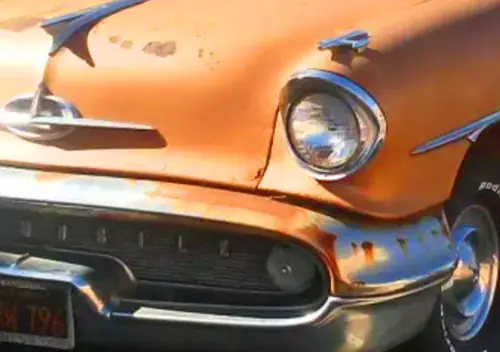
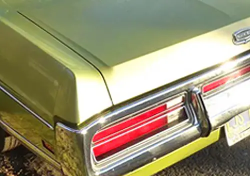
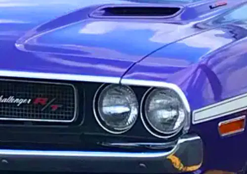
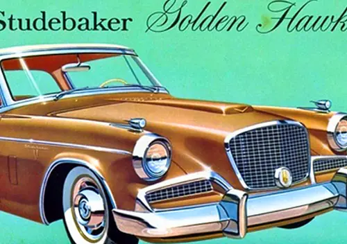
Yes! McCall started out in advertising, he should know. “’58 Bulgemobile – Too great not to be changed, too changed not to be great.”
I love old car ads, and could gaze at them all day. When I was a kid (and not anticipating that we would have an internet) I used to buy old Life magazines and cut them up because I saw the car ads as the only things of value in them. I still have the ads, a decent collection of them. However, most of them are now readily available online, so I guess I cut up those old mags for nothing. Oh well.
BTW, you have cited the abridged version of the Jordan Playboy ad. The full text is here.
My parents had a collection of old National Geographics in the basement, like millions of other Americans. The collection started in the mid-50s. I used to page through the old issues, ignoring the articles and the gorgeous Nat Geo photography, seeking out just the old car ads. Many hours were lost that way.
On the one hand, I wished I had cut out the best of the ads and saved them. On the other hand, old National Geographic magazines can be acquired in bulk at many a yard sale, so the opportunity has not been lost.
I have all National Geographics from the late 1800s to the 1990s on a set of CD ROMS , they are complete with advertising. So at least I have PDF copies of all the ads I lifted from my mothers magazines! Best part is: The discs are searchable! Just type in “Buick” and get pointed to a decade’s worth of Buick ads! Who Hoo! ?
Given the expected readership, Most car ads run to higher end. Interestingly Checker often advertised in Nat Geo. In fact that may have been where they advertised the most! (with conservative B&W ads,natch!).
“Love Letters To Rambler” in those old NGs as well, James. Loved em.
I used to look for the Lincoln Continental ad’s running through the ’60’s, showing the slow progression of body style changes.
As I recall they were run on the back cover
Like this. https://s-media-cache-ak0.pinimg.com/736x/49/6d/0d
Another iconic ad;
http://mascola.com/insights/retro-ad-of-the-week-cadillac-1915-the-penalty-of-leadership/
A favorite of mine! With my ’90 brougham, the first page of the owners manual is a copy of this ad. Beautiful, elegant and regal writing, that’s for sure!
My 89 Brougham had that in the manual as well. As I think about it, how cynical was that. I can think of nothing about the late Brougham that evokes the idea of leadership of any kind in the automotive world of the late 80s-early 90s, good as the car may have been.
I could spend days looking at vintage car advertisements. They’re probably one of the biggest influences in my choice to study and pursue a career in marketing/advertising.
The best ones are those that tell a story. I always like the 1970s Buick and Oldsmobile ones. Buick liked to feature its cars in Americana-style life events such as weddings, retirement parties, and holidays, implying that the car was a member of the family or a life milestone. Oldsmobile’s were even more interesting. For multiple years they used similar professional characters as proud Oldsmobile owners, talking about how their car was important to their profession. They included the judge, architect, realtor etc.
A Buick at a retirement party. Who’d a thought? 🙂
The Oldsmobile ads aimed at various professions remind me of the “Invitation to _______s” ads Imperial did in the early 60s.
“When better cars are built, Buick will build them.”
“Packard: Ask the man who owns one.”
I like a tagline that sounds like a sentence an actual human might say.
The standard retort to the Packard slogan to explain their demise was that too many people did ask.
The great Dave Barry once had a parody car ad that went something like: “Dodge! Bold! Adventure! Written! In! Incomplete sentences!”
On the back of a magzine I just recieved is a vintage advertisement reaTruth in advertisingding SPORTY,POWERFUL,YET SAFE, cruises all day at 70
The car for the enthusiast. Sports type floor gear shift with 4speed close ratio gears. Holds the road tenaciously. Corners as if on rails. Powerful,economical OHV engine. Top efficiency braking.Magnificient all round vision and comfort…..plus 4 wide doors for easy access. Roomy interior. Big luggage boot.
Yep this is the advertising blurb that accompanied a photo of my Hillman Minx when it was new in Australia.
yeah I like driving it, its a fun car and drives great but……..
these were racing saloon car of choice back in the day in 1960 on NZs fast flowing circuits one Harold Heasley beat everything in a Humber80, a NZ version of my car
Trivia fact for today- Jordan Baker, the lady golfer and sometime date of Nick Carraway in “The Great Gatsby” was named after the Jordan Playboy and the Baker Electric cars. Not a very flattering characterisation for a woman really…
So today, she might be Mercedes Tesla? 😉
Or Apple Twitter maybe!
…beats Kia Hummer. 😉
The fact that F. Scott Fitzgerald used the Jordan as an inspiration for his character of Jordan Baker in “The Great Gatsby” is indeed a testimony to the power of advertising. This is a great book. Do yourself a favor, buy it and read it, and a few years later, reread it. Don’t rely on the movies to tell the story. This is an American literary icon.
P.S. Buy the copy with the original artwork designed for the cover, not the stupid cover with the cast from the piss poor remake movie with Leonardo Decaprio. After you’ve read the book, the original cover will come to life. Google it if you don’t see it. It’s there.
The “somewhere west of Laramie…” blurb written by Ned Jordan became so iconoclastic in the advertising business that David Ogilvy, the founder of the Chicago ad agency Ogilvy & Mather, made his new recruits memorize the 173-word ad copy word for word.
Imagine a honcho eating a nacho on his broncho.
The Jordan Playboy advert was brilliant and remains so to – day .
.
Me, I’m one of those dunderheads who decides what I like looking at then I buy it and modify to suit my needs .
.
In this foolish manner I have wasted serious amounts of $ trying to make some pig into a silk purse .
.
On the other hand, I have built some fabulous Road machines I’ll never ever let go of .
.
-Nate
It’s interesting how well transportation in general lends itself to effective advertising. I can remember many ads from old Sail and Yachting magazines that evoked much of the same feeling as these. Just replace the open road with the open sea and you’ve got many a happy dream.
When I was kid in the late 1970s, there was a book at a public library in Dallas that I kept checking out a lot of times. The book had lot of advertisement prints during the 1930s and organised by the alphabetical order of manufacturers. I remember the title was ‘Cars of the Early Thirties’ by Tad Burness (1975).
The Jordan advertisement was also profiled in that book along with many obscure and famous brands, including Cadillac and Duesenberg. Reo had ‘screaming’ advertisement about being the first to offer the automatic gearbox (that was 1932 or 1933, I think).
Gday mate. Still chuckling at Harpo I expect.
I love automotive hype: ads, brochures, postcards, car magazine articles.
Every car I ever owned has had piles of it collected. I want to be amped by what I have purchased. I love the hype because I know it’s hype. People want to be “sold”.
The people in those ads; I wanted to be one of them, especially in the paintings Pontiac used. And Mercury for 65. They papered my bedroom walls when I was 10.
I have several CDs of automotive ads that are always satisfying to browse.
Much better than throwing them on the floor in a fit of automotive vapors and rolling in them. Who needs to sniff glue ?
Given the no frills, basic models I choose, allowing a little puffery and ad BS to give a thrill costs nothing and is a whole lot of harmless fun.
There’s a simple reason why car ads pretty much never get into technical detail; the internet. There’s an expectation that if you’re interested in how a car is engineered, you can go to the manufacturer’s website and view it in far more detail and at more leisure than a 30 second TV spot would allow.
Ned Jordan lived until 1958, just long enough to submit copy (alternative fact) for the now legendary Volkswagen campaign of D’Oil Dayne Burnback. As we now know, his style adapted perfectly to the demographic that the agency targeted for the beetle, aging male academicians.
hehehehehehehe
Thank you – I’d always hoped I wasn’t the only fan of old car ads – a niche worldwide club that I’d be honoured to be a member of. Further to that, I’ve lately been looking at the classified ads in Motor Sport, early 60’s onwards. Some truly astonishing bargains were to be had – how about (Jan 61) an ‘excellent condition’ 1935 Mercedes 500k supercharged for £199, or maybe a concours winning 1935 Rolls Royce 20/25 for £310 ? Yeah, me too…
Makes me realize how much many of us miss Kevin Martin. He had lived in some incredibly interesting places, and had a wealth of knowledge and stories. He went to boarding school not far from where I now live, and shared some great memories of this area before the population exploded. Makes me wish I’d gotten to know him better.
Well said BuzzDog, Kevin was a great contributor to CC, both as a writer and commenter.
It’s interesting to me that the ads show women behind the wheel without the typical denigration from other contemporary ads that were intended towards female drivers.
There were quite a few ads going way back to the early days of the car specifically targeting women owners and/or drivers, which were recognized early on as being a very important part of the market.
In fact, without getting too political here, I would say that a lot of ads from the 50s and especially the 60s were more sexist than perhaps the ones from further back.
Chevrolet had a lot of ads targeting women because they saw them as a key part of their strategy of wooing away current Model T owners with something more stylish. The men at the time were still more in thrall of the utilitarian T.
I once saw a print ad for the Datsun 510 with a headline along the lines of, “Front disk brakes, independent rear suspension, a slick 4-speed: 15 years ago you were lucky to get all that good stuff on a race car.”
And then, a ways into the body copy, “Now your wife can drive it to the laundromat. Times sure have changed.”
I’m sure that if the copywriter were writing the copy today, s/he wouldn’t assume that women automatically get the laundromat detail.
I always liked Packard`s ‘Ask the man who owns one’ tagline. If they built Packards today, would they opt for a gender-neutral tagline like ‘Ask the person who owns one’?
Yes, as well they should.
Suzuki Auto blatantly stole it for a couple years in the ’90s updated as “Ask anyone that owns one”. (It was long gone before the Daewoo badge jobs arrived).
Offhand what I notice most about the Jordans is that they don’t show the literal vehicle.with much detail, and are in one color plus black. I appreciate the advances that went into making the later print ads.
But there’s just something about the Jordan drawings that gets into your head.
And if one goes thru much of the 1930s ads there’s a big change to the “wall of text” effect, especially for the middle and lower-price makes.
I think this was some years after the Jordan ads, but Duesenberg used what we would now call lifestyle ads. There would be an illustration of an obviously very wealthy man or woman with the headline “He [or she] drives a Duesenberg,” and no other copy.
How about this for an ad from the “good ol’ days”.
Translation: “A good recommendation: never take the wheel after after a good meal without a small glass of Cointreau liqueur.”
*facepalm*
One of my favorite car ads is actually a 1965 Buick Riviera TV commercial.
It ends with “….a car a woman can appreciate, but only a man can understand”.
Happy Motoring, Mark
As a boy, I remember reading about the Jordan Playboy and the famous tag line, but this is the first time I’ve actually read the ad. I looked at a lot of old car ads when I was a kid, and like many other readers, National Geographic was a favorite source. In college, a teacher of mine described the concept of selling the sizzle, not the steak and these great old ads are classic textbook examples. Today I still enjoy reading them. Thanks for a great Monday morning read.
The power of advertising can be timeless. When my family and I took a big cross country road trip this past summer, we drove back through Wyoming, and I had been yapping about this ad as a great example of using evocative imagery to sell a product. The reality of Laramie, and the country to the west, was far less idyllic. My 14-year-old son summed it up succinctly: “why would anyone write an ad about this?” Lesson one in the art of persuasion!
I noticed a special ‘Saturday Evening Post’ edition (who knew it still existed?) on the newsstand yesterday devoted to the American automobile industry up to about 1940, with a number of articles but more notably large numbers of ad reproductions. Worth a browse through, if not a purchase (C$14.99 – no doubt lower in the US).
Ned Jordan was selling the sizzle, rather than much steak, sometimes at a premuim price. Consider the Playboy specification compared to what else could be had for 1923 for the same or less, selected roadster or sport tourings that competed directly with the Playboy:
Jordan Playboy, Model MX, 245.8 ci L-head six, Continental manufactured, 54.5 hp, 120 inch wheelbase, $1,895.
Studebaker Big Six, Model EK, 353.8 ci L-head six, Studebaker manufactured, 60 hp, 126 inch wheelbase, $1,835.
Buick Master, Series 50, 242 cu OHV six, Buick manufacture, 60 hp, 124 inch wheelbase, $1,625.
Chandler Six, Model 32, 288.6 L-head six, Chandler manufacture, 55hp, 123 inch wheelbase, $1,795.
Nash Six, Model 690, 248.9 OHV six, Nash manufacture, 55hp, 121 inch wheelbase, $1,525.
Auburn Six, Model 6-63, 248.9 ci OHV, Weideley manufacture, 63 hp, 122 inch wheelbase, $1,725.
Although Continental manufactured good quality, rugged, understressed engines for a wide variety of automotive, commercial and marine applications, having a propriety engine under the hood branded your make as an “assembled” car. That suggest the car was somewhat inferior to those built by companies that engineered and manufactured their own engines, who fostered this attitude.
All carmakers of course bought components from outside suppliers but one was supposed to build ones own engines to be a first-class carmaker. It didn’t help as the 1920’s wore on, as the industry shake-out continued most of the ‘assembled’ carmakers failed, further ‘proof’ of their inferiority. Ned Jordans’s promotional skills couldn’t stem the slide that began after 1926, although still producing some very attractive cars.
Jordan also overextended the company by rolling out the “Little Tomboy” models for 1927. This was an attempt to extend the company’s line-up to a lower price bracket. Unfortunately, it didn’t work. Overproduction for 1926, along with the failure of the Little Tomboy, sent the company into its fatal slide.
When I read the article on the 1964 Dodge Dart commercial, my first thought was, “Ned Jordan.” He wrote his own advertising copy, and specifically avoided what he called “mechanical chatter.” He believed that talk of mechanical and engineering features was boring to the potential customer.
Two other Jordan advertisements got him into trouble with the censors of the day. His “In the Middle of the Night” ad pitched the Jordan as a means for a young couple to escape from “tiresome chaperones” during the evening hours.
His “Port of Missing Men” ad featured a Jordan parked in front of an isolated road house. The house is dark, except for a red light shining from an upstairs window. Neither ad went over well in certain quarters.