While manufacturers have been name-dropping their competition for as long as they have been making advertisements, actually showing a picture of a car from another manufacturer in an ad is quite rare.
 Perhaps the granddaddy of this trope (to me, anyway) is the series of ads Ford ran between roughly 1975 and 1978 for the Granada, comparing it to various contemporary Mercedes Benz products. I remember these ads very well, even though I would have been between 7 and 10 years old when these ads ran. Ford produced maybe a dozen or so different variations of this ad – I’m including just a few here.
Other than some superficial similarities like blackwall tires, body-colored wheelcovers, and vertical grilles, even my childhood self could tell the difference between the two. Really, these ads are more of an exercise in framing than anything else: Take two cars with similar shapes, in the same color, and with the same background and same lighting, well then of course they are going to look similar.
But as we all know, beauty is more than skin deep. Even as a kid I knew then that comparison was laughable, and I wasn’t even aware at the time that the Granada’s bones dated back to the 1960 Falcon.

Of course, Ford is hardly the first manufacturer to feature cars from other manufacturers in their ads. In most cases, the “other” car is not a direct competitor of the car being advertised but rather is included to burnish the image of the advertised car. Case in point, the 1927 Bugatti photobombing the 1961 Corvette ad above. Clearly, GM is not worried about anyone cross-shopping the two. I will leave it up to commenters to speculate what is going on with the backward-facing passenger.
This 1963 Volkswagen ad is using the same playbook as the 1961 Corvette ad, in this case drawing a connection between one cult car (the Ford Model A) to another that was well on its way to cult status (the VW Beetle). They even included a model made to resemble Henry Ford.
This 1963 Saab ad is a repeat (it appeared in my Nighttime vintage ad trope piece), but I still like it. It gets as close as any to featuring pictures of cars that could be considered actual competitors. The car on the left is of course a VW Beetle, while the car on the right appears to be a 1960 Volvo 122S.
But more often than not, the appearance of other manufacturers’ cars was typically used for comedic effect, as is the case with the legendary 1984 Citroen ad above.
That is certainly the case with the 1989 Volvo ad above. It looks like one of Paul’s famous “small car appears to be towing a big trailer” posts (see here and here for examples).











Very interesting to see this article, because this week I happen to be researching an article on an AMC Javelin, and from what I understand, the modern use of Comparison Ads was pioneered by AMC’s ad agency in the late 1960s.
From what I can gather, before that time, the use of competing products was considered taboo in auto advertising (I’m not sure how much this extended into other industries… and I assume some minor players, such as your Saab ad here, did it anyway). In 1967, AMC hired Wells, Rich, Greene, Inc. as their new ad agency. That was an unconventional choice for conservative AMC, because the firm’s founder, Mary Wells, was considered by many to the most innovative ad executive of the 1960s and had a unique approach to product promotion. She founded her own company in about 1965, and AMC was her first automotive client.
Once of her first ad campaigns was the “unfair comparison” series (below). This apparently provoked outrage among much of Detroit’s establishment. Lee Iacocca was particularly enraged, and quit talking to some AMC executives as a result. He said (somewhat insincerely, in my opinion) that “Any time people try to play dirty they will lose… the public is too smart of that kind of approach.”
Except that the approach proved successful, and as evidenced by the Ford Granada ads here, Iacocca dropped that aversion pretty quickly.
It’s hard to believe now that these types of comparison ads were once taboo.
There are thousands of auto ads dating back to the first manufacturers that compare a new product with a successful product. “Finest of the low-cost Three!” It was never taboo, or if it was, few yielded to it. When you have your life savings in a product, you aren’t going to pull anything that could help you make it successful.
Can you show us an example or two? Because the one you did is not a “comparison”. A copy line like that “finest of the low-cost three” is not an ad showing the competition; it’s just a tag line. What this post is all about is actually showing competitive products in the ads. That was not done back then.
I was prepared to be underwhelmed by the claims for the Rebel. Considering the trim and interior on Chevelle sedans and wagons was usually underwhelming, the Rebel makes a case for itself.
And, they forgot one, The Rebel has attractive bright aluminium upper door frames, the Chevelle doesn’t.
Our “70 Rebel” did have bright frames around the door windows. lol I’d forgotten that.
Thinking it was that “SST package”. H’mm.
Could never get past those annoying “vacuum wipers” though.
“AMC” should have been ashamed to have those in “1970”.
“We don’t confuse them, but the neighbors sure do.”— Mr. and Mrs. Harold Wagner
Says it all right there. Cars have been marketed as status symbols forever. An affordable, knock-off ‘internationally-sized’ domestic car that vaguely looked like a well-regarded foreign brand, presented better among the Jones circa mid-70s, than an old school fuel and resource-hungry full-sized car.
As much a reflection on consumer’s aims and values, as Ford’s. The Big Three were all guilty. With faux Mercedes grilles and design touches appearing in the heart of their line-ups, even before the Granada arrived. I knew people that preferred the Volare over the Aspen, strictly on its duplicate Mercedes grille.
Ford may have been blowing smoke. But buyers were prepared to accept an imitation, happy to pass along the smoke, to impress others.
As I’ve mentioned before, IMO the styling on 1978 UK-based Ford Granada would have perhaps better accomplished the popular aim to appear European-influenced, than the decidedly domestic-looking Fairmont. More Mercedes-like in looks, than the Fairmont. Repeat the Granada formula again, more convincingly. And likely would have taken even more sales away from the Volare/Aspen, and Malibu derivatives.
Or, perhaps, the larger ’79 Oz Falcon.
Yes.
They should have thrown a Beetle in to the Citroen ad too. Just as many headlights as a Beetle, for less money.
I’m not sure what Chevrolet’s advertising agency thought they were accomplishing with this ad, which tries to mock the people who thought the 1953 Corvette wasn’t a real sports car by saying that the 1966 Corvette had become a great sports car by being almost nothing like the 1953 Corvette.
It doesn’t say that at all. It simply points out that the Corvette’s basic concept of being a fiberglass sports car with an automatic turned out to be a viable and lasting one.
Of course it improved over time, but the basic concept endured.
My take was that they mentioned all of the things that the 1953 didn’t have, and that held it back from being taken seriously by Jaguar enthusiasts for instance. The C2 had an advanced chassis, powerful engines, and two types of synchronized manual transmissions that the original lacked. They did mention that you didn’t have to shift for yourselves, but I still don’t understand why they wanted to evoke memories in potential buyers that people laughed at Corvettes a dozen years earlier. It is true that fans of European sports cars faced instant humbling if they made fun of a Sting Ray. Why remind people that it evolved from a car that didn’t even have a nice chassis for a cheap sedan?
The hard core sports car drivers/racers stopped laughing very quickly in 1955, when the V8 and manual transmission came out. In 1956, the C1 was the hottest sports car available, and a whole lot of racers were buying it, or crying as it went by them.
The C1 Corvette chassis was not at all inferior to the great majority of sports cars at the time. And magazines like R&T and others praised even the original ’53 for its performance and handling.
The only ones laughing were the tweed-cap wearing snobs, and the ad is poking fun at them for that.
There were 75 Corvettes produced in 1955 with V8s and manual transmissions. There were probably more Austin Healey 100s running around with SBCs and manual transmissions in 1955 than there were Corvettes.
I don’t understand the tagline on the VW ad. It appears Mr. Gillis traded his 1929 model for a 1936. Nothing unusual about that. 😉
GM spent perhaps millions designing and creating ads, and buying ad space for X-Car ads, but I recall only a handful of direct comparison ads to other manufacturers. The comparison of the Pontiac Phoenix to the VW Dasher below, ran regularly for a while.
For a car that so trounced (on paper) much of its direct competition, I was surprised they didn’t run a plethora of high profile ads in 1979/’80, showing how superior they were to the Volare/Aspen and Fairmont/Zephyr. Car reviews made these comparisons, I don’t recall seeing many GM ads doing so.
An ad that I remember from the X-car launch was one that compared its space efficiency to other General Motors cars. I think one of the cars was the Monza, which was three inches longer, three hundred pounds heavier, and had no interior room at all. It was one of those head-scratcher GM ads when they seemed to be saying that this time, they’re not selling you a practical joke. Which sadly they were for the first model year.
Why don’t you find us a copy of that ad? I don’t remember one like that; it seems rather unlikely.
That sounds like educational material that would have been sent to the dealers to help train the sales force. It would not have been shared with customers.
I’m working on it. I waded through the first three 1979 magazines this morning. It will take a while to find the time, unless I’m fortunate in picking the right magazine early on. I have R&Ts and CandDs for the 1979-1981 period to go through.
Pontiac ads from 1981 were all terrible like that, comparing their cars to one competitor (or sometimes an imagined competitor, like comparing a Grand Prix to a Celica), but overrun with legalese and minor selling points like longer-lasting spark plugs in the one above.
All of these are funny for me. Madison Avenue and its English counterpart are delusional. On the other hand, it keeps the cost of the publication down by having advertisers. I feel sorry for Mrs. Gillis. If he is so cheap that he did not buy a new car in thirty-three years, she hadn’t dared to go to Montgomery-Ward to buy a new dress ($3.95 in the Better Women’s Dresses Department). Thanks for the expose. Now, if you will excuse me, I am busy comparing apples to oranges.
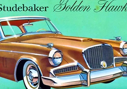
The Hawk has the same vertical grille as a Rolls and the same performance as an Alvis.
That’s not a comparison. It’s simply saying that a sophisticated car lover like James Mason thought that the Hawk was worthy to be added to his collection of other cars. It’s about association, not comparison.
It doesn’t seem *totally* implausible, as Studebaker still had a bit more cachet in Europe than they did in the US. The Hawk was pretty long in the tooth by 1961, going into the 9th year of this basic body design and its 6th year as a Hawk… some of the export Hawks eschewed the added on tailfins that were bolted on starting in 1957 (not sure about the smaller fiberglass fins used on 1956 Golden Hawks).
My Dad worked with a British guy who grew up in South Africa, and he said that V8 Larks were held in decent regard over there due to their performance compared to the majority of garden variety of small sedans with four cylinders or small sixes.
I am the rare dude that has owned a Granada and a couple Mercedes. I can tell them apart.
I’ve also never seen a Granada in real life with cornering lights!
My Mom bought a black 1977 Granada new in her early 20’s, that had cornering lamps. It was one of the ones that had most of the option book thrown at it… 302, aircon, sport mirrors, wire wheelcovers, and so forth… Kind of in the “mini LTD” fashion.
Sounds just about perfect if only she swapped the fake wires for those Magnum 500 lookin wheels…..
https://i.kinja-img.com/gawker-media/image/upload/c_fill,f_auto,fl_progressive,g_center,h_675,pg_1,q_80,w_1200/fwojokdulojiq5uwxj5v.jpg
Oh and I’d actually like to have a Dasher today – cannot say the same for an X car.
I’ve seen that top add for the Granada ESS before and thought about how ridiculous it is from the perspective of a car guy. The ad is configured like a game, guess which is which, mark your answers in the boxes on the right, then see what your score is. For someone familiar with cars, it seems absurd that one could look at the pictures, especially the full car pics, and not know which is which. And if you knew those, the hubcap and taillight pictures would just correspond (and the MB hubcaps have their logo!). The interior shots might be a little challenging, since Ford straight up copied MB’s headrests and they don’t show the Granada’s extremely non-Mercedes-style dash. But still, is there a person in America seriously shopping cars reading that ad who couldn’t differentiate those???
Now I’m looking at it and thinking there may have been a segment who, while maybe not ignorant enough to confuse the cars, was only superficially aware of brands and think the Granada looked more modern. Looking through 1970s eyes, the Granada did look rather modern with its boxy, formal styling. WE know its mechanicals were aging and/or ancient, but most of those people weren’t aware of that. Square headlights seemed really modern in the mid and late 70s, the 78+ Granada had them while the MB still had old fashioned round lights. So 1960s! Get with times and buy a Granada (and save gobs of money while doing it)
Who knows how many cars those ads sold, but the Granada was a hot seller. Ford knew how to sell cars in those years.
It does seem that Ford came up with the ESS package specifically to support this ad campaign, with their blacked out window trim, body color sport mirrors, body color hubcaps, and blackwall tires.
Few seem to have taken the MB bait, because virtually every Granada I can recall seeing was a mini LTD with whitewall tires, chrome window trim, and chrome mirrors.
Agreed. The ESS package was extremely rare on the ground. But if a potential buyer was interested in a Granada because of this ad, they most likely would have gladly taken the mini-LTD version, as that was inevitably what they really wanted anyway. If you were dumb enough to be fooled by the ad, you weren’t going to really notice the difference between the ESS and a regular Granada.
Now I’m looking at it and thinking there may have been a segment who, while maybe not ignorant enough to confuse the cars, was only superficially aware of brands and think the Granada looked more modern. Looking through 1970s eyes, the Granada did look rather modern with its boxy, formal styling.
You’re missing the whole point. The typical consumer knew that Mercedes was a top prestige brand, hence it had to be “beautiful” or attractive regardless of whether it actually was or not. As a matter of fact, the 450SLC’s styling (it’s ungainly C-pillar and the off proportions from stretching the two-seater SL) was widely considered to be iffy. Many panned it; few thought it was a truly good design.
That mattered not the slightest, because the typical Joe Schmo and wifey would have died to have…any Mercedes. They were in no position to evaluate and compare the styling of these two cars, other than falling for the absurd conceit that the Granada was the equal of the Benz because of some very generalized similarities and of course the body-colored wheel covers.
The ad only worked because it assumed (rightfully) that the target Granada buyer was too dumb to see how they had been hoodwinked into thinking these two cars were somehow comparable. Anyone who actually knew about cars or styling back then instantly realized what an absurd, cynical and shameless comparison this was.
The Granada C-pillar area doesn’t look much like the 450 SLC’s, but the early Fox body Mustang notchback’s sure did.
“I’ve seen that top add for the Granada ESS before and thought about how ridiculous it is from the perspective of a car guy.”
Agreed, but this is the automotive equivalent of the cheapskate who buys cheap liquor and pours it into its expensive top shelf equivalent. A lot of the cheapskate’s guests won’t have a clue or even care that their 12 year old single malt was actually produced yesterday in El Paso.
LOL!
I won’t go into the usual comments regarding the Ford / Mercedes comparison. But, I do think the less broughamy Granadas look good, and recall these trims having been thin on the ground. I don’t recall ever seeing the sport wheels depicted on the Granada coupe.
The most interesting thing to me about the Ford / Mercedes comparison was that in the absence of the Mercedes, most people saw the Granada as a mini me LTD.
Ford obviously sold a lot of Granadas. But, you can wonder if putting a Granada Ghia next to an LTD Landau and touting its LTD luxury in a smaller package would have sold a few more cars. It certainly would have drawn fewer snide remarks from the Mercedes camp!
As an older teen by the time the Granada came out, I thought those ads were ridiculous. Who could mistake a Granada for a Mercedes? But I was far from the right demographic. By the way, I think the Saab ad is newer than 1963. The grills of both the Saab 96 and the Volvo 122S were revised for 1965 and this ad shows the newer grills.
Perhaps part of the copy for the Saab ad was cropped out, but I don’t understand why the VW or the Volvo would be afraid of the dark.
Here’s a copy of the full Saab ad. It’s from 1967:
Thanks for posting the full ad.
Front wheel drive, eh? Makes sense. If forced to guess, I would’ve said “What is a 12 volt electrical system, Alex?”
BZZZZZT! Wrong answer! Thanks for playing. 😉
This 1963 Volkswagen ad is using the same playbook as the 1961 Corvette ad, in this case drawing a connection between one cult car (the Ford Model A) to another that was well on its way to cult status (the VW Beetle). They even included a model made to resemble Henry Ford.
Tom, did you actually read the ad copy? It’s not at all like the Corvette/Bugatti ad; this is one of a series of ads VW did that featured real life people who actually bought VWs, and the guy in the ad is the real guy. No model; no fake comparisons.
My sole point of this post was ads with pictures of cars from other manufacturers. Most are obviously not direct comparisons (or even comparisons at all).
Call me jaded, but most “real people” ads are anything but. Even if Albert Gillis is a real person and his story is true, I’m sure the marketers had a hand in making him up to resemble Henry Ford, even down to the center part of the hair.
Here’s a picture of Henry from 1919 for comparison.
Thanks, but I know what Henry looked like.
I assumed that he is the real person, but I still feel bads for his wife if this guy only bought a car after 33 years of driving that Ford! He probably got a cramp in his hand every time he had to put his hand in the pocket where he stows the cash. I find it very funny.
The 1961 Corvette ad is interesting because the Bugatti is beautiful but looks so old-fashioned, but it was only 34 years old at the time. Imagine a new C8 Corvette parked next to a pristine 34 year old Ferrari (say a 1990 348) and a layman would have a hard time determining which one was the old-timer.
While my dad was picking up his new 1979 F150 Supercab short bed with tilt AND cruise,,,,, wow wee wow wow,, lol,,,, I was on the lot checking out the white Granada ESS coupe with red interior and to my 15 year old eyes that interior, those wheels, that steering wheel,,,, the whole package was E P I C !!!
For several years in the late 50s through mid 60s, American Motors issued “X-Ray” brochures that provided head to head comparisons with select competitors to the American, standard Rambler/Classic, and Ambassador lines.
Here’s one example:
https://oldcarbrochures.org/United%20States/AMC/1959_AMC/1959-X-Ray-Rambler-Brochure/index.html
I remember seeing the Ford Benz ad in magazines they arent remotely similar, no way youd end u in the Ford by mistake looking for your Benz in a arking lot
According to the VW ad, the Model A owner “even jacked it up at night to save the tires.” Really? Every night for 33 years? I don’t believe it!
His poor wify. Who jacked h e r up at night … ?
An interesting, and unusual comparison, I’ve never seen made before. The early Chrysler P-Car Plymouth Sundance to the Chevrolet Corsica. May seem an unusual comparison at first, but the Plymouth does compare favourably. The more typical, direct competitor, being the Chevrolet Cavalier. The Sundance and Shadow offering many small luxury touches, as listed here.
The space efficiency of the hidden rear hatch, and optional turbo motor giving the Sundance, further cargo and performance advantages. Though the better interior room of the Chevrolet, may have meant a lot to some.
Sway bar OPTIONAL on the Corsica? Sheesh. Wonder if it was standard on the Beretta…….
Concord D/L price advantage, over comparably-equipped Volare, Granada, and Nova. With well done illustrations.
Attractiveness is subjective, but I find all three competitors better-looking. That Concord half-vinyl roof, being rather unattractive.
This one I remember for sure!!
Ford being unserious, as they compared the Granada’s appearance to the Mercedes-Benz 450SEL, when the Ford looked more like the soon to be discontinued Mercedes-Benz W114/W115, and upcoming W123.
I remember a Jeep Grand Cherokee commercial around 2005 that bragged about how it was faster in some performance metrics than a BMW. Of course, the Grand Cherokee they chose was a Hemi, and the BMW was a 184-hp 325xi of the (at the time, soon-to-be replaced) E46 generation…literally the fastest Jeep against the slowest BMW.
Slightly off-piste, but the copy in the VW is just superb, right down to the last throwaway line “‘I didn’t think they were supposed to burn oil,’ he said”. No wonder the ads are famous.
Why are car ads so perpetually grim, so serious and witless? The 2CV one is the last vaguely amusing one I can remember, and it’s 40 years old!
The “2CV” ad is “far and away” my favorite one here.
Unless I missed it, I am amazed nobody thought of the famous 1965 Ford LTD ads, which boasted that the car was quieter than a Rolls-Royce. The 1966 LTD was advertised with a handful of other pricey cars in the background, including a Mercedes 600 and a Jaguar Mark X.
Good point! That would obviously be a direct predecessor to the later Ford Granada ads. Those LTD ads were pretty well known and the success of those and the first “brougham ” surely played in the thinking of Ford’s ad campaign with their “brougham” compact.
Here’s another one.
I see it now- BOTH are silver and BOTH have whitewalls!
And another.