Twelve years before the disco-era Cordoba was introduced, 1963, Chrysler could have made a long-hood, short-deck coupe to combat the Grand Prix, Thunderbird and Riviera in the burgeoning personal luxury coupe market. This was a New Yorker coupe to begin with, and I changed the proportions and simplified the chrome trim a bit, in a nod to the simpler body-side fad begun with the ’62 Grand Prix. I think this series of large Chryslers is very underrated. They had a two-year-only body, with traces of the fuselage styling that would come in ’69. They also had traces of the stillborn S series of large cars, the last styled by Exner as Engel was taking over. By adding the more classic-era proportions of a longer hood, shorter deck and slightly reworked formal C pillar, I think Ex’s lines work even better.
What If: 1963 Chrysler Cordoba
– Posted on March 23, 2012






That’s not bad! The only thing I would change is I would raise the trailing end of the deck lid up just a tiny bit.
Great work though!
very nice! +1 on the deck lid
I have been staring at this for several minutes. A fascinating concept. Unfortunately, I don’t think that the lines of this car (attractive as I may find them) fit with the T-Bird/61 Continental/63 Grand Prix formal style. The sloping rear window and decklid were quite an unusual style for the era, and these Chryslers had a fairly short deck to begin with.
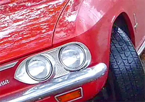
I have always been intrigued by the single straight line that separates the top half of the car from the bottom half, creating sort of a two-tone effect simply from the change in sheetmetal angles. This car uses the Corvair-style border that encircles the car instead of the fender peaks that the 61 Lincoln popularized and were seen everywhere by the 1970s.
Random fact of the day: The color on this car is Holiday Turquoise. I know this because a good friend in high school drove a 63 Newport 4 door hardtop in this color that his parents had bought new. The color was also on the 63 Chrysler pace car convertible, one of the few non-white cars to pace the Indianapolis 500 mile race up to that time.
IMHO, the 63-64 Chrysler had one of the great dashboards of the 1960s, a perfect blend of classic and 1960s Modern.
I can hardly tell the changes, not to say its not nice. Chrysler should have just put a conventional engine in the Turbine cars and it would have had a personal luxury coupe already done.
Other than the front end, of course. 🙂
Yeah, a more conventional 4 headlight set up, with hidden headlights would work.
“Chrysler should have just put a conventional engine in the Turbine cars and it would have had a personal luxury coupe already done.”
+1
In principle, perhaps. And I wish they had. But those Turbine cars were hand built by Ghia, at considerable expense. Tooling up to build a production car would have been quite an investment at a time Chrysler could ill afford it.
Yup. And as I’ve read, the fact that the Turbines were built by Ghia was a major reason most were scrapped — they were on a customs waiver, and Chrysler didn’t want to pay the (apparently very hefty) import duties for keeping them.
I wonder what the R&D cost for the Turbine Car program was opposed to actually producting a traditional ICE version of the same vehicle. In other words, scrapping the whole turbine engine idea and simply building a car that essentially have the next Thunderbird’s styling a year earlier (and with a Chrysler engine).
Otherwise, the ’63 Cordoba ‘concept’ wouldn’t have worked for exactly the same reasons that Chrysler’s 1970 musclecar lineup didn’t make a dent in sales, i.e., all those various models did nothing but cannabalize sales from other Chrysler models.
A 1963 Cordoba loosely based on an already existing car line wouldn’t have had any ‘conquest’ sales from Grand Prix, Thunderbird, or Riviera owners. All a 1963 Cordoba would have done is hasten the demise of the ‘personal luxury car’ that Chrysler already had at the time (the 300 letter series) which were already declining.
But a brand-new, exclusive Cordoba based on something that looked like the Turbine Car with a traditional engine? That might have been a different story.
You raise some good points. This is maybe the first hint that Lynn Townsend would not go down as one of the better Chrysler leaders. True, the limited edition Turbine cars had to be cut up, but the bulk of styling work had been done, it was a beautiful concept, and the competition was all heading down this road. Ford had been raking in cash from the TBird for years, the Buick Riviera and Pontiac Grand Prix were in showrooms and he had to know that the Toronado and Eldorado were on the way. A Chrysler personal luxury coupe should have been a no-brainer. The running gear was all there, all they needed was that new body shell, that could probably have been adapted from the 62-64 Plymouth/Dodge structure. But no, Chrysler ignored this market for another decade. Maddening.
Absolutely gorgeous. It might look even better in formal black.
Chrysler business coupe?
Another case (like ’55, ’56) of classy styling for Chrysler to retrogress back to the mean after only two years on the market.
That looks pretty good, I’ll bet they would have sold a few. BTW, are those ’62 Impala hubcaps it’s wearing? They suit the car well.
Yep, looks good! Wish they’d had the means to hop aboard the wagon at the time.
They made sort of a half-hearted attempt with the original Dodge Monaco in ’65, but it was even less successful than the first Barracuda or the subsequent first-generation Dodge Charger
That’s such a beautiful car, and so perfectly done I thought it was real. I had to dig up pictures of a ’63 two-door convertible to see what you did. Very nicely done. Would you share the original with us to understand your changes better?
I agree they could have and should have offered this car. Darned if I can see any difference in the rear overhang, just extending the front could have been done relatively cheaply. You made a great-looking car even better.
Nice work. Can you do something about the huge opaque expanse of metal between the rear wheel cutout and the roof? It always seems unsettling to me in monochromatic cars, though camouflaged by vinyl tops. Maybe make the wheel cutout (& wheel) bigger, or the rear window to extend more rearward, or…
That is a point, although I like the blank sail panel. I’d be more tempted to add some kind of trim either fore or aft of the door, like a ’65 T-Bird.
Ahhhhhhhhhh but then we would have missed out on Richardo…
“Soft corinthian leather…”
“…To the last, I will grapple with thee… from Hell’s heart, I stab at thee! For hate’s sake, I spit my last breath at thee!”
far be it from me to comment on hypothetical early 60s American car design but I’d have thought this would be more in tune with the times? (apologies for the clumsy ‘shop work)
Balancing the front and rear overhangs a bit more evenly and softening the C pillar just makes for a happier design to my eye… though perhaps I’ve taken it too far into ‘stang/camaro territory?
Looks Japanese, a bit like the first Nissan Silvia or something like that.