(first posted 7/13/2017) Sometimes you see a car parked on the side of the road that you simply have to stop and photograph*, such as this Rolls Royce Camargue. Looking at it from a distance of 40 years, it is hard to see why it caused the controversy that is seemingly forever associated with it. Let’s have a look at the story.
 I don’t think there is anything mysterious about the Camargue back-story. In 1969 Rolls Royce decided that they wanted more differentiation in their coupe (or two-door saloon as they referred to them), to succeed the 1966 Silver Shadow-based coupe by long-time coachbuilder Mulliner Park Ward. Note that the famous Corniche name was not introduced until 1971.
This time the coachbuilder was Pininfarina, an interesting move as most people would associate them with Ferrari. Perhaps this was because Pininfarina had done a similar machine in 1968 with the commissioned Bentley T-Series Coupe Speziale, which was judged to have successfully captured that marque’s sporting spirit. No doubt the seminal Florida concept car was a factor too.
Initial designs were submitted and development work was commenced in early 1970, with a plan to put the car into production in 1972 for a launch in early 1973. However this plan was interrupted by the entire Rolls Royce group being declared bankrupt on 4 February 1971! Thanks in part to a stock of Corniche being ready to go, the car manufacturing business was reformed as Rolls Royce Motors Ltd. Assessing the Camargue project during this process saw the launch target delayed to 1975.
Apart from the new body, the Camargue shared virtually everything with the Silver Shadow platform on the same 120” (3,048 mm) wheelbase, with self-levelling, 4-wheel independent suspension. The big new announcement was the first automotive split-level automatic air conditioning system, which apparently added more than entire BL Mini’s worth of cost to each car! I’m sure this was of much more value to customers though than the other publicised ‘innovation’ that the Camargue was the first RR to be designed in metric measurements!
The instruments and controls were styled to look like those from an aircraft. This was an interesting concept, but I don’t know that the 1970’s production execution did it justice – typically there is some distortion of plastic parts. Replacing these with CNC’d aluminum as Jonathon Ward’s ICON cars & 4x4s feature would be more fitting, in both senses of the term.
January 1975 saw the car introduced to the press before its world launch in March. While nobody expects a Rolls Royce to be cheap, the price of the Camargue could be termed colossal at over 50% more than a Corniche or over 1/3 more than a Phantom VI limousine!
Inevitably comparison must be made with the 1971 Fiat 130 Coupe, which was also designed by Pininfarina and shared many of the same stylistic themes as the Camargue.
It could be argued that having to accommodate the traditional upright Rolls Royce grille and bulky 6.75 litre V8 meant that designer Paolo Martin was not able to achieve the same purity of line and sleek slenderness of the 130.
There were some tricks such as a strong highlight line below the doors to minimise the visual depth of the body, and a feature line below the greenhouse for similar effect. Overall the silhouette was relatively sleek. The Camargue was 3.5″ wider than other Rolls Royces but only the front track width was increased to suit, leaving the rear wheels a bit lost in the wheel wells.
Interestingly there is a fair resemblance in the shape of the 1977-on GM B-body coupes, such as the Buick LeSabre.
That grille of course was perhaps the biggest point of controversy, because it was not upright as was right and proper on a Rolls Royce, but angled forward at a rakish, or even raffish, seven degrees. It may not sound like much, but was apparently enough to properly upset the purists.
In light of current Rolls Royce models where the grilles all lean back and there are things such as the inset multi-piece Ghost grille, a mere tilt seems a trifle!
In an era where Rolls Royce and Bentley were effectively badge-engineered, only one customer demanded to have a Bentley version of the Camargue. Others have been converted, but don’t usually achieve as neat an appearance as the factory.
More extensive conversions have been done too, such as this quite impressive folding hardtop conversion.
Not everything will be to everyone’s taste, such as this rig, presumably set up for falconry. I suppose you could say it is a case of function over form, and that Pininfarina was not consulted on the conversion?
Another interesting one is an update by Robert Jankel, who installed headlights and tail lights from the Silver Spirit – not entirely suitable to my eye.
There were a couple of prototypes used to test turbocharged versions of the 6.75L V8, presaging the later Turbo R saloon. One of the prototypes (DZ5) was destroyed in a crash, but the remaining one (DZ6) was retained in the Engineering Department until it was sold years later by an Australian enthusiast (on display in the Fox Collection museum in the Melbourne Docklands).
The Corniche picked up the same mechanical upgrades as the sedan range as the years passed, and there were other changes such as repositioning the fuel tank behind the rear seats and transferring the bodyshell build from MPW to Park Sheet Metal near Coventry.
The total production run was only 530 cars over 11 years. I had expected that there would have been an initial flurry before demand tailed away, but surprisingly it seems that the sales rate was comparatively regular across the years.
* Sometimes there are cars you can’t stop for too. I saw another Camarge parked in a small residential street by pure chance late last year, around the time I took a break from writing due to taking on a new role at work which took up a lot more time, and I couldn’t stop or go back for it. As it happened though, I’d seen the same car before – the photo above is from the Philip Island Classic race meeting 10 years ago. All Camargue photos are of cars I’ve seen except for the interior shots (don’t have any decent photos) and the cars that have been modified ex-factory, so that represents a decent portion of total production to have seen in one city I think.
Further Reading:
Both street-parked Camargues were also spotted by Don Andreina: Cohort Sighting: Rolls Royce Camargue – A Gorgeous Flop
The Camargue also features in Paul’s article on: Pininfarina’s Revolutionary Florida: The Most Influential Design Since 1955



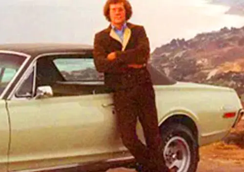

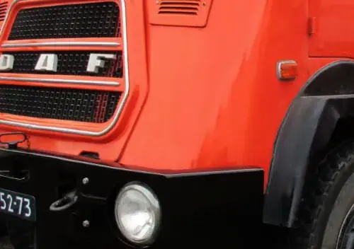
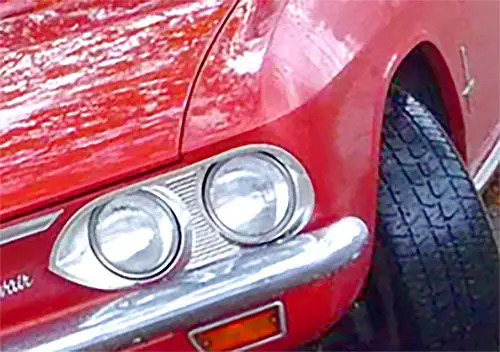
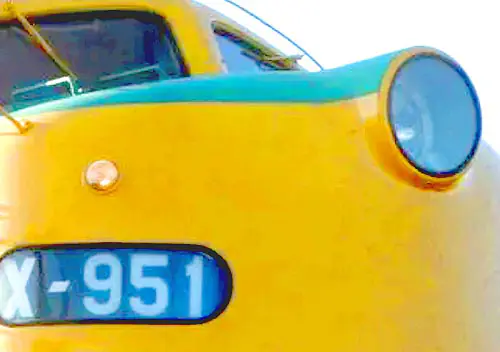


Perhaps Pininfarina was so into ‘design-recycling phase’ in the 1960s…
A wealthy Dutch businessman had specified that his Mercedes-Benz 300SEL 6.3 to have unique coupé body. So Pininfarina went to work and produced this one. His car preceded Camargue by a several years.
https://drive-my.com/en/test-drive/item/1769-mercedes-benz-300-sel-6-3-pininfarina-coupe.html
Isn’t the similarity too startling?
I think the Mercedes looks better. Cleaner lines less clutter
Thanks for that link. I was not familiar with that MB PF coupe.
Has Pininfarana ever NOT been in a design-recycling phase? It seems like they make one design for someone per decade, and any automaker who commissions their work thereafter will get the same exact look.
Case in point, with Pininfarina and the Tipo design for my Alfa Romeo 164s and it’s design siblings…
The Fiat Croma, Lancia Thema and Saab 9000.
They also used the similar styling on the Peugeot 405.
The resemblance to the Alfa 164, is uncanny…I’m sure Alfa Romeo and Peugeot were not happy about that one.
Kinda, like two women, going to a fancy nightclub, only to see each other with the exact same outfit on. 😛
Alfa, Saab and Fiat Croma were developed as a single platform. They have the same underpinnings and their shape is governed by the bodyshell and keypoints in the construction.
More here: https://en.wikipedia.org/wiki/Type_Four_platform
Many see Pininfarina as lazy, reshashing previous thoughts and ideas, but I don’t see that. I see an artist, taking the opportunity to evolve his artistic language. Though these designs are similar and carry a common theme, there is a clear evolution of thought from one to another. From the 1968 Bentley coupe to the Mercedes 6.3 coupe, to the Camargue and finally the Fiat 130.
I see an artist taking every single opportunity to define and refine his line of thought through a very long line of actvie artistic judgments. That isn’t lazy, that’s the tell tale of a true artists touch. That’s what makes all of these designs intrinsically Pininfarina though the Bentley and the Fiat has nothing in common at all from an estethic point of view besides both belonging in the same evolutionary line of thought.
It’s not laziness I see. What I see with Pininfarina is “we came up with this excellent design, and you(the automaker’s) will have the privilege of using your name and chassis with it, if you choose us”, so no matter the purpose of the vehicle application or the legacy of the brand or model itself, they’re getting this Pininfarina design, and people will want it because Pininfarina is apparently the greatest, and perhaps they are.
I don’t at all question their artistic merit, but I don’t think they are always the right choice for automakers to choose, nor are they the best automotive artists in the business (not that they aren’t influential).
That seems reminiscent of the great British coachbuilders who would have clothed Rolls-Royce chassis pre-war, whose bodies had a certain style, enabling the initiated to tell who built the body without having to look for the coachbuilder’s plate. Me? I read the photo captions!
You’ve touched on an interesting point, one that can be traced to the decline of the carrozzerie. FWIW, this was Martin’s entry point to PF.
Okay, Don…
I think you’re channeling the Jetsons here. 😉
“What I see with Pininfarina is “we came up with this excellent design, and you(the automaker’s) will have the privilege of using your name and chassis with it, if you choose us”,”
and they rode that attitude all the way down into insolvency.
both the Camargue and the Mercedes are ungainly, ugly designs, exercises in futility: what did justify the price of the Camargue? just the fact of it being so expensive that made it so exclusive? for people that feel that desirability and exclusiveness are the same thing…- the FIAT 130 is a complete different story and designwise it belongs in a totally different league.
I’d rather be seen driving the ultimate monstrosity
Frua?
Yep. The green was the two door, and this is the four door. Based on the enormous Phantom chassis as opposed to the bread and butter Shadow platform. I love these for all their elephantine extravagence.
Previously featured on CC too:
https://www.curbsideclassic.com/blog/1973-rolls-royce-phantom-vi-dropehead-by-frua-the-end-of-an-era-of-custom-coachbuilt-rollers/
Even more of a “Thunderbirds” car than the Camargue
” just the fact of it being so expensive that made it so exclusive? ”
that is the entire point of Rolls Royce (and Bentley.)
I meant the Camargue only
This ad isn’t so laughable anymore…
It made me laugh!
Great overview. That blue beachrunner is an absolute disgrace.
This, the T Speziale, Fiat 130 and Oliver’s 6.3 mentioned above were all from the hands of Paolo Martin. When the Fiat 130 was released before the Camargue, the RR management was furious, and some efforts were apparently made to further differentiate the cars but I can’t remember what they were.
Unfortunately I don’t think they nailed the design. Legend was that the Italians provided dimensions in metric and the Brits converted them to imperial resulting in the beauty lost in translation, but I think that’s apocryphal. It’s just an unwieldy shape, where the 130 coupe was PERFECT!
I think they should have stuck with the T Speziale.
I love it and I always have. The presence of this era of Rollers and Bentleys is just spot on to my eye.
hilariously overpriced junk.
I can’t decide what I think of these, even now. Some designs don’t scale well, whether up or down. To me the long rear quarter windows make things look just a bit off. And the dash panel is a definite letdown.
In all, the car lacks the Britishness that I expect from a Rolls. I would take a Shadow or a Cornishe over this without question.
But wow, what a rare find!
John’s discovered a rare instance where badge engineering has improved on the original, the Bentley grille shell sits more comfortably to my way of thinking.
I’ve seen a black one that lurks about here and these things are huge. More imposing than than graceful, like a 600 Grosser, and I guess that’s the intention. The location of the rear axle doesn’t look right to me, it needs the wheelbase extended by 100mm.
If I had the resources, and a plausible reason for 4 seats and 2 doors in a coachbuilt car the MPW 2 door saloon would be my choice. Just like Thomas Crown
I agree with Don, the Jolly Blue Giant should at least have wicker seats…on second thoughts just scuttle it to create a beach break.
Thank you for the history. Any Imp news?
I wonder if the Camargue would have been better received as a Bentley? It may have helped reinvigorate the brand, as it seems during the sixties that it was languishing. Although apart from objections about the grille possibly being reduced, it wouldn’t have helped the other design issues.
Trying to find a new home for the Imps etc at the moment Jim, hopefully will have it sorted within a month. A mate is working on restoring an Imp GT, should be done by the end of the year.
Evel Knevel said it best: “A thing not worth doing is not worth doing well.” I think you nailed the real problems: inept proportions and uninspired detailing. You are correct in that the spare, edgy (though a bit generic by today’s standards) Fiat 130 front end is far more elegant than the leaden, blunt Camargue, which is saddled with the Rolls grille, nearly impossible to adapt to a modern car after around 1935. Tilting it forward just made it worse (you’re right again; Bentley’s grille shell would’ve helped). Sheer, undecorated surfaces can be convincingly elegant only if they are accompanied by deft proportions, contours and detailing (’61 Lincoln Continental, Iso S4, Fiat 130 Coupe). Here the vast blandness just looks like what it is: an absence of ideas. One additional issue is that Pininfarina’s best work was on smallish to medium-sized cars. They often had real trouble with the vast surfaces of Cadillacs, for example, though they did a much better job with the proportions, details and surface development on the huge “Jacqueline” show car, about a decade before the Camargue, as well as with their first Caddy ever, a V16 from 1931:
Fiat body, ’74 Pontiac face, extra-high Rolls Royce prices–frankly I’m amazed that they even managed to sell 530 of these over 11 years… Makes for a great find and post today!
+1000
You nailed it – ahahahahahahaha!
I will never look at one of these abominations the same way again after this post. The ’71-’75 Grand Ville was an absolutely beautiful design, and is one of my all time favorite early ’70’s large cars. Comparing it, at <$6,000 to the stratospherically priced Rolls, and putting the 2 photos side by side has just completely annihilated any reason I might have to even TRY to find the Camargue pleasing to the eye. Thanks for that. I've struggled for years to find something pleasant about this thing. I'm now feeling much better about failing to do so.
Rolls could’ve at least committed to either the Catalina front (turn signals the same width as the headlight clusters) or the Bonneville/Grand Ville’s wraparound-light one, rather than splitting the difference and having the signals wrap around on the outside and stop just short of lining up with the inner edge of the headlight housing on the inside.
I wonder if the Camargue’s black headlight bezels were a last-ditch attempt to play down the resemblance.
So many grotesque-looking cars on one page!
I’ve never seen a Camargue in person, which is hardly surprising. But years ago when I’d see pictures in car books, I was enthralled by it — the combination of the stratospheric price and the somewhat frumpy styling made for a mesmerizing contrast.
Oddly, I never noticed before that the grille is angled forward. But now that you’ve pointed that out, it’s the FIRST thing I see when I look at these pictures. To my eyes, rather than looking rakish, that giant slab of a grille looks like it’s been shaken loose a bit in that forward-angled position, and I wonder how much car’s countenance would be improved just by tinkering with that one little detail?
The Camargue was the second Rolls with a forward tilting grille, though the first one was not quite full sized:
https://en.wikipedia.org/wiki/FAB_1
It was fully approved by Rolls Royce though.
I wonder if the Bentley T-series was inspired by Lady Penelope’s ride? About the only thing that the Bentley is missing is a clear plastic roof.
It’s more than a little weird that Fab 1 *wasn’t* a Thunderbird all along…
Interesting Bernard, it seems that RR helped with the model used for the show, supplying a radiator grille with Spirit of Ecstasy, but when a full-size version was built (based on a Bedford bus chassis) to take the Andersons to the premiere of the movie they were not as enthusiastic.
From Wikipedia: “On the night of the premiere, the replica broke down after a few hundred yards and the Andersons were forced to make the rest of the journey by taxi. Rolls-Royce were not impressed by the car, which had a poorly built fibreglass body, and made several attempts to purchase it and have it destroyed.”
Interesting article on a rare beast!
I think what I find “wrong” with the Camargue is the headlights and tail lights. The round headlights make an otherwise modern design look dated. The single rectangular lights are okay, but the quad rectangular lights….that they didn’t use, looks great.
The taillights are “wrong” for the same reason the headlights don’t work, they look cheap….pedestrian, VERY un Rolls-Royce.
As for the “aircraft inspired” instrument panel, having worked on Navy aircraft for 20+ years starting in 1970, I’d say the designers got it very close. Of course, Navy planes don’t use polished wood, but the plastic used by Rolls-Royce perfectly mimics the metal surroundings of the instruments.
From the side, the Camargue, looks fairly decent. That “sporty” Bentley pictured, though, looks like something cobbled up from a Ford Galaxie.
Fully agree on the lamps–that gold-colored one three photos from bottom, retrofitted with quad rectangular lamps, looks *so* much more natural.
Pretty clear where Cadillac found its inspiration.
That grille isn’t stock. It was a popular period accessory, but wasn’t sourced or approved by GM.
That grille isn’t stock, and this Seville was new in 1975.
Wrong manufacturer.
Now, we can see where Lincoln copied it’s upright, waterfall grille from.
Lincoln, started using this grille on the 1968-71 Mark III.
Also, Cadillac would never purposely put that Superfly
inspired piece of crap, on their production cars.
That ugly grille is a bad afterthought, you buy from a 70’s J.C. Whitney catalog.
Lincoln did crib that grille design from Rolls, though I’d say that it was more inspired by the Silver Cloud and the Phantoms as they were current in the mid 60’s when the Mark III was in design.
Considering how much the 1974-76 Continental front end design looked like the concurrent Marquis Brougham, though, they had to do something.
Somewhere I have a road test from a 1976 issue of Motor Trend and IIRC they complained about the lifeless power steering (bought from GM!) the bland styling and the lack of such basic luxury car features as a tilt steering wheel, which made the high price even more ridiculous.
I didn’t think much of these things 40 yrs ago but looking at the pics now they’ve kinda grown on me. I do think they would have looked better with a smaller quarter window and maybe if that grill didn’t lean forward.
This generation Of RR had very mediocre feel in the steering and handling wasn’t so hot either. The steering got a major upgrade along the line, but I don’t think the Camargue was a beneficiary of that improvement.
I’m fairly sure the Camargue got the rack steering just after the Shadow did, and then the Silver Spirit rear suspension before that car was released. None of which helped the appearance, except perhaps to help it disappear from sight round corners slightly faster.
If they had to go with round head lights, I think they should have hid them behind some Lincoln style doors. The grille leaning forward reminds me of a crooked tombstone.
I’m the man who mistook a Corvair for a Rolls Royce. (There’s a famous book called “The Man Who Mistook His Wife for a Hat”.) I was driving down a curvy part of Sunset Boulevard in the Bel Air section as I approached a vehicle up ahead perhaps a few hundred yards away. There was something elegant, formal, squarish, and upright about its profile as it made its way around the curves of Sunset. I actually thought it was a Rolls Royce, until I got close enough to realize it was a 4-door second generation Corvair.
Windows must’ve been up? I’m pretty sure R-R never made a 4 door hardtop, and I know GM never made any secondgen Corvairs as post sedans.
What exactly is split level air-conditioning?
Maybe warmer air at the feet, cooler air at the face? That’s what I’d want.
Upper and lower-level climate control from what I understand. As K. Holm has noted below, side to side split is common now, and some upper-luxury cars have several different zones throughout the cabin.
The narrow rear track in the rear kills it for me from too many angles, as well as the too-short wheelbase. Yes, it just didn’t really click.
” …a decent proportion of production to have seen in one city.” No kidding, and a city at the bottom of the world at that! I’ve never seen one in my life. Much amused by various comments above on the theme of trying to like it, because it was such a World’s Most Expensive Best In World awed hushed-tones Do Not Touch icon when I was a kid, that I felt awkward that this emperor was clearly nude. And really out of shape.
I vaguely recall reading somewhere that a major difficulty for Pininfarina in being confined to the Shadows’ platform was the height of the firewall, which then created all sorts of proportioning problems for what is a lower-roofed car. It’s certainly hard to credit that the designer of the very lovely Fiat 130 coupe could produce this. Thus I speculate that a very old-Britain committee of tweed-wearers at Rolls politely tugged and pulled each at the drawings of this Italian fellow until his thoroughbred horse became a wild two-humped camel; the company then ran out of money so they produced it, covered the horror with a critic-silencing price tag – and named it after a swamp.
“Thus I speculate that a very old-Britain committee of tweed-wearers at Rolls politely tugged and pulled each at the drawings of this Italian fellow until his thoroughbred horse became a wild two-humped camel; the company then ran out of money so they produced it, covered the horror with a critic-silencing price tag – and named it after a swamp.”
Not a bad summary justy!
The leaning-forward radiator and the greenhouse that looks three sizes too big are jarring.
But for me, the rear view makes it seem that the designer ran out of time, money and inspiration when he got there. How dull, how boring, how undistinguished.
The back end of that M-B 300 SEL Pininfarina has the same “I quit” look to it.
The third picture looks to me like Lee Iococca redesigned the Rambler Marlin to sell as a Lincoln. The interiors of pictures 4&5 looks like someone made that dash at home with plastic bits from an early Golf. Guess I am not a Rolls-Royce fan, at least of this era.
Is it me or do these cars have the ugliest steering wheel ever? It reminds me of the base steering wheel you got on a Ford Fairmont back in the day. I think the featured cars lines are gorgeous, though. Rolls Royce vehicles always scream money to me, regardless of the year.
Baby blue interior with plastiwood dash, three-on-the-floor…I’LL TAKE IT!!!
LOL!!
That interior is the definition of Spartan, but I weep for the simplicity of those HVAC controls. Just a split second to push a rheostat slider where you want it; versus the modern system in my Fusion that requires an inordinate amount of time and attention to navigate screens and/or find and hit tiny buttons repeatedly for even minor adjustments.
The steering wheel was ‘traditional’, as with so many things at RR. Here is the 1980 turbo prototype inteirior, with a more modern wheel.
Great!
You just HAD to give me that flashback?
I used to see that bland, flat dashboard, and cheap blah, hard vinyl steering wheel…Everytime, I shut the wafer-thin doors on my 79 Mercury Zephyr sedan.
Except, my Zephyr’s was Grampa beige.
Thanks, for the uninviting visual… again. 😉
Too funny Sarcasmo!
The main feat of the Camargue was to make another expensive aberration of a contraption, namely the Panther Rio, look restrained, well balanced, almost Rolls-Royceish elegant – and that’s no small feat!
The split-level a/c was split upper/lower not left/right as seen now.
I can name another problem with these cars, that I really started to see in the dead on side profile of the red one. Because of the short and stubby wheelbase, the doors seem almost too short. One of the things I can appreciate about coupes, even if I don’t care for them as a whole, is that the doors have been lengthened appropriately so that it fits with the rest of the car. The doors on the Camargue almost seem like they were taken from a 77 Cadillac Sedan Deville and just bolted onto the car as is. It just makes the car look so much stubbier and shrunken as a result, and plays into just how bad the design is.
According to the NADA guides, the MSRP for a Camargue in 1981 was $156,000. I don’t know if that’s the exact correct price, but if it is, for the price of this car, I could’ve bought a brand new Ferrari 308 GTB and kept the rest of the money for repairs. Nearly 160k for this thing seems like a waste of money.
The quad square headlight prototype (YTU 731W) is an improvement but the black-trimmed surrounds are still a mismatch for the grille, and their curved corners a mismatch with the turn signals.
Since R-R bought so many components from GM, maybe a rummage through the 1980 Monte Carlo parts bin would’ve been doable?
Let’s just say that Pininfarina’s seminal (and exquisite) Florida coupe didn’t come off as well reincarnated 15 years later as the Camargue. Note the big difference in the relationships of the C-Pillars to the rear wheels.
+1, Proportions of wheelbase to greenhouse placement badly off. The ’74 Pontiac front analogy also apt.
Always felt the Camargue was a terrible waste of fine coach-building skills on a lousy, bland, unappealing design.
Pininfarina, like many Italian styling studios, had a great feel for and facility with small, sporty cars but far less so with large cars.
1981: a Cadillac Eldorado was a better car, even equipped with the V864 engine. (368 – the engine it self was very solid).
This Rolls Royce may look ok from some angles, and not so ok from other angles. Combined with the British quality this car is expensive and a not to easy to live with.
That roofline looks a lot like a mid 60s Ford from some angles.
As JPC mentioned, the resemblance to a ’77 Lesabre coupe is striking, especially from the rear 3/4 view. However the Lesabre gets the details better. The quad lamps as on the gold-colored photo help a lot, though it still needs a lot more help to jump into the truly elegant category.
Marlin-esque or no, I quite prefer that T-series coupe speziale, as it seems to share the majority of the sheetmetal other than the greenhouse and the rectangular lamps with the Shadow coupe. More family resemblance.
I didn’t want to mess up the thread with this but its been long enough now.
There’s a Rolls Royce in the last picture ???
All I can see is a Magnificent Magenta Mopar, (Magenta was Chrysler Australia’s name for this color)
Interestingly with registration plates that predate the car by about 4 years, a Vic Roads search show this letter number combo assigned to a completely different car now.
The Camargue, much like the Vilhelm Koren design slant-headlamped Bentley S3 Continental and Silver Cloud III 2-door saloon and drophead coupé, is a much-misunderstood car. As with them, the styling of the Camargue was controversial from the start. Also, as with the earlier cars, we are now seeing interest and appreciation increase.
Camargue is very colour sensitive and doesn’t always photograph well. It at its best in one of the unique metallic colours from its special palette, to which Rolls-Royce and Paolo Martin gave great thought and attention. Such colours include Crown, Laurel, Mistletoe, Larkspur, Sepia and non-metallic colours such as Fenland Sedge and Richmond Blue. Certain traditional, dark Rolls-Royce shades as Masons Black, Garnet and Velvet Green also work very well. The American penchant for Arctic White or Magnolia is dreadful, although it could be argued that those colours don’t work well on most other Rolls-Royce.
I have noticed in these photographs a couple of cars with alloy wheels and rear quarter badges – these were added on later and clash with the starkly clean and uncluttered lines. The brushed stainless hubcaps with polished rings are factory correct, and give the car a quiet, unhurried grace. Having said all that, a run of twelve final ‘Camargue Limited’ were produced for the US market, all of them garishly finished in Arctic White with matching Everflex roof, colour-coded mirrors and bumpers and allot wheels. Interiors were finished in Scarlet hide piped in White with Black carpet and rugs.
I owned chassis BCX02368 a 1981 US specification Camargue finished in Masons Black with Scarlet hide when I lived in California, and it was a delight in every respect. It also saved my life when a suicidal maniac jumped in front of me on the Santa Monica freeway.
Here in Hong Kong, I have owned JRH50295, finished in Paprika with Brick Nuella hide. They are a wonderful driving Rolls and deliver as promised. My only issue here is that the extra width can be mildly frightening on our narrow and twisting roads. However, that really isn’t of much concern as there is no need for a car here, and I only use it on weekends or to see clients in the New Territories, where I can exercise it on the Tolo Highway or other 100 km/h roads.
I find it hard to see the point of this car. Just what did it do better than the Corniche, other than cost more, and arguably look more modern? I guess to some people there is more status to a Camargue simply because it is known to cost more, but to my eyes a Corniche is the more attractive.
Guess they had to price it much more higher than the Silver Shadows / Corniches as they knew from the start, sales figures wouldn’t make it.
I was never offended by these but can’t say I would’ve been a buyer back then. I’ve never been one much for British cars anyway.
I AM elated though, through government takeover, RR’s RB-211 took to the skies. What a lovely sounding engine at full chat: https://www.youtube.com/watch?v=dXjZB0np6D8&t=118s
Sometimes you see TWO cars parked on the side of the road, and you have to stop and think, ‘which one do I want to photograph…?’. 🙂