I don’t know the origin of this rendering, but the artist has eclectic taste. The ’57 Fury is of course a classic, but the choice of the plane and truck are a bit out of the ordinary. No, that’s not a DC-3; it’s a civilian version of the Curtiss C-46, a larger two-engine plane designed as a pressurized passenger plane shortly before the war. It ended up as the military C-46, unpressurized, and with a number of issues that the ATC dubbed “The Flying Coffin”.
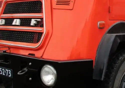
And then there’s the British Ford Thames truck.
I’m generally familiar with th C-46, but read up on it at Wikipedia, which has a good page. I’m not going to give you a Cliff Notes version; just head there and read it yourself.





I cannot answer your question. Also, I am mystified by the partial name of the airline.
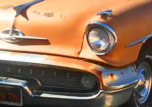
Maybe this is because I am amazed that today is the first time I ever realized that those conical wheel covers for the 57 Plymouth came in two varieties – plain for regular Plymouths and with little ring of dimples for Furys, as shown here.
Could the name of the airline just be generic? They are selling the car, the plane is just the background?
Wait a minute. Why are a Fury and a Ford Thames at the same place? Opposite sides of an ocean?
I doubt that this artwork is selling anything. It has all the earmarks of being modern. The Fury isn’t white and has a California plate, two things that suggest this is not derived from a period promotional shoot. Also, the aircraft was an outdated relic by 1957, certainly not something with the kind of jet/space age aura Chrysler would seek for a pairing with this car.
The non-US fuel truck suggests that the artist is from some other country and is paying homage to two vintage US designs.
Is the (British Ford) Thames truck in California an homage or a joke or both? Who in the US would have a clue what it was? Or even notice? It could have been a secret until this morning.
Wikipedia says the C 46 was often used post-war as a freighter. Is that generic window spacing?
Printed for the dentist’s office?
Around the World Airlines?
Seems to work but the spacing seems a bit off. Or maybe it is intentionally ambiguous. What I am crediting as a “U” doesn’t quite seem to make the cut with what is showing.
There was a cargo company in the 1960s and ’70s called Seaboard World Airlines, whose planes had graphics just like this one — same color scheme, same lettering, and same gold tail.
My guess is that they used a Seaboard plane and then edited the name and tail marking to make it generic. Below is another picture of a Seaboard World Airlines plane – this one just says SEABOARD WORLD on the side, though others did say the longer SEABOARD WORLD AIRLINES like the plane in the Plymouth picture.
And the truck in the background seems strategically placed to cover up the FAA N-number too.
This seems to be the winner. My guess is this is an allusion to Trans World Airlines (TWA) but altered from Seaboard World Airlines to the fictional Around (the) World Airlines and the creator didn’t get the letter spacing correct.
Additonally, I would surmise they chose to copy the obscure airline over the much more well-known TWA in an attempt to minimize any legal ramifications.
It looks like the art actually drew from this exact photo. While the wing is moved around a bit, look at the bright rectangular “box” painted on the fuselage below the side windows of the cockpit, in the drawing. In the photo, that “box” is actually a reflection from the interior of the cockpit, showing through a lower side window of the cockpit. Likewise, one “shiny” cast spoke of the landing gear wheel in the photo, pointed towards the rear of the plane, is duplicated in the drawing.
Great observations. I suppose that would further explain the placement of the Thames truck, since the artist wouldn’t have to recreate the plane’s belly.
The plane (N10427) crashed and was scrapped in 1973, in Colombia. An engine failed, and the plane lost altitude and crashed, trying to land on one engine, killing the two pilots aboard.
https://www.historynet.com/going-commando/
This article talks about these flying over the Himalayas. Interesting how they may have attempted that absent a pressurization system.
I can’t make sense of that airline name. Aron___World something.
The ’57 Plymouths looked like a heavy car with those big deep haunches.
The dash mounted mirror and fender mounted side view mirror gave the driver little opportunity for good visibilty in those directions.
Yeah, I think it’s AROUND THE WORLD AIRLINES to be generic with some disregard for spacing.
Maybe we need a caption contest: “Realizing he’d brought both the wrong car and the wrong jacket to Jamaica, Biff decided cut his losses and stow away on a cargo flight back to JFK”
Still, that double A on the vertical stabilizer is throwing me off.
How about, “In a ripoff movie based on Hot Rod, Pete is about to disconnect that truck and take the C-46 for a ride.”
I wonder if this was a discarded proposal to offer the 1957 Fury in colors other than Sandstone White.
1958 was limited to Buckskin Beige with 1959 being the first year for a wider color palette.
Seems to be here at Flickr (and perhaps many other places) where it’s referred to as a “postcard” (don’t know why).
https://www.flickr.com/photos/autohistorian/51962969121
I see there’s the artist’s vanity-plate “57 Fury” there as well. This sorta feels like something from a dozen-years-ago “Cars of the Fifties” calendar or something—or even the artwork for a puzzle?—but who knows….
I think you may have gotten it with the close-up of the license plate, sort of like a stamp proposal someone submitted to the US Postal Service.
As I mentioned previously, it’s the color of the Fury that really questions any kind of legitimacy of the image as official Chrysler artwork. It wasn’t until 1959 that Plymouth offered the Fury in anything other than a singular white or beige hue.
From the Flicker link, I was able to make out the word ‘OKAMOTO’ in the lower left. A perfunctory search shows it as a Japanese company that’s been around since 1934 and makes a wide wariety of products, including ‘automotive materials’.
Maybe it’s part of some sort of advertising material that company came up with back in the fifities?
I suspect it’s much more recent than that, from the description of “postcard” seems it could well be that, the type you often see in gift shops of museums etc, used to be a big rack of them in the motor museum near where I grew up.
I wouldn’t fly in a plane that says AA on the tail. It brings back memories of Foster Brooks doing his drunk airline pilot skit with Dean Martin.
Ford Thames lorry driven by a foul-mouthed Glaswegian used to deliver our school milk back in the Fifties – looked really modern back then.
Suddenly it’s….. yeah, I got nothin’. 😉
As military transports turned airliners go, the C-46 was sleeker and better looking, than the 377 Stratocruiser.
Beautiful painting. It appears it may be a collage of three original subject photos. Four, if you include the Rick Nelson-like man.
Given that the California license plate enlarged by George Ferencz was not issued until 1963, this work is certainly not contemporary with the car.
Perhaps a word from the artist, “Keep the CC members guessing!” Can we find the artist and ask his wont? Love your comments, gents.
Interesting colour for the Plymouth, since I have a ’58 Belvedere in that colour! :).
Although ‘57 Fury’s only came in white.
Obviously just a poster of some kind with little regard to authenticity.
On the Thames truck front, there was a small fleet of them in my childhood town. One was rolled, and spent the rest of it’s life topless.
For some reason I was always pleased to see it. And good catch on the Seaboard World airlines. I went there, too late as usual
Those Thames Traders used to be everywhere but its decades since Ive seen one in the wild, they just vanished when worn out and replaced with newer models.
Based on the great comments I’m reading here, I’m gonna add another perspective;
I suspect this was an illustration created for a short story in a 1960s magazine, perhaps an issue of Saturday Evening Post. I agree the artist likely selected several different photos to illustrate things like the refueling truck, modifying certain parts like the airline name due to copywrite issues.
Perhaps the story line included a part where Bob was carefully watching the refueling operation, before the plane took off with it’s hidden precious cargo.
The license plate reminds me of the clues left by the designer for the Louis Marx Toy Company. He often left visual clues on both the toys and the box graphics. Quite a few plastic toy cars had the license plate number 718 which was the street address of the designer’s home, He was also known to hide his initials in various locations in Marx toy box color graphics, especially on the big “Play set” boxes.*
* I don’t have my Marx Toy Co books handy, but I am pretty sure the number was 718, and his initials were CH.
Is the sweepspear authentic? It isn’t as garish as the trim on the ’58 GM cars, but it’s bad enough.