Here’s a controversially styled car, courtesy of a controversial stylist; the 1960-62 “Plymouth” Valiant. A product of the one and only Virgil Exner Sr. And here’s a quote from another controversial stylist, a certain Chris Bangle of BMW fame: “A leader’s job is to take people where they don’t want to go.” Love them or loathe them, the work of both have left their mark in the automotive industry; and on more than one occasion, took us to places we didn’t wish to go. So, where was Exner’s original Valiant taking us to?
Exner’s talent was undeniable from early on, calling the attention of some of the most renowned names in the auto business. First, he left his illustrator post at a small advertising firm to work under Harley Earl at GM. Mr. Earl knew a talented number when he saw one, and before 30, Exner was head of Pontiac’s styling. Then, in 1938, he switched jobs and went to work under another design legend, Raymond Loewy.
Now, Earl and Loewy were excellent talent managers and self-promoters but were no great draftsmen themselves. Instead, they were the ideal kind of men to deal with corporate management and clients; balancing costs and production deadlines, while having a great eye for design.
By all accounts, Exner outshone his superiors in the artistry department; he could sketch, style, and sculpt like nobody’s business. In the industry, he became known as a ‘designer’s designer,’ and as such, he preferred to work in the styling studios rather than deal with management matters.
In someone’s quote; “Earl and Mitchell were sons of b*tches that loved cars… but Exner was an artist that loved cars.” This meant that while Earl and his ilk managed artists in an authoritarian manner, Exner always behaved as ‘one of the guys.’ Even as he ascended, he kept a close relationship with the designers around him, and always preferred to get his hands -and suits- dirty working by their side.
This doesn’t mean Exner was devoid of ego. That he had in spades, otherwise he wouldn’t have been an artist. Boisterous or mousy, defiant or easygoing, artists always look for the spotlight. Otherwise, why would they devote themselves to any craft? To expose one’s ideas publicly, and receive validation or scorn is not for the humble or faint-hearted.
Indeed, Exner’s need for recognition soured his relationship with Loewy as he gained favor with Studebaker’s management, one of the firm’s main clients. A brief interlude followed, with Exner leaving Loewy, and working directly for Studebaker, though with Loewy still being credited for the work. It all sounds dubious and shady now, but it was common PR at the time; the ‘genius’ one-man show. A bit of PR storytelling that worked wonders with the media and the public then.
As it’s rather known, Exner landed shortly after at Chrysler, which was in dire need of new styling ideas by the early 1950s. From the get-go, the intention was to create a number of styling proposals to lead Chrysler’s future designs. To build them, the company hired the services of Carrozzeria Ghia, in Turin.
Despite the production lull of WWII and the ‘cars of the future’ dreamt during that period, few Detroit carmakers took those styling paths. Instead, Italian coachbuilders were the hotbed of the automotive styling world. Chuck Jordan admitted as such; visits to European car shows were a must for Detroit’s stylists. Pictures were taken, deals were signed and ideas flew between the two continents.
Exner working with Ghia was part of that trend. With the Carrozzeria at his disposal, Exner started an ambitious effort to mix American and Italian styling.
There’s been much debate on who did what with the Chrysler-Ghia concept cars. Corporate PR would have everyone believe it was mostly Detroit’s input. People in Italy close to the experience say it was a ‘collaborative effort.’ For the 1953 Chrysler Special, Exner’s scale model shows a number of differences in proportion and detailing to the final Ghia car; suggesting that Luigi Segre took his own initiative when needed and that Exner agreed with the results.
Ultimately, part of the problem is that designers working on a car are not too different from an orchestra. A conductor is needed, and a soloist too, plus the ancillary players. For practical and legal reasons, the conductor is the one ‘responsible,’ even if we as humans wish to learn the minutiae of ‘who’ came up with what. Yet, the ‘conductor’ is ultimately responsible for the final results. After all, Larry Shinoda’s sketches may have been behind the ’63 Corvette, but if Bill Mitchell hadn’t said ‘yes’ to those, the ’63 we know wouldn’t have come to be.
That said, it is always fun to find out who the ‘soloist’ was in those automotive numbers we like.
During the Ghia days, Exner got to play with some ideas that became part of his permanent repertoire. Also, thanks to wind tunnel testing performed in the labs of Turin’s Polytechnic University, Exner developed a fascination with fins. Besides being different and cool looking, the tall fins ‘helped a car’s stability.’ Or so was the PR behind their logic and application.
That being true, Exner obviously also really liked them.
Here’s where the happy ‘fin-tastic’ years of the Exner experience take place. It’s evident someone was having fun with the ’57 line. The models were exuberant, cohesive, and eye-catching. Nothing looked like them, and the rest of Detroit rushed to emulate them. Exner’s ego must have been greatly rewarded; the industry, even his old bosses, were now chasing after him.
One problem. Once everyone caught up with him in short order, how would Exner the artist upstage them again?
The opportunity presented itself when Chrysler announced its new compact for 1960; the Valiant. As luck would have it, here was Exner’s chance to leave a mark in a new segment. That is if he didn’t die first in the process. In 1956, workaholic Exner suffered a massive heart attack. It sidetracked him for good and left Chrysler’s styling rudderless for a while.
Not that Chrysler was alone in their troubles. By the mid-50s the whole of Detroit was in a state of flux. The postwar market had been red-hot, being a quickly changing environment filled with possibilities and peril. Independents were merging or about to disappear, and competition amongst the Big 3 was fierce; with new divisions being created out of the blue. It was such a dynamic environment with so many players involved, that actions were often reactionary. Companies invested, ‘planned’, and ‘prepared’ for the ‘future,’ but most waited to act until somebody else did so first. A ‘look over your shoulders’ kind of behavior, in a constant act to upstage the neighbor.
And when it was known Chevrolet and Ford were to release compacts in 1960, Chrysler just had to join in the fun. Rushing while doing so.
In 1957 Chrysler president Tex Colbert set up a task force of 200 engineers to develop “Project A901,” the company’s compact fighter. The model was to be Chrysler’s first unibody vehicle and to expedite production, it was the first automobile designed with the help of IBM computers. Suddenly it’s 1987?

Following company tradition, “Project A901” was designed from the inside out, with passengers’ comfort being top of the list. Along Exner, Chrysler’s engineers were set on creating a car that while smaller, would not sacrifice passenger and luggage space. The in-development Slant-6 would also allow the car to have a low cowl and ample visibility.
In the handling department, Chrysler’s engineering did their work. The suspension was to be an SLA torsion bar up front and leaf springs in the back. Under driving, it proved to be the best in its class. In many respects, as a previous CC mentioned, the Valiant’s development was the progenitor of all future RWD Chrysler cars.
At some point, “Project A901” got its official name, “Valiant.” There are a few stories regarding its origin. Some say it was the result of a contest between Chrysler employees; a likely explanation.
Thus, Chrysler’s compact was launched as a separate brand in 1960, under the slogan ‘Nobody’s Kid Brother.’
Now, Exner may have been down, but he was still kicking and was ready to make his next artistic statement. While the Chrysler 1960-61 lineups showed some unfocused ideas -the result of some upheaval at Chrysler’s styling studios during his absence- the new Valiant was the one product Exner put most of his effort into. So very much so, that the proposed -and aborted- ’62 lineup clearly carried Valiant genes.
In all, the Valiant was Exner’s chance to lead again.
Something to keep in mind with products such as cars is that it’s a marriage of commerce and art. There are goods that consumers need where such matters don’t come into play; beans, salt, or soap for example. Then there are many others, like clothing and cars, where appearances matter. Some may like to believe otherwise, thinking that trends don’t apply to them, etc. But even if one chooses to consciously eschew popular trends, the truth is no one buys a product they dislike in appearance.
A stylist, being an artist, follows instinct. An annoying and indefinite term that resumes the whole matter. By instinct, an artist knows that repeating the same forms and shapes makes for dull and boring results. Yet, investors prefer to stick to known quantities and safety. To not meddle with what’s worked before. But safety also leads to dullness and boredom, as Chrysler had experienced with their dwindling sales in the early ’50s.
Moving into new directions is daring and risky, and when mixed with business, it can have rather costly results. And yet, evolution is always necessary. There lies the tension that ever exists in the business of commercial art. And with the Valiant, Exner was pushing the public to go from his exuberantly finned Bebop wonders, to the flights of imagination of a norm-shattering Ornette Coleman.
It was clear that Exner was in search of a new artistic language by the late ’50s. His artistic self looking for ways to upstage those around him. The Valiant resumes a bunch of ideas that had been simmering in his head for a while; with many details coming from the age of the Ghia concepts.
The Valiant’s central radiator flew in the face of Detroit’s ‘wider and lower’ practice; but had been a Ghia concept car mainstay (upper left). The Valiant’s simulated round fender around the rear wheel was meant to evoke the classics, like in the Ghia D’Elegance (upper right). The ‘eyebrow look’ and horizontal-plane-wing body had already been suggested on the Flight Sweep of ’55 (lower left). And then there was the influential Imperial D’Elegance of 1958, where cabin and body finally fused together in ‘fuselage’ form (lower right). With the ‘fuselage’ body now being Exner’s new language, it only made sense that simulated horizontal fins provided surface treatment on the flanks; as it occurred on the Valiant (and the XNR show car).
Artists, like everyone else, can suffer from ‘group thinking.’ They can create a design made to impress other designers, inadvertently ignoring the general public. As told in a previous CC post by Paul, the original Valiant’s fuselage silhouette was way ahead of the competition. It was most evident with the ’62 lineup, which used the Valiant’s principles; with the short deck and long hood, and the cabin pushed slightly to the back. The ’62s had rather dynamic bodies, making Ford’s and Chevy’s offerings look static in comparison. The trouble was to look beyond their fuzzy detailing.
If we forget about its three-dimensional reality (just try, please) the intersecting lines of the Valiant clearly show the ideas behind this ‘design for designers.’ Specially in profile. The front fender wing connects to the rear one, adding movement and continuity. A subdued character line below the windows’ edge connects with the rear fender flare. The whole cabin was visually pushed almost 1/3 into the body (an effect achieved by moving the windshield back, close to the dashboard’s edge), resulting in a more dynamic profile. Finally, the rear sculpted fender ‘adds’ volume to the compact vehicle, breaking up the shape in what would be an otherwise plain rear quarter.
It’s to a large degree, a rather cerebral exercise. And in real life, the design’s good bits get lost under its elaborate sculpting. As it’s proven over the ages, many find the Valiant’s styling too polarizing and inaccessible. Yet, it’s got a number of details that designers can appreciate. It actually reminds me of Bangle’s work to a degree, with the Z4 and its many intersecting surface treatment lines. Another design that was filled with many ‘design for designers’ ideas.
I had some time to ponder those many concepts as I examined this early Valiant I discovered in San Salvador’s streets. As I understood, some of the model’s styling flourishes were meant to disguise its compact dimensions. And in real life, they do achieve that result. The car seems larger than it actually is.
Chrysler’s were not really part of my childhood, as they weren’t that common in Puerto Rico then. I can’t say how a Valiant would have impressed me as a kid, but I remember coming across my first one in California during the ’90s. It was a light beige one with a dull paint finish, otherwise in pretty good shape. I remember staring at it and thinking something along the lines of: “That’s an odd-looking vehicle… I think I wouldn’t mind owning one.”
Now, “odd-looking” is not a quality most people mention when searching for a car to buy. But the little 1960 Valiant did good sales business for Chrysler, even if behind the Falcon’s and Corvair’s numbers. With 194K units sold in its first year, the model proved that some buyers liked a product that stood out. However, sales went down from that first year, showing that most of the public wasn’t quite ready to follow Exner’s new lead.
As with many of my Salvadorian finds, this Valiant has much missing and altered trim, though its body seems fairly solid. Even if the trim is altered, such efforts show invested -if misguided- owners. The real reason this old car is still around, and for that, I’m thankful.
Talking about missing trim, I have a hard time telling if this is a ’60 or ’61. I believe it’s a ’61, and if so, a Plymouth Valiant, after the short-lived brand effort was dropped (unless you lived in Canada, where the brand lasted longer).
On the other hand, some trim has survived for ages on this Valiant. Barely. And for those who don’t know, the grille badge serves as the hood release. It’s a neat little detail.
Thanks to the wonder of wide-angle lenses, here’s an augmented view of the Valiant’s ‘plane wings’, showing clearly those aviation genes that Exner loved to play with.
The Valiant’s back is, admittedly, where Exner’s ideas get fuzzier, and it’s harder to find much reasoning behind them. Other than those details being his hangups.
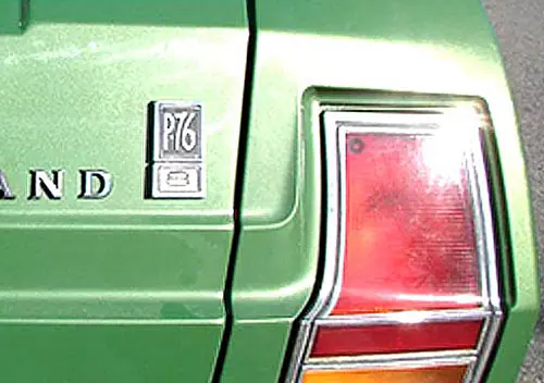
And here it is, la piece de resistance! The much-derided ‘toilet seat.’ For those who can’t stand it, may I suggest you a similar vintage Lancer? And what’s up with that badge? How did that end up here?
Seen from this view, a number of Exner’s ideas were ahead of the times. The aggressive extrusions on the Valiant’s fenders are now common practice, even if applied in a more integral form. Look at the lines of that tiny black Hyundai upfront; some of its intersecting body lines almost appear to be an extension of the Valiant’s.
There’s only so much artsyness the public is willing to take. And while the Valiant did OK business, I very much doubt Exner’s original ’62 Chrysler lineup would have been much of a success. Just like musicians enjoy the cerebral exercises of Bach’s variations, the public prefers the emotions of Beethoven and the playfulness of Mozart.
As it’s known, Exner got booted from Chrysler during the whole ’62 debacle. Yet, he would eventually influence the industry again with its 1963 Stutz revival concept. Chrysler was going to take a safer route with its next head of styling, Elwood Engel. Probably a good decision. It took a few years for Detroit to catch up with Exner’s retro desires, and Chrysler wouldn’t have been able to afford the wait.
In the meantime, let’s take one last look at this Valiant, a styling exercise whose leadership was questionable, but ultimately influential. I won’t deny that I find Exner’s work fascinating, even if not always satisfying. The places he wanted to take us were probably not always to our liking, but what would the automotive world be without his detours?
Further reading:
Automotive Design & History: 1962 Plymouth & Dodge – The Real Reason They Were Downsized
Car Show Classic: 1960 Plymouth Valiant V-200 – No, It’s Not A Plymouth, Not Yet
Curbside Classic: 1960-62 Plymouth Valiant – No One’s Kid Brother







Great article, and thank you. The mystery badge is from a Chevrolet. Maybe a ’60?
I’ll be the odd man out here. I’ve always loved the original Valiant. I don’t recall seeing very many of them growing up in the rust belt in the seventies. Most of them had dissolved by then. Even a later 60s Valiant was a rare sight amongst ubiquitous Dusters and other contemporary Chrysler compacts. But then I like the 60 Plymouth too; another oft criticized offering. The only bizarre Chrysler I can’t stomach to this day is the downsized 62 and 63 Dodge. The 61 Plymouth for example has for me taken on a mid century Buck Rodgers appeal though in 1961 I would have spent my own money on anything else. But heck , I listen to Ornette Coleman. None of this makes me hip. It just means I share something with the 194,000 people who took a 60 Valiant home. Prices for surviving examples aren’t bad and every now and then I’m tempted by something I see on Hemmings.
We can both be the odd men out here. I once had that “The Story of Valiant” booklet. The chrome hash marks on the top of the rear fenders definitely say it’s a ’61.
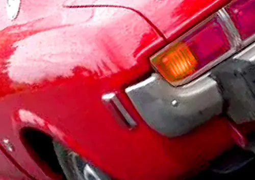
Never noticed those hash marks in front of the ‘cat’s eyes’ on the ’61 Valiant before. Actually thought it was a reference to the Lancer, which got similar hash marks on upper trims, but the location was behind the rear wheels.
That twin flag bade had to have been copied (mimicked) from the ’59 Chev. Nice idea, I suppose. Gladly short lived. I never noticed that before.
That badge on this car was not original; it is of course a Chevy badge someone mounted there instead of the “Valiant” script of the original.
Very nice write up. You know, at 60, I never truly appreciated the art of the different cars as a kid, but I do now. And I’ve learned that it is ok and normal for there to be love or hate for the design of a car.
One of the 4 cars we own is a 1978! Thunderbird Diamond Jubilee. Ok, so not everyone loves the large blanked out window, or the fluffy vinyl top. But when I first saw one, at 16, I knew I’d own one.
Now you’ve shown me another possibility with a Valiant. Guess I’ll need more garage space!
This is an exceptionally well written and well-researched article.
Kudos to the author for an outstanding piece of work.
I will be looking for his name on future posts.
Loewy and Ex were quite well known in their day but are not so well known today.
I wrote a book about this (“Lancia Loraymo and the Loewy Logic of Industrial Design”).
There has been one book about Ex, “Virgil Exner: Visioneer: the official biography of Virgil M. Exner,” by Peter Grist. I recommend it, but it is a bit pricey today.
I’ll second the admiration of Rich’s write-ups. They remind me of the automotive versions of the types of articles found in high-end literary magazines like Vanity Fair, The New Yorker, and Esquire. Extensive readers know and appreciate well-researched and constructed writing, regardless of the subject matter.
Yeah, some articles might be a little more in-depth and ‘wordy’ than some might like, but for the automotive cognoscenti (which seem to be many here at CC), well, they’re worth the time and effort to read.
Likewise, the comments of most users aren’t bad, either.
Great write up as usual, but….these things make my eyeballs bleed.
My first new car- a ’61 Valiant V 200.Solidly built, albeit with rear seat upholstery at an angle!,wonderful engine, great transmission with the shifter easily slid into park.Heater controls nicely placed at the right.Sat 6 with relative comfort, full spare under spacious trunk.I had to special order the toilet seat!car came without it.Only bad spot, sheet metal curved too close to rear bumper.Solved the problem with specially crafted bumper guards.
Great article Rich, you are doing some amazing heavy lifting. My dad subscribed to Time Magazine from the 1940s until the 1970s. So, I remember reading that issue featuring Loewy, when I was a kid.
Before my time, so I didn’t experience these day-to-day. They seemed like well-engineered cars, let down by overzealous, polarizing styling. Perhaps ego-driven?
I’m surprised such weird styling by Chrysler during this era, ever got approved. Why there is a marked distinction between the profession of ‘artist’ and ‘commercial artist’. Foremost, commercial art needs to be sellable.
Polarizing and trendy, a frequent recipe for poor sales.
The Valiant station wagon had the potential of being a rather cool looking vehicle, even if retaining the 4 door version with my mods – however, a hardtop would have been even cooler looking (in my opinion).
I somehow both admire the ’60-’62 Valiant styling and don’t like it. Besides the overly exaggerated fender bulges, the huge C pillar window always bothered me, looking more like something from a 1930s or ’40s car than something to lead the way into the ’60s. The windshield is too upright, which also makes the front seat compartment feel claustrophobic. And toilet seats belong on toilets not cars.
Mechanically though, the Valiant was the best of the 1960 compacts.
“I somehow both admire the ’60-’62 Valiant styling and don’t like it.”
That’s a very good way to describe the original Valiant. It’s radical but not overly polarizing or offensive in an Edsel or Aztek way.
It’s probably best to say it looks like a compact that had been styled for the late fifties market and didn’t quite fit into the New Frontier sixties, sort of a holdover from the Eisenhower years that didn’t jibe with the youthful Kennedy administration.
It’s sad considering the Valiant’s solid, advanced engineering compared to, say, the Falcon, which was way more conventional in both appearance and drivetrain (and was a huge success).
I guess that may have been part of the problem; Chrysler management wanted to highlight how new the Valiant was underneath, but simply went a bit too far with Exner’s design ethos. The Valiant definitely stood out relative to other cars from 1960, but not really for any good reasons. And it sold well enough to convince Chrysler management that the same styling should be applied to the downsized 1962 Mopars (and everyone knows how that turned out).
For a brand-new 1960 compact, the radical Corvair was a much cleaner, more cohesive design (especially the sporty Monza coupe).
Where the 1G Valiant mainly loses it for me is the ersatz Mercedes/Lark front end. The toilet seat on the sloping trunk lid does it no favors, either.
In that regard, the 1961-62 Dodge Lancer is much better, including the toned-down, Dodge-family round taillights in lieu of the Valiant’s cat-eyes.
It’s worth noting that Exner really cleaned up the Valiant with the terrific second generation model. Unfortunately, by that time, he was gone from Chrysler so most of the credit goes to Engel who did make some minor (but noteworthy) improvements. Initially, Engel added the little finlets, an irony considering how Exner had moved on from that short-lived fad.
Then, too, Engel’s touches of the full-width grille and moving the taillights to the finlets for 1964 really pulled the whole design together. To me, while the original was distinctive to a fault, the 1964 Valiant is the high-point for Chrysler’s little compact.
I like the Valiant front end. To my eye it has a bit of Italian flair. The Lancer front end is generic-blah. We agree about the toilet seat and the tail lights.
As an engineer who worked closely with industrial designers for decades, I found this very interesting. Thanks Rich! And as someone who grew up with a neighbor that had a Valiant for a long time, until after I had my license and got to drive it once or twice (pushbutton transmission and all), I was pretty used to them. But the mid-sixties streetscape had such a variety of cars that almost everything looked normal. When you could see a Mustang, a ‘52 Chevy, a ‘59 Chevy, a Valiant and a Beetle in one glance, the Valiant didn’t really look odd. Kind of like the Gen2 Prius, after a few years of seeing them it was just another car. Imagine if the Aztek or Suzuki X90 had sold in the hundreds of thousands 😀
An excellent study, thank you!
Speaking of interesting design, the house that Loewy issue of Time Magazine was delivered to is a masterpiece on it’s own merits: https://goo.gl/maps/GVCR1k8T3ypdi3xj8
A nice survivor and good write up .
I’m wondering if this car had the nifty short manual trans shifter……
-Nate
That gold 1962 Chevy Impala looks good to me. The character line that runs down the side just below the beltline gives a feeling of forward motion to the car. In all, it’s a very cohesive design in my eyes.
Kudos, Rich; a most delightful and insightful article. It’s a perfect subject for an artist like yourself to take on. The Valiant (and ’62 Plymouth & Dodge) represent the high water mark for unchecked artistic flights, thanks to Exner. Like the 1934 Chrysler Airflow, it would be a lesson for the whole industry (AMC excepted, apparently, with its Pacer and Matador coupe).
Exner previewed the future, with the long-hood, short-tail proportions, but the weird details derailed them, as well as just the fact that Americans are conservative and need time to get used to new ideas.
Which they did, in the form of the Mustang, in 1964. There’s no doubt that the Ford designers were inspired in good part by Exner’s proportions, and even the specifics of the ’62 Dodge front end, which rather previews the Mustang’s.
I felt the same way about the original Valiant at the time it came out as you did: fascinating, curious, surprising, but put off by certain aspects that made it too odd. But then kids tend to be rather conservative.
And it did not age well. I had a friend whose parents still drove one in Towson in 1965-1966, and it was a bit embarrassing to be seen in it by then. It had not aged well.
Some have said that it was a mistake to apply such an advanced design language on a compact car; that this is better done on a large and upscale car. But then the ’60 Corvair was an advanced design too, although in a rather different vein. And while the Europeans went gaga over the Corvair, and set about copying it like mad, the ’60 Valiant had little or no direct influence there.
The Valiant and ’62 Plymouth/Dodge are two of the most fascinating chapters in post-war history. They may not have been successful at the time, but here we are still debating their details and influence.
Honda Driver is not alone. I genuinely liked the Valiant from the beginning and now with the benefit of 20/20 hindsight, it ws the best styled of the 1960 compacts, leaving the Corvair and particularly the Falcon behind in their comparative frumpiness. It does not matter to me that Europeans chose to copy Corvair because in their imitations they also took on that frumpiness. But Valiant was perhaps too strong a character to copy. That, I regard as a virtue.
I understand about being a style leader but surely Chrysler had focus groups in the 1950’s that could have warned them the design was too radical and caused them to tone things down a bit. Also, I feel certain that Chrysler had lots of corporate intelligence available that let them know what the Falcon and Corvair were going to be.
Outstanding article and background research – thanks for this great read today!
I like your analogy of car designers and an orchestra. It reminds me of the oft-told musical joke about when a symphony’s conductor suddenly became ill before a concert, and one of the musicians had to take his place at the last moment. After the concert, one of that musician’s colleagues saw him back stage and said “where were you tonight?” Sometimes it’s hard to keep the musicians (or designers) from just doing their own thing anyway.
Well done! Nice write up on a car sadly hobbled by those of us with vision.
My family and I were big fans of Valiants, Darts and Dusters – but these?
Imagine you are one of hundreds of outstanding engineers, creating cutting-edge work within your teams of interior design, handling, engine design and – then you hand off your work an “artist” that turns your work into looking like – a potato with wings. You watch for two years as your excellent car loses to the ridiculously dated Falcon. Not even close. For every one sale, GM and Ford gets more than three.
Was it the “artist” that screwed up? Well – from the time the winged potato was replaced, Chrysler Plymouth was number one in the compact car market. Buyers chose the Valiant and the Dart over the Falcon, Chevy II and Corvair. So the answer is – yes, it was the artist that screwed up. This excellent car was hobbled by the guy who wanted another auto styling hit. The entire early 1960-1964 Chrysler design had harmed the corporation. Good cars that were tough to look at.
Thank you Engle for stepping in and saving the Valiant
A terrific article on the design of the Valiant! You picked up all kinds of things I had never noticed (and I’m one of those who likes the original Valiant’s “out-there” look). Seeing the underlying formal structure of the profile view helps me understand why I find it satisfying. Apparently designing for designers works across art forms, because I’m a classical musician trained in the forms and structures of classical music. (Fortunately for us, there’s plenty of cerebral stuff brewing under the surface in Beethoven and Mozart!)
Exner definitely had his stylistic language that makes his work instantly identifiable, just as personal language comes through in great paintings and sculpture and great works of literature, music, theatre, and dance.
Always liked the “s/w” version of the the “early on, Valiants”. We had one/two roaming the streets of our town.
One was light blue, the other , a “beat looking, brown”.
This was a fabulous article, Rich. As one who has done some diving into this pool before, I think you are on target with your conclusions. Like Exner as more artist than manager. I have wondered if this wasn’t the real reason for the problems of 1957-58 – Exner got promoted to VP and Bill Schmidt was hired from Ford. But I think the evidence tells us that Exner wanted the title and prestige of VP but still wanted to do the work in styling – which left precisely zero room for Schmidt, who left after a short time.
Exner is also on record as saying that nobody on his staff had a strong idea of what would replace the 1957 vision of car styling. Exner came up with one concept – which is shown in the Valiant and in the 1962 Plymouth and Dodge. But right around that time, stylists at Ford were coming up with an alternative – that was clean and rectangular (think 1961 Lincoln). While the public chose Exner’s vision in 1957 (until the failings of the non-styling parts of the cars soured buyers), the public ran to the other side of the boat and embraced Ford’s vision, and the more stylish variation that soon came from GM. Suddenly, Chrysler’s styling looked very dated.
I love the jazz analogy. Another one is that Exner went all Ornette Coleman while the rest of the industry went in the direction of Stan Getz, whose clean, simple phrasings (often in a bossa nova style) struck the public’s fancy.
For me, I don’t feel the Valiant’s styling has aged well. Why? The foretelling long hood short deck proportions, and six window profile, made it look very modern for its day. Placing its design in comparison with newer cars like the ’63 Riviera, that did a much cleaner job of making the long hood short deck proportions beautiful. The very dated and overstyled bodywork of the Valiant, combined with the state-of-the-art proportions and clean greenhouse, makes it look like a strange prototype miscreation. As it looks more modern than it was, the overdone ’50s like styling touches, make it near a design mess IMO.
Great article, Rich. I love your analysis of the form, showing relationships I hadn’t noticed – like why that character line under the windows was there. I’ve never been able to figure out the design of the ’62 big Plymouth though. While the Valiant gets an immediate Yes! from me, the Plymouth just merits a “Huh?” – this from a guy who’s not a great fan of the other two either. I have a spare kit I’ve been going to customize, in an attempt to tidy up the design, but the more I look at it, the more puzzled I get – I’d love to read your take on just what was going on there, there seem to be so many disparate details. Another time.
Always loved these cars as a kid – they just looked so different. I always liked the ’62 without the ‘toilet seat’, but preferred the ’61’s taillights.
But they were a design that went nowhere. The following generation (as rebodied in Australia) showed no visual resemblance to these, except perhaps the low waistline. The ’60-2 aged quickly, but attracted an enthusiast following very early in Australia. helped no doubt by having the 225 as the only engine available here – with almost twice the power of a Holden, who wouldn’t want a Valiant?
So does CC-in-scale have one? Yes, but it’s one of my early models (about 1972) and I don’t have any photos of it. Here’s the box photo – nice angle!
The Lark took similar elements as the Valiant for its front end – and did a better job than the “artist”. The Comet took similar elements as the Valiant for its rear end and tail light design – and did a better job than Exner. What one might like about the Valiant, was done better by its competition revealed at the same time.
Sorry, but the public was not impressed Mr. Exner.
I posted this here in the past – a superb rendition from one of the geniuses on the below HAMB thread – and again I wonder what might have been if Chrysler had something like this with the 273 V8 in, say, 1962.
https://www.jalopyjournal.com/forum/threads/the-photoshop-thread-to-end-all-photoshop-threads.300531/
What a terrific piece, Rich Baron.
Your lines drawn onto the old Val possibly, if inadvertently, illustrate the problem of the car. You are someone with an eye to pick up the underlying unity of concept, but alas, most of us aren’t. I have no doubt Exner literally saw a different object when he looked at the same car seen by a pleb like me. And I see it all in disunity, with stuff going everywhere, and form seemingly for the sake of it.
But like some others here, I do have a soft spot for these flared-wing oddballs. There were very few around when I was a kid in the ’70’s, and it was fun to see some car that was not one of the multitudinous Holdens or Fords. And in an odd twist of fate for low-priced US car, various factors meant that they were sold and priced as a bit upmarket here, so most seen had been well looked-after.
Excellent article on a superb car.
The 1960 Valiant was revolutionary. It was a quantum leap ahead of anything else-far superior to its competitors, though unfortunately, mamy people are essentially cattle, and prefer flashy advertising to good engineering.
The chassis is superb, the suspension excellent even today…it was head and shoulders superior to the archaic (even then) Falcon, with its poor geometry, add-on ram-assist steering, and high unsprung weight and center of gravity due to high-mounted coil springs.
Unlike GM and Ford still using archaic (often cast iron) 2-speed automatic transmissions,the Valiant used the aluminum 3-speed 904 TorqueFlite. (Which ran to 2003!)
But the biggest advance was something nobody thinks about now. Standard on all Valiants (all Chryslers for 1961) was…an alternator.
I was 16 and a sophmore attending highschool in Union, NJ when I first saw a Plymouth Valiant. The car really made a big impression that I could not explain.
I spent many hours sketching that car in favor of paying attention to Early European History.
Fast forward to 2025 and I am fast approaching my 80th Birtrhday. Six months ago I spotted a 1961 Dodge Lancer. Again, I can’t explain why but I bought it.
Mr. Exner worked his magic. I LOVE this car.
It’s name is Virgil.
Stephen ;
Slant 6 of V-8 ? .
You made the right choice, these are terrific drivers .
-Nate