(first posted 2/28/2017) This article by renowned historian Michael Lamm in Special Interest Automobile magazine #125 was posted at hemmingsblog.com, but in case you missed it, or are ready for another go-around, here it is. (click on pages for full size).
Source: hemmingsblog.com









GM got some revenge for Chrysler’s ’57 grab of styling leadership. The weirder elements of these cars came closer to production on Chrysler’s 1959-1962 cars than they did on any GM car. Did Chrysler have a mole in these studios?
No…Should be “When GM discovered LSD! IMHO
GM from 1958 to about 1962/63 where some of the most ridiculously idiotic looking cars in the world. 2 1/2 ton 22 foot long finned chrome plated parade floats. Just sayin’
I’m with you on that one Paladin,
I have considered the LSD explanation myself.
Further, at that time, those cartoon freak show vehicles were taken very seriously by well educated people and involved a large amount of hard money on the line, for what they were making (!?)
It must have been a really interesting time.
PS, It was not just GM!
I remember a cartoon of the time showing the back of a ’59 Chevy sticking out of a garage. A boy is running out of the garage crying, “Mommy, the car is eating my bicycle!”
The LSD theory certainly fits the designs.
Also, it was around that time when Virgil Exner got a heart attack and a convalescence during the development of the 1959-1960-1961 Plymouth/Dodge/DeSoto/Chrysler/Imperial models where the stylists improvised and didn’t got some coherence.
At http://www.forwardlook.net/forums/forums/thread-view.asp?tid=34724&start=1 they showed some proposed ideas for the 1959 DeSoto with one clay model who have stacked headlights. If they had adopted it, DeSoto could had caught Pontiac pants down.
“Imagination Ran Amuck!” would have been more appropriate. It would have been interesting to see what would happen had GM had put these cars into production.
Call me weird but I kinda like Olds with the close together center lights more than what made production. The Pontiac ones are just bat shit crazy looking(pardon my language, there’s no better way to describe it!). The center stacked ones look like locomotives, imagine those bearing down on you in your rear view on a foggy night!
Oh this stuff is just delicious! My fevered little brain was so excited by car styling in this era, and ’59 was the peak. Thank you Paul for posting the whole article.
It’s hard to imagine a world before two headlights at each side was the normal way to arrange them. They really had no idea what would look good without trying lots of variations. I agree with you Matt that putting a pair of high beams in the center was probably inspired by then-current locomotive design, like this EMD F9. Why does this arrangement look great on a train but hideous on a car?
It probably comes from generations of seeing locomotives with a single headlight at the center. So it looks normal.
Cars are a personal expression, so need eyes. I find the set “expressions” of autos often interesting in comparison to their drivers’ miens. Photo essay waiting to be done right there.
Locomotives are industrial machines so can be cyclopean and reflect a robotic sense of industry moving itself. Once diesels with a monotonous drone arrived, the lore about train crews began to diminish. Which made my job easier at one time.
Agree (in jest) with another comment about appearing to be LSD influence. But this really looks like a design Hail Mary thrown from the opposing 10 with seconds left. All those wild ideas were frantic attempts to generate something new and beyond. Also seems to me that they have resemblance to space monsters from cheesy sci-fi movies of that time.
My take is that the cars they were attempting to apply the centered high beams (especially the stacked arrangement) to, were extremely horizontal beasts. Just about every styling element was meant to emphasize that low and wide appearance. Locomotives are taller than they are wide, especially at the height where headlamps will be most useful, so there isn’t much opportunity to put the main lights anywhere else.
I’ve always been astounded that the 1958 and 1959 GM models were COMPLETELY different body designs. Even in those days when GM was flush with cash and could do no wrong in the automotive world, that’s quite a lot of money, time, and resources to spend.
Chrysler may have had something to do with that, of course…
I’m always stunned at the difference between a ’57 Chevy and a ’59. Only two years. Imagine that much change between a 2015 and a 2017.
Or even better, the difference between a ’53 Chevy and a ’59.
Granted, most new car buyers of that time probably would’ve had one car in between (a ’56), but can you imagine that much of a difference between 2011 and today? I can actually name a few vehicles that haven’t changed body styles since 2011!
The interesting thing is that my widowed mom was left with a ’53 Chevy. She couldn’t fully depress the clutch pedal even with the front seat adjusted fully forward, so she traded in the car on a ’55 Chevy (yes, it had a manual transmission also). Then she skipped over all the crazy years and bought a ’61 (STILL with a manual).
We’re seeing what happens when marketing, salesmanship, design and incestuous intra-Detroit, intra-corporate mentality run amok.
Also – if this wasn’t a 1991 article, I’d say we were being trolled by someone interested in providing information that satisfies a number of corporate conspiracy rumors. We’ve all wondered what those 1959 GM products looked like before their styling staff spied the 1957 Plymouths. It would have been easy to troll us by showing us made up stuff.
But – these photos show what all the big car companies did back then. We’ve seen mutant clay models from every auto corporation, and they aren’t pretty. I don’t believe they were meant to be anything more than just 3D models of ideas.
We also know that there was probably a lot of panic by 1955 within the Industry. The 1953 Recession was unexpected, then the Independents began their slow decline and merger. Studebaker hooked Packard and sucked them into oblivion, AMC was still trying to accomplish something, and the Big Three were trying to emulate one another in branding. The market was no longer booming as it once had.
All these elements seemed to be seen in the mutant clay models of the time. Space Age design elements, Jet Age design elements, Atomic Age design elements, all these combined to make cars that looked like disasters. Unfortunately too many of these tumor-covered embarrassments ended up on our streets. I know a lot of guys go crazy over these cars, but if you weren’t growing up with them on our streets during that decade, they are really kind of hard to stomach and kinda burn your eyes.
Marketers ran amok. Why anyone would ever consider pasting these chromed uglies upon a car and think it is cool, is a total mystery to me. While the 1959 Buick is a remarkable work of auto art, there are many more auto monstrosities from the other divisions completely lacking in taste.
I was taking a look at the 1974 auto brochures I own and am struck by their extreme auto ugliness. Then I remember the Lincoln Mark VI, the Cadillac Seville with its bustle trunk, and the homely stuff on the roads during the early 1980s. Perhaps during turbulent change, the auto industry looses its sense of taste and forced into radical changes their styling themes just couldn’t bridge.
I prefer my cars Vanilla.
What amazes me most about this period was that some of these way-out ideas actually made it off the sketchboard and into clay form before someone said “Hang on – that won’t work.”. All those days of work on a clay before someone can make the hard call?
Like those mis-placed headlights: surely no state in the nation would’ve allowed those, let alone export markets. And a central rear deck fin: really? I can relate to fins as an upward sweep of the rear fender as on a plane’s fuselage, but to plonk one in the centre of the deck? As you say, Vanilla, they were in panic mode. Where would the public taste go next?
When Harley Earl made his “100 pounds more chrome” comment, that really showed he was past it. Young customizers had been stripping off excess chrome for over a decade, and he wanted to add more? Not to downplay his past achievements, but that comment is pure stylistic Alzheimer’s. Time to bow out. The shape is the thing; the ornamentation is merely accent.
Jaguar D types ran one fin behind the driver for high speed stability it was actually functional, 59 American cars simply could reach the speeds that was useful at.
…. and while all this insanity was going on, across town they were putting the finishing touches on the Lincoln Continental? Talk about chalk and cheese!
Never thought about the time scale until you said this. Wow!
It’s as if GM were outsourcing styling to Dr. Seuss and Ford to Europe.
Looks like some made it to metal and were photographed in Design Center courtyard only to be scrapped like the Corvair test mule that was parked out front. Sad.
Ah, combinations. Personally I would think that combining the ’59 Oldsmobile front at the top of the page with the ’58 Buick double rocket rear would’ve produced the perfect late ’50s car. A stunning finale to the excess of the immediate post-war period.
Paul, fascinating article.
How about similar articles about Ford, Chrysler, Studebaker, Hudson, Packard, AMC, etc., auto designs ? And the Japanese and European auto designs for comparisons?
Yes, Paul! Please?
Look closely at the bottom image on page 46, the inner pair of headlights. Are those eyelashes?
I think those are ersatz air intakes. While the stylists were obviously letting their freak flag fly high, I don’t think it was flapping in the breeze hard enough to dream up car lashes.
They almost went full Edsel.
It’s hard to believe that these ideas came from the same company at about the same time, as Chevy Corvair was being developed.
There are some styling cues that are best left in the concept stage, and not put on production cars.
This is such a fascinating period in the histrory of the American car. Stylistic changes were occurring so rapidly, “longer, lower, wider” was in full swing, and themes become increasingly baroque until the public couldn’t take it any more. Then suddenly, the 60s were upon us, and more rational shapes appeared (except for some residual goofiness at Mopar), and compact cars became all the rage at both Consumer Reports AND Road & Track (if not quite so much with the public at large).
I experienced it but was a little too young to fully appreciate what was going on.
I’m not really sure these are supposed to be taken seriously, I see them more as tongue in cheek proposals trying out new concepts and themes. GM was caught with their pants down in ’57, and gave the designers free reign. We should all celebrate that instant in time where the designers were truly free and could really use that room for creative freedom. This is designers just frollicking around for the sheer pleasure of thinking big thoughts. Thoughts that was so way out there they would’ve been kicked out the room had they made those propositions anywhere else in any other instant in time. Some of those thoughts were just ludicrous, other thoughts trickled down to actual production. Don’t tell me the ’59 Cadillac is any less out there, it’s only with 60 years of familiarity we see is as a classic, and it’s still the most outré Cadillac ever made.
I wish I didn`t read this before going to bed. Now,I`m gonna have nightmares for sure. What were GM stylists on when they did these mock ups??
I look at these from a slightly different angle. And from the experience of having known a Ford designer from the Fifties (my boss at the bicycle shop in Erie), who brought in his drawings one slow winter day to show me what he did. He was the kind of designer who did door handles, not complete car designs, and his complete cars designs showed why. His big success was the hood ornament on the 1956 Mercury.
Computers, CAD, and the like were 15-20 years in the future. So designers were down to doing something on paper, scaling it up as much as possible on paper, and then going to clay to see how it really looked. All things that would be easily done on a computer screen today before even bothering with three dimensional modeling.
I believe the plan was to go as wild as possible, try anything, then put it out in clay full size to see how palatable it was. Keep toning the designs down, more and more, until you reach the point of palatable to a customer in Des Moines or Albuquerque. Then fine tune and lock in what is left.
These are outlandish because today this level of outlandish would be done on the computer screen and never see three dimensional modeling.
Add in the shock and panic factor. Chrysler has just blown your doors off. The word is out. Try something, anything, just jump back in front of Chrysler . . . yesterday! And, for God’s sake, do something more futuristic than that damned ’57 Ford!
I seriously doubt any of these, other than the most conservative, were really intended for production. Now, if one of the crazier headlamp treatments actually looked attractive in 3D, then let’s use it.
I heard a story about the 59 Cadillac fins, but can’t remember the designer’s name who told it.
One day the executives came through the design studio with Bill Mitchell to approve the new car, but were shocked by the outrageous fins and instructed the designers and modellers to revise them while they were at lunch. Several hours later they were much happier to see a smaller fin and approved it.
What they didn’t know was that rather than making the fin smaller, the designers had made the other one much larger, so the original just looked smaller!
Perhaps David Holls?
Clearly at the end of his reign, Misterl was badly losing his magic touch, groping for the next theme or direction to lead the industry. Begin overthrown by a former employee now rising to lead was just the natural order of things. Unhappily, Exner’s reign was far more brief.
Shocking to realize that the body detailing on the “Buick Special” proposal on p. 41 bears such a remarkable resemblance to Bruce McCall’s ’58 BULGEMOBILES, which were intended as cruel (or loving?) satire. Did McCall have inside access and did he merely paint what he saw?
The clays with 1958 rooflines were what would’ve been restyles. Imagine if didn’t get to bring out the actual 59’s in time?
1958 B body for Chevy/Pontiac was a ‘one year wonder’, sure. Up to 1957, Chevy/Pontiac were A bodies, re-designated to mid size cars for ’64. The ’58 B was brought out for ’57 Buick/Olds actually, so got some use of new tooling.
Then, the ’59 B was new for all brands, even Caddy. C body for Caddy and upper Buick/Olds came back later.
What were the designers at GM smoking at this time and how do I get some?
Supposedly Earl’s mantra was “go all the way, then back off”. Unfortunately some of these more extreme design proposals show that they didn’t back off soon enough. But those who criticize and disdain the late ’50s period of US car design just don’t get it. The whole reason they were so cool is because they WERE so over the top. Completely free to experiment, go crazy, a perfect reflection of the zeitgeist of Post-war America at the time: we can pretty much do anything we want, world, so there. I was a car-crazy young man then, I loved it then, and I love it now. One of mine… so there.
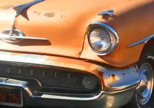
Yours almost looks the same as this ’58 Olds I shot at a junkyard–except the junkyard car is a Dynamic 88 and yours looks like either a Super 88 or a 98.
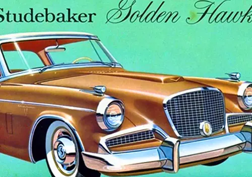
The brochure image shows the Dynamic 88 4-door is this same color, which looks gold in real life but may be “Sandstone Iridescent”?
One didn’t often see GM playing me-too at that time, but it surely looks as though they were making jackasses of themselves trying to out-Exner Exner.
I guess AI still cannot make cars uglier than humans can!
Esa imaginación no podría prosperar por mucho tiempo . Es una lástima que en aquellos tiempos la industria automotriz de GM y de Chrysler haya confundido imaginación con despilfarro inútil de recursos. Viendo todo en modo retrospectivo , seguramente la American Motors Corp con sus vehículos racionales Rambler ha dado una clase de buen gusto, racionalidad y carácter sobrio que aún sigue siendo muy admirado en Europa . Deberíamos hacer una autocrítica : los medios de prensa periodística siempre favorecieron exageradamente las virtudes de los Tres Grandes de América . A los Rambler , que ocuparon un modesto 4* lugar, generalmente los subestimaron
In a word-STRANGE! Thank God they never saw the light of day.